I’m trying roses now, using a reference photo from PaintCoach’s Patreon site. This is the background done, on a 11×14 canvas.
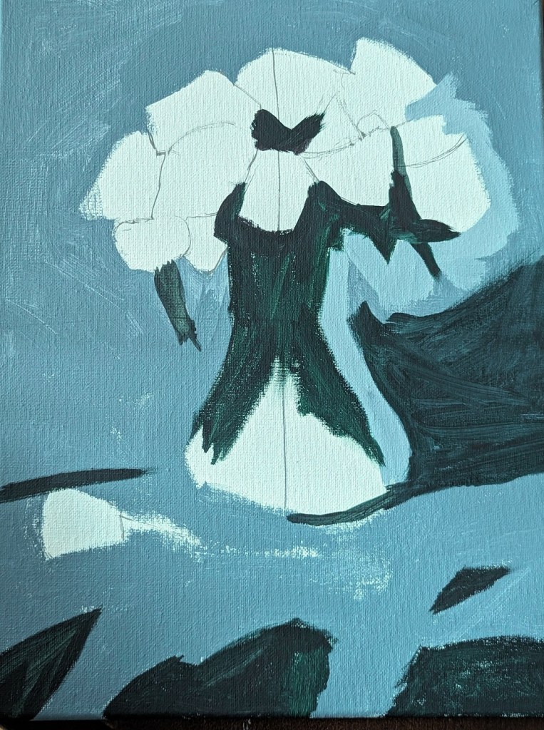

I’m trying roses now, using a reference photo from PaintCoach’s Patreon site. This is the background done, on a 11×14 canvas.
Here is the completed work. The orange I left untouched from the initial wash of color, adding alizarin crimson and yellow for the brighter and darker parts of the leaves.
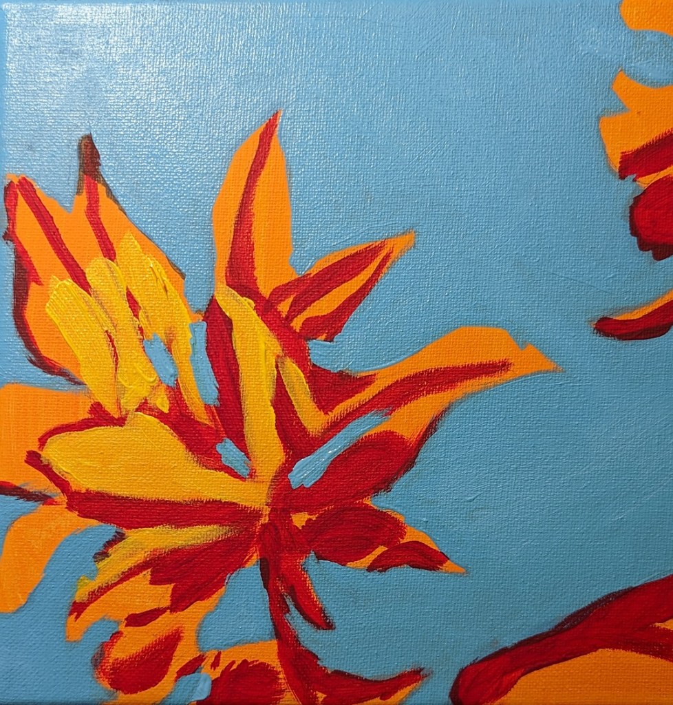
One more study I’ve done in the Adventures in Acrylic class. I did not do the fluorescent orange spray paint, and this time, instead of using my Perinone Orange (a close substitute), I went with Liquitex’s Cad-Free Orange paint, more soothing to my eyes.
Then I did a free-hand drawing in pencil of some of the orange leaves from the reference photo provided in the class, and did some light shading of the shadow areas as I saw them.
My blue was a mix of Utrecht’s cerulean blue (fluid) and Liquitex’s soft-body Light Blue Permanent (I think it is). I used a long-handled small bright brush to paint in the negative spaces.
This is really an in-progress painting, but I’m tempted to leave it as it is and go on to something else. We’ll see!
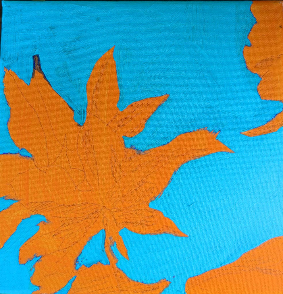
This is another work from Marla Baggetta’s Adventures in Acrylic class I’m taking. I have to say I’m NOT a big fan of phthalo blue, at least as a background. Especially a portrait background! That blue just shines through in an aggravating fashion! And, obviously, it affects the look of the other paint colors used. All in all, she looks greener than I had wanted her to be. Until I get portraits down well, I don’t see the purpose of using wacky colors. 🙂
Anyway, painting a portrait — though this was supposed to be “expressive” and “fun” not an absolute likeness — is one thing, drawing is another. I fiddled with the proportional divider I bought for sketching, and the drawing was pretty decent. But once I started painting over my pencil lines, the drawing went out the window. Ugh!
I AM reasonably satisfied with the facial planes and the shadows — for a first attempt.
Oh well. Tomorrow’s another day!
The other online classes I bought included a color mixing class from Will Kemp, a British artist who works with oil and acrylics.
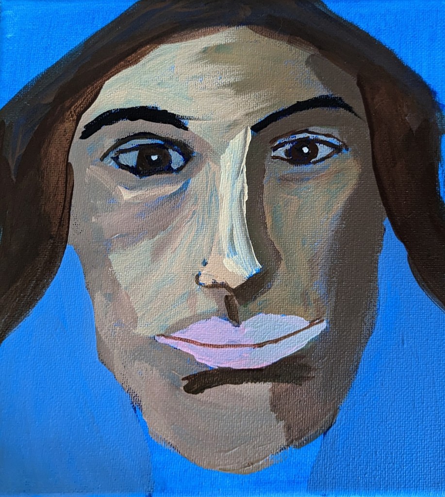
These tulips were done on 7×10 watercolor paper. The finished work is on the right, but appears too blue. The true color of the table and the vase are on the left.
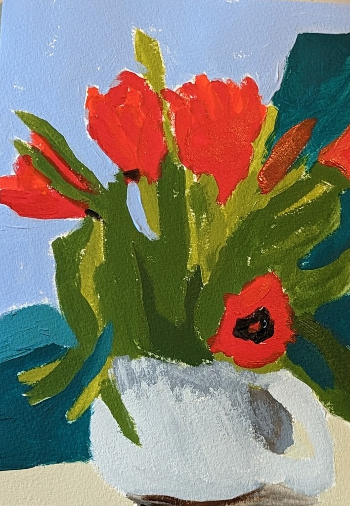

The next-up item in the Marla Baggetta Adventures in Acrylic course was these red poppies. She suggested we use fluorescent orange spray paint for our background; instead, I used my perinone orange paint by Chroma Atelier Interactive, which I find wildly fluorescent!
Using the reference photo, I drew the poppies in pencil over the painted canvas, and then watched her video, closed up my laptop, and did my best from-memory version. At the very end, you use a white gel pen to outline as you see fit; here, I reviewed the image of her final work, and then just winged it.
This was fun!

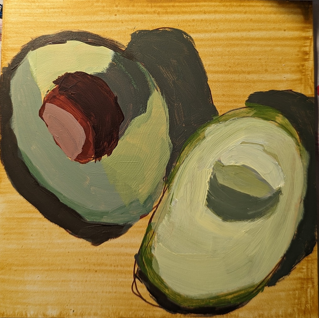
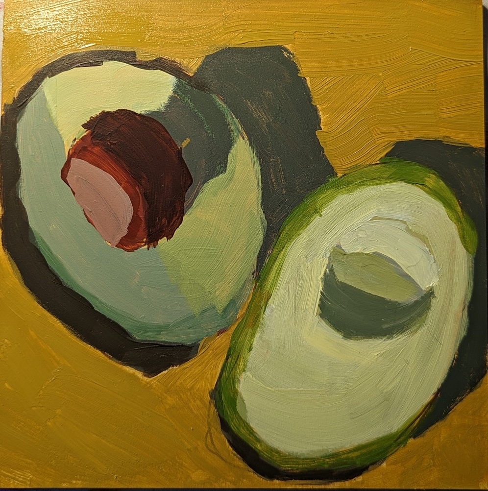
Next-up in Marla Baggetta’s Adventures in Acrylic was painting an avocado. This was on a 6×6 Ampersand gessoboard. I watched her video then shut down my laptop, and just worked off the reference photo. Here are some in-progress photos.
I used a yellow ochre glaze, and then drew out the shapes with my Liquitex burnt umber paint marker. There are excessive striations with the yellow ochre because I was using the liquid/soft body version and then mixing it with water. (That’s a mistake!) The watering-down really only makes sense (to me) when using full-body paint.

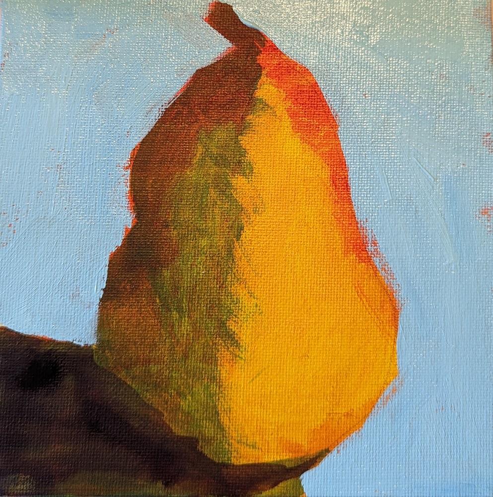
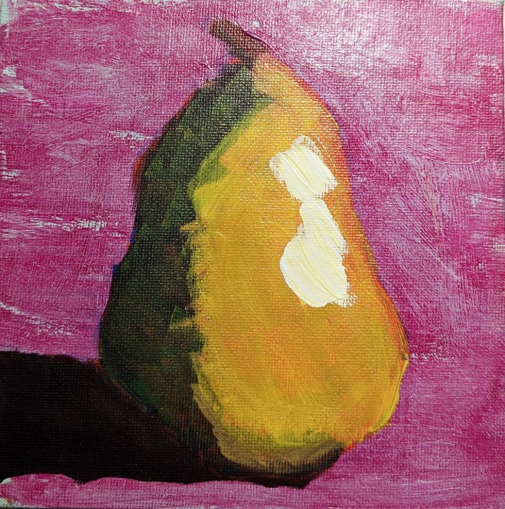
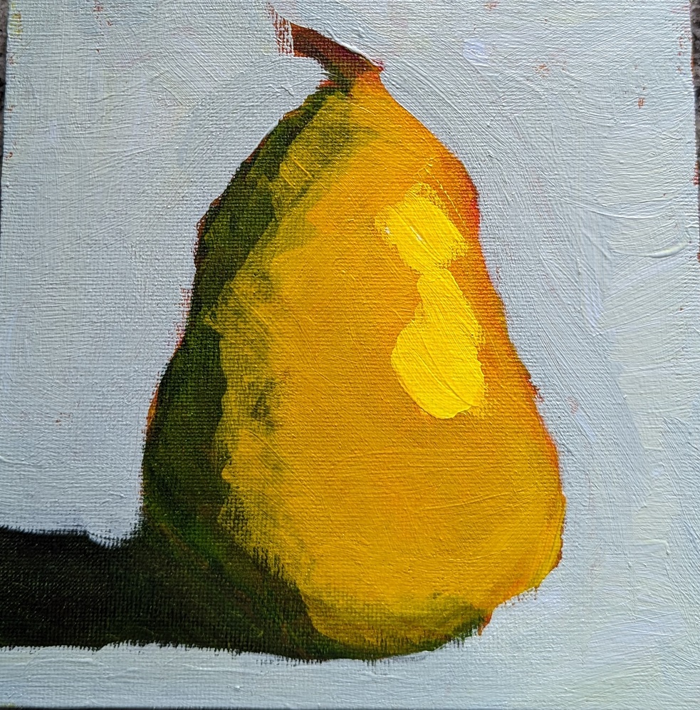
This is the last pear I did — I’m sick of pears for the moment! — and this was done on slippy-slidey gessoboard. (I’m almost done with my stash of that stuff and am in no hurry to buy more.) In this one, I did the final yellow glaze only on the pear itself, and before I added the highlight.
Funny thing, after all this pear painting, I was at the grocery store today, and for the first time I really noticed all the pears in the produce section; each type has its own shape. I think of this shape as somewhat close to a “classic” pear, but that’s really the Bosc pear. Some are short and squat more like gourds or squash.
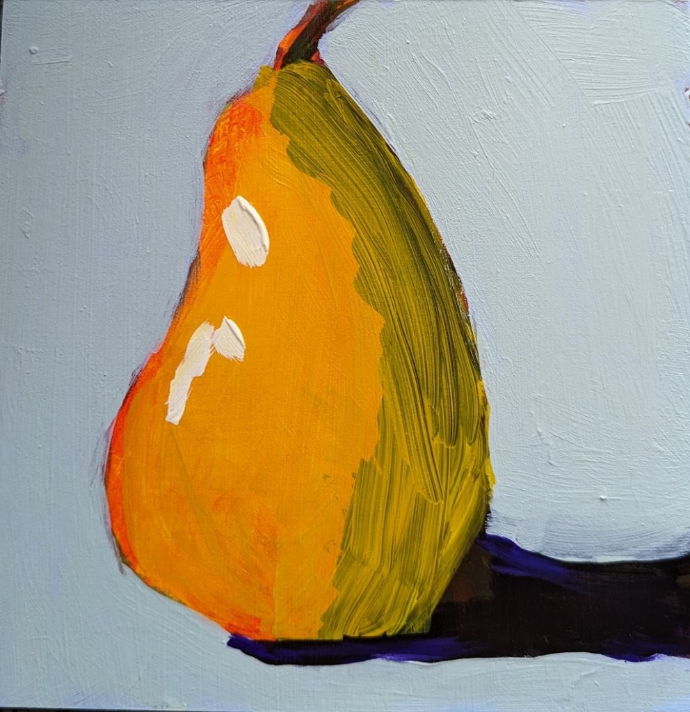
This is work from the Marla Baggetta class I mentioned the other day. These pears were done after I watched the video provided, so they’re closer to how she did it, but not entirely. I took a series of in-progress photos; sometimes we’re glazing, sometimes we’re painting. The very bottom photo at the end is the final result; everything skews yellow because a yellow glaze was the last step.
I’m not entirely sold on the layering and layering of glazes; seems like a lot of extra work. It seems to me to make more sense when using pastels than when using acrylics,
This was done on an 8×8 canvas.