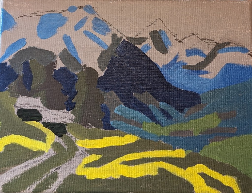
This is another exercise from PaintCoach Patreon’s page. The idea is that, if your solid shapes of values works, your painting will work once the detail is filled in. And it’s also to help beginners like me think in terms of shapes rather than things.
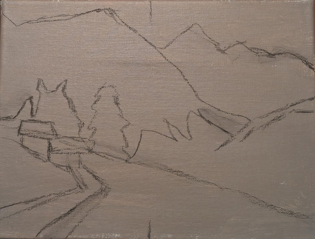
I used a raw umber and white tone on a 9×12 canvas, and sketched out in charcoal (a few days ago) — again, because I was also watching postseason baseball.
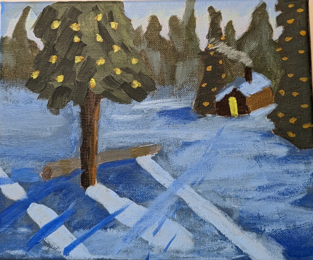
I’m working on another lesson from PaintCoach’s Patreon pages. This one is called “Winter Cabin”. I’m using an 8×10 canvas, which I toned with Windsor & Newton Galeria’s Pale Umber. I sketched out the basic shapes with a Liquitex acrylic paint pen in Burnt Umber.
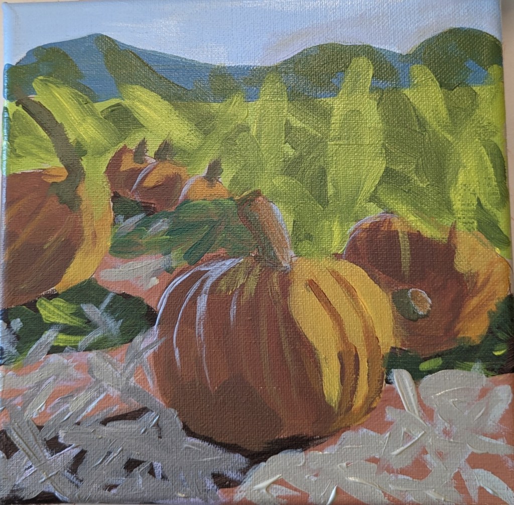
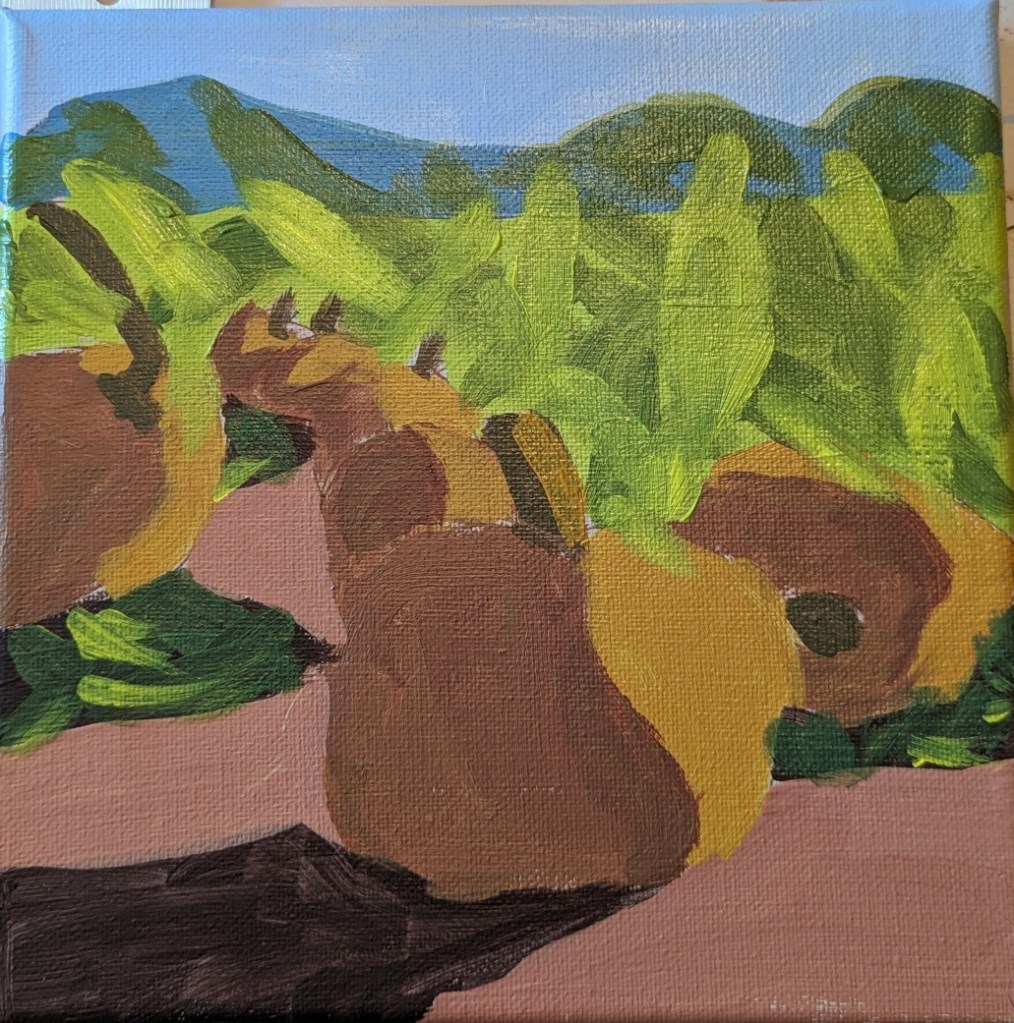
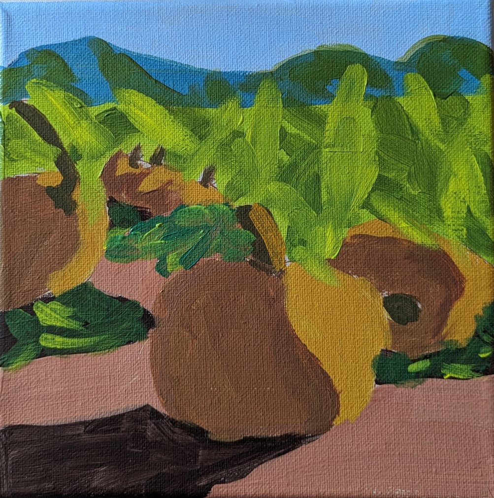
After I completed today’s work, I realized that the center pumpkins were all in a line, and I decided I didn’t like that. Bad composition. (See left image.) So I removed one of the pumpkins, and I think it looks a bit more natural.
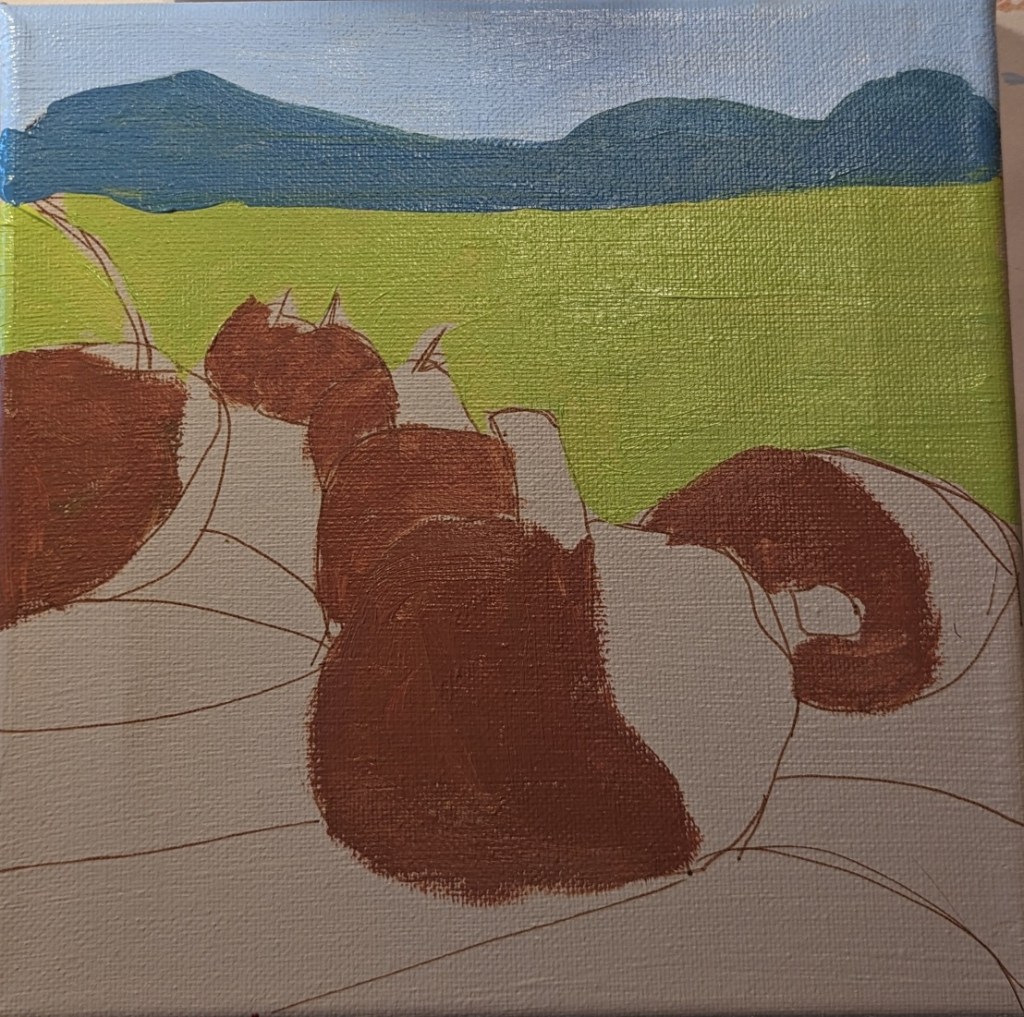
It’s finally starting to feel like fall here after a long, hot summer. So, I’m in the mood for fall-themed paintings. This one is from a lesson for patrons of PaintCoach. The idea is to map out the large shapes first, and get the values set before filling in the detail.
I’m doing this on an 8×8 canvas, which I painted with Winsor & Newton Galeria in Pale Umber, drawing out the lines with an acrylic paint pen. (Some of the lines are “wrong”, but I’ll be painting over them anyway.)
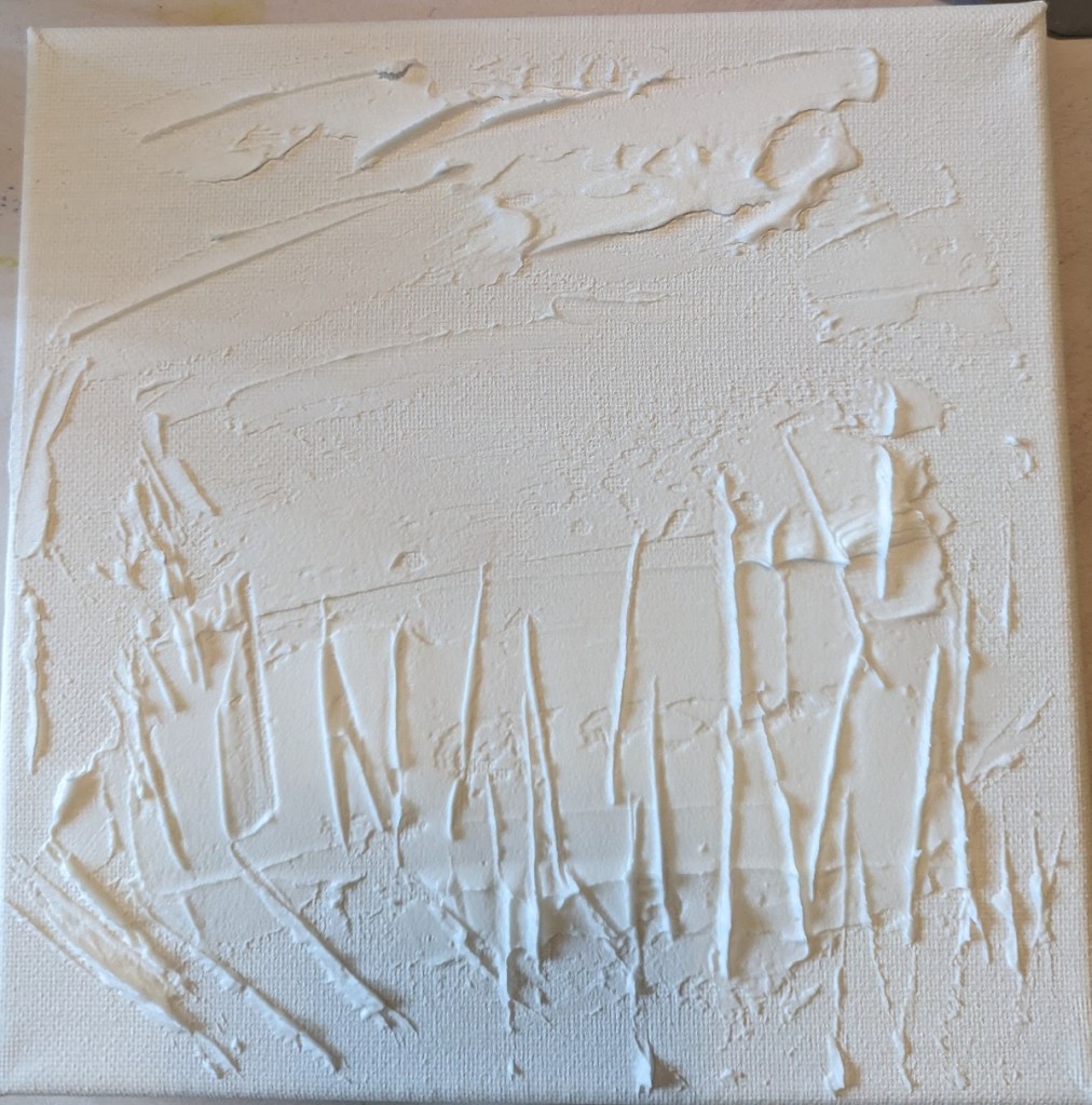
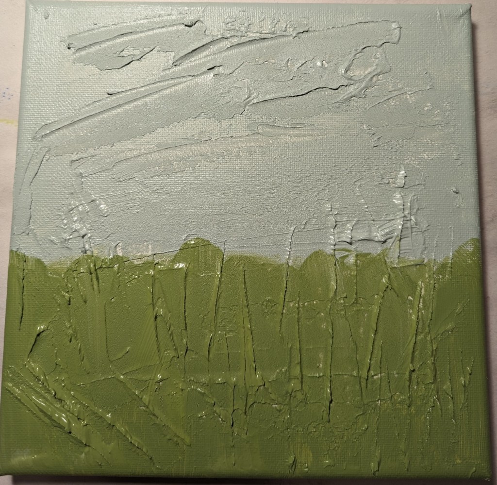
This painting was based off an image by RÜŞTÜ BOZKUŞ from Pixabay, and an article I found on the UK site Painters Online. I used an 8×8 canvas for this work, and took photos of each step I took.
Step One was to apply the modeling paste. The horizontal “goop” was to signify clouds; the vertical lines was to signify weeds and plant stalks.
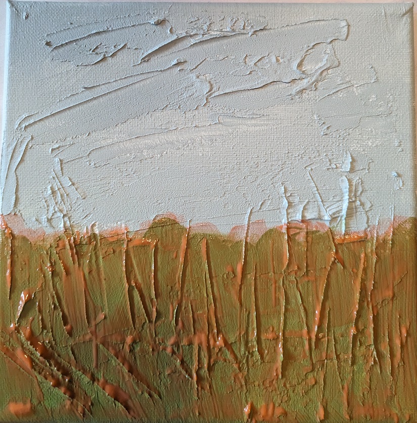
After applying the modeling paste and letting it thoroughly dry, I went in my own direction rather than following the Painters Online demo.
I used a gray green mixed with a yellow green for the grasses, and a gray blue for the sky area.
Green is reportedly not a good color to use alone when doing landscapes and meadows. So, my next step was to apply a transparent orange glaze (using Liquitex Gloss Glazing Medium over the green paint, and let that dry thoroughly.
After the glaze dried, I added a darker value in the center bottom (to match with the reference photo) as well as adding a glaze of Cadmium Red Medium Hue for the clouds.
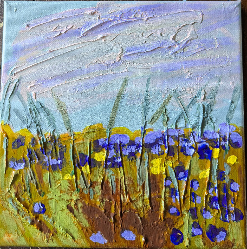
Next I painted the flowers, using Dioxazine Purple with some Titanium White, some yellow flowers, and highlighted the stems with Gray Green, yellow, and Burnt Sienna. I retouched the grassy area with some green. Then I added some of the Dioxazine Purple mixture to the clouds in the sky, and called it a day.
(The photo here doesn’t fully reflect the periwinkle/purple color of the flowers; they look too blue.)