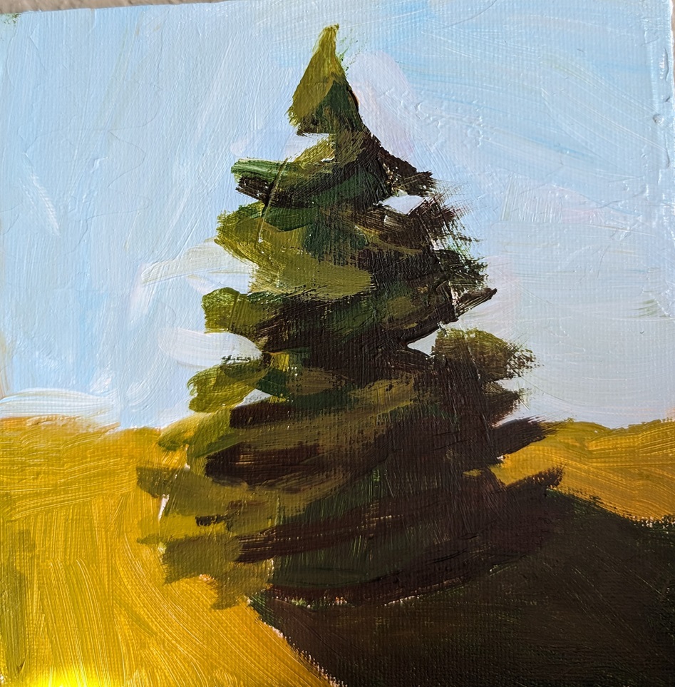
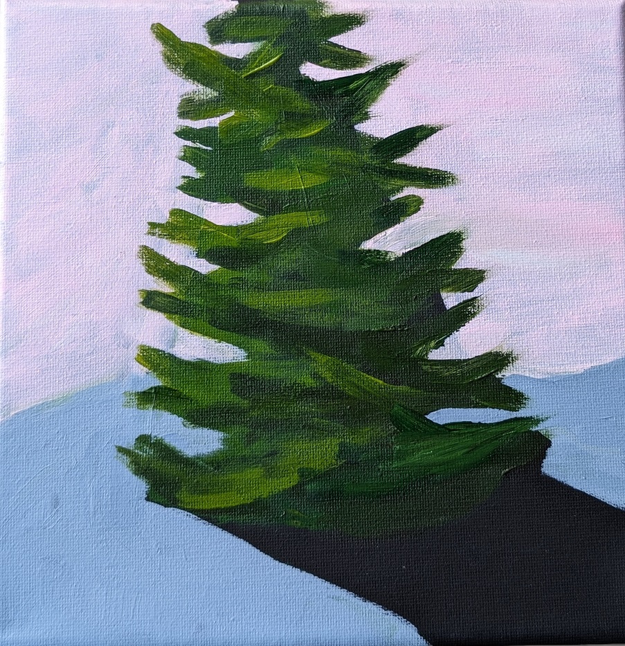
So I’m going through the Foundations classes in the library of Acrylic University — basically the reason I paid for a year’s subscription. In Acrylics 101 we cover the basic tools (brushes, easels, types of acrylic paint), the importance of thumbnail sketches, values, color (opaque vs. transparent, color mixing, etc.) and then finally we do some practice paintings. Three are minis (6×6) and three are larger sized (up to 16×20).
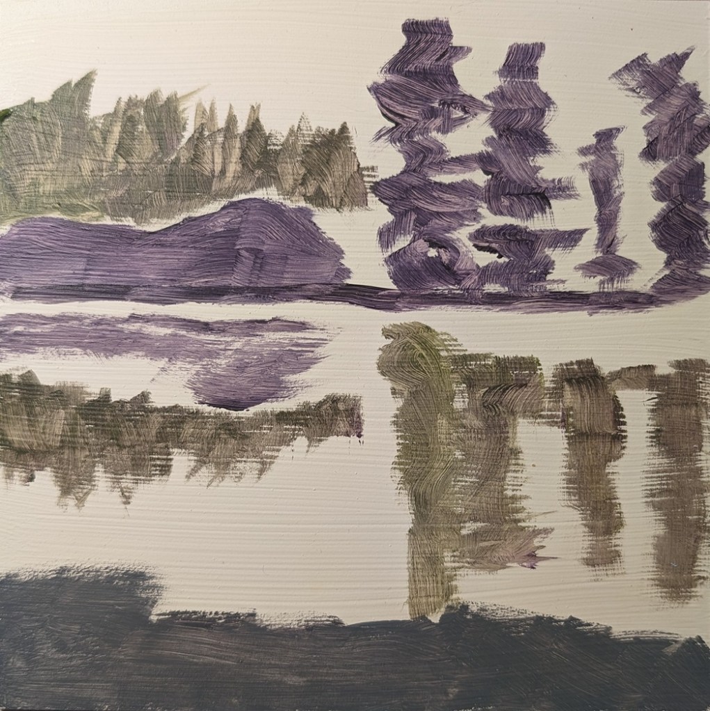
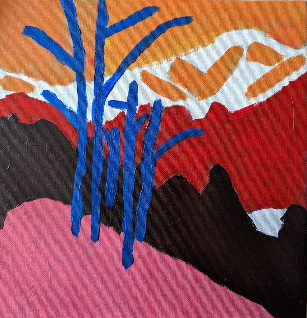
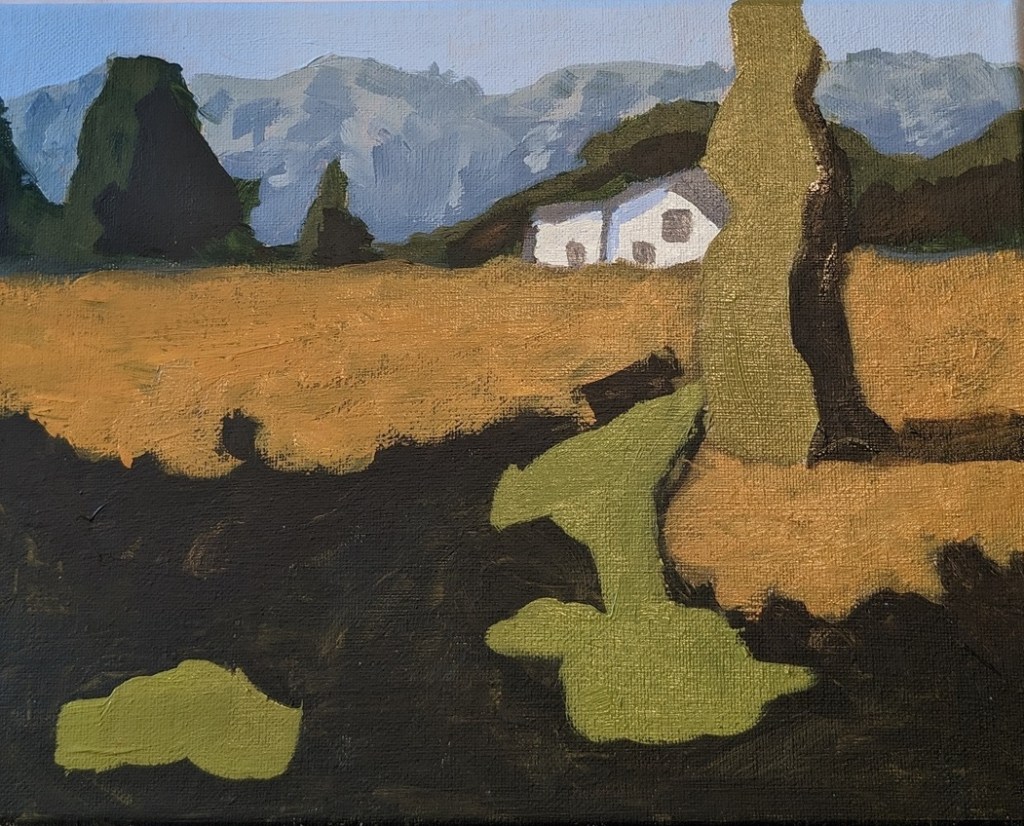
Jed Dorsey, our instructor, says that he has found that beginners do better — and gain confidence more quickly — when they attempt to copy a painting rather than work with a reference photo (or plein air) primarily, I assume, because the artistic decisions have already been made. He demos painting a copy of his own painting, explaining why he did what he did.
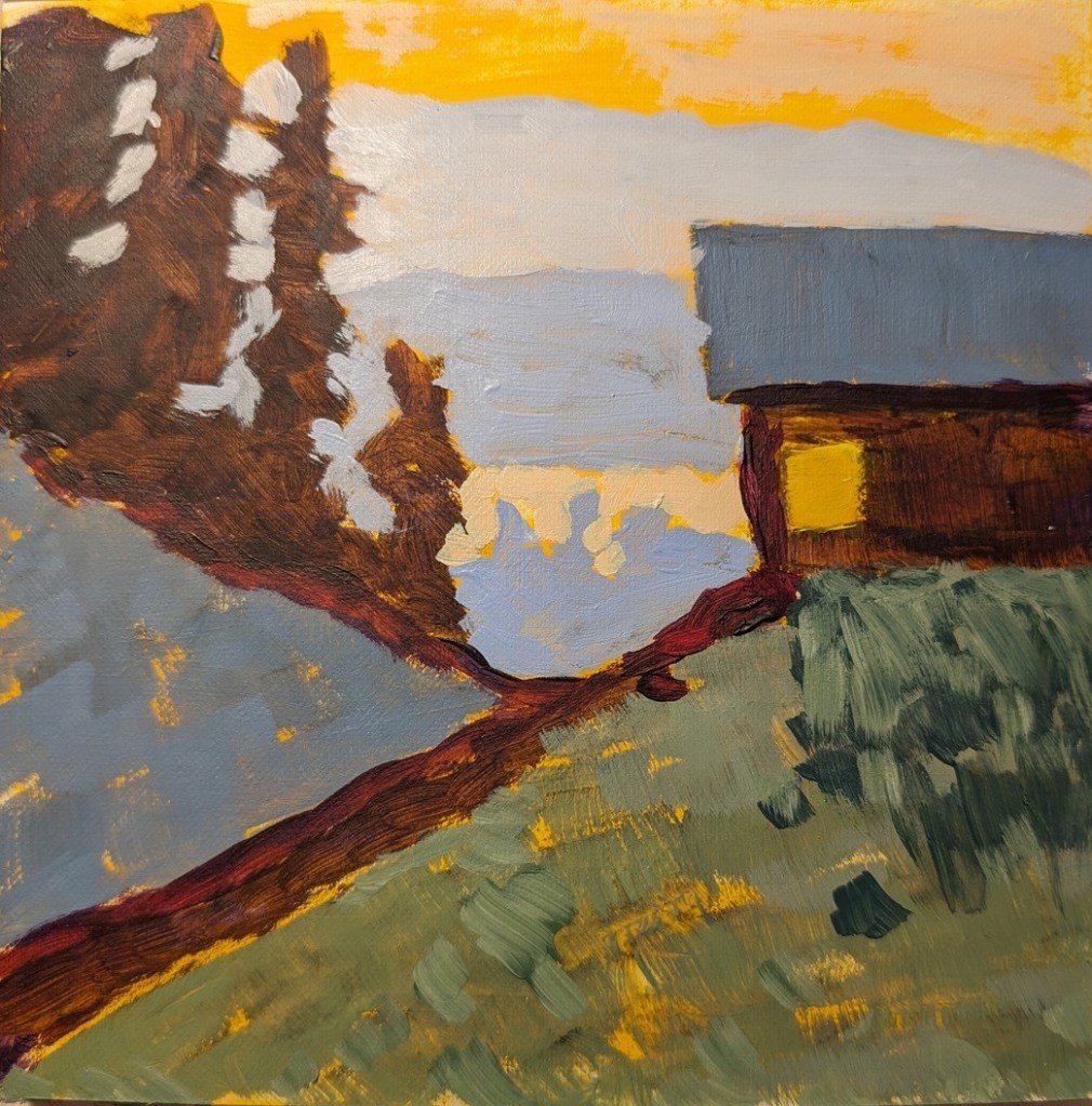
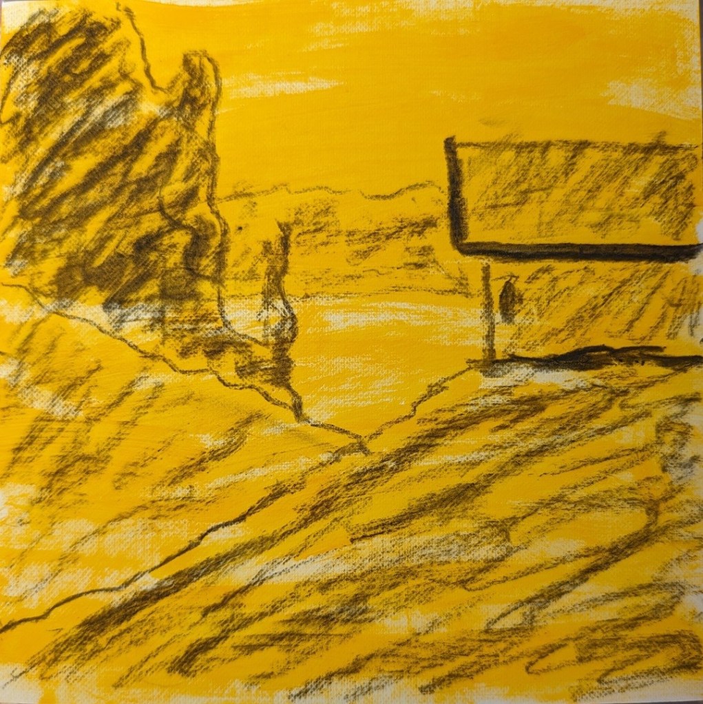
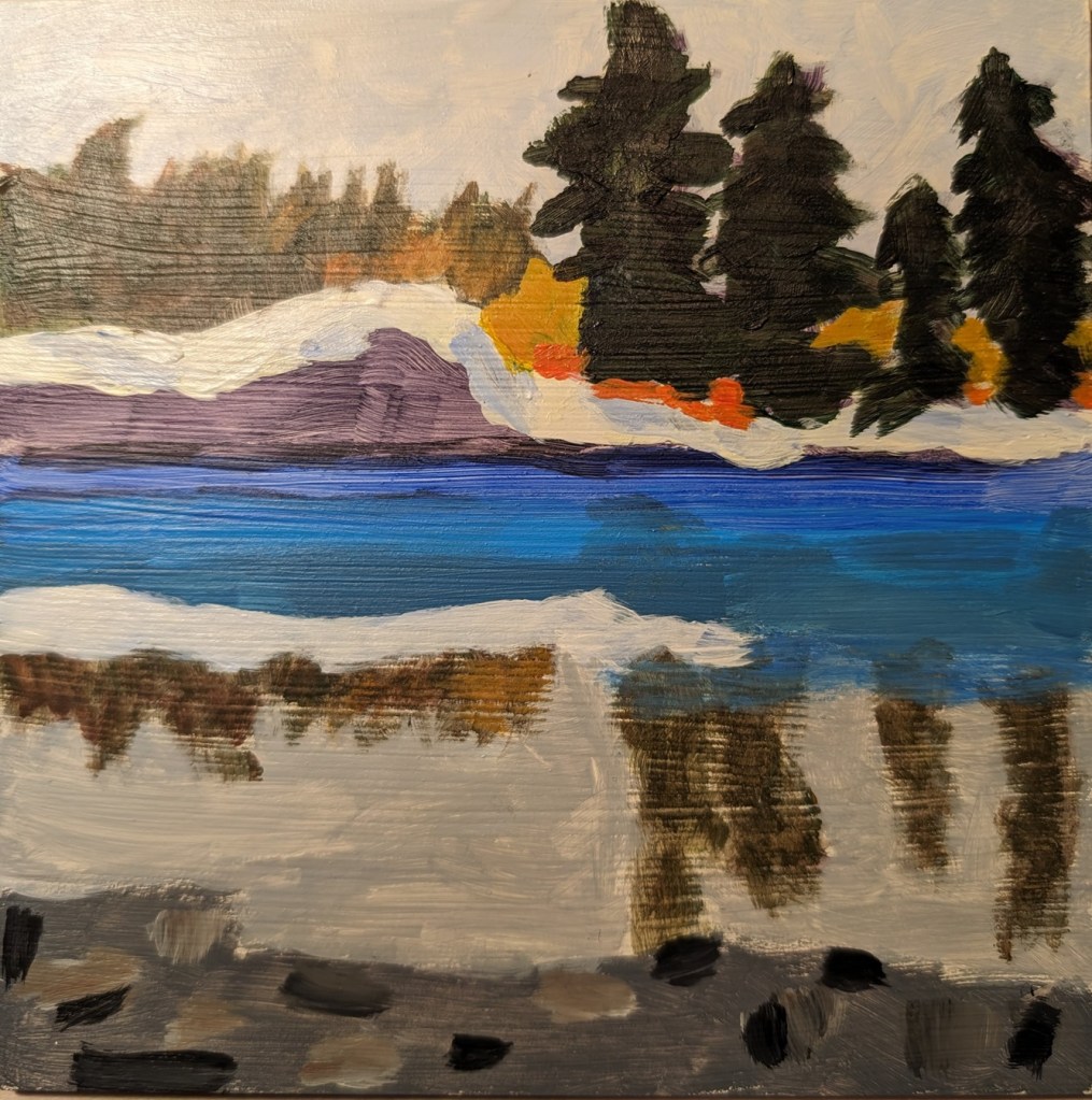
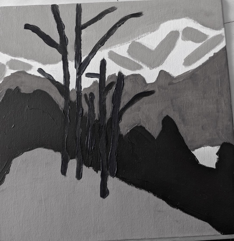
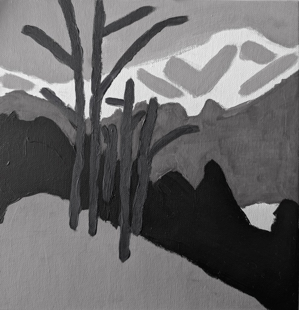
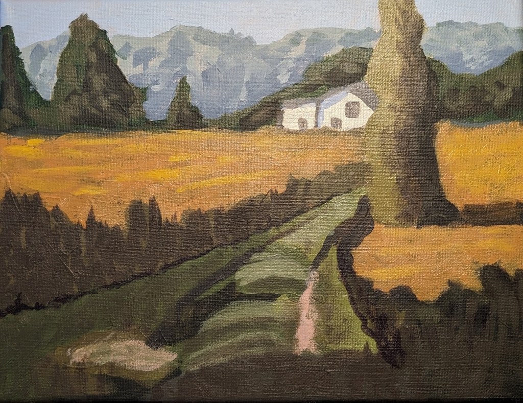
So, with that lead-in, here’s my painting of his painting. I used Diarylide Yellow as my toning color, and painted on 6×6 canvas paper using only a #8 flat brush.