“Confident Color” Arrived today!

A week or so ago I was reading a posts about color palettes on Karen Margulis’ blog. She referred to 2 books on color by Nita Leland: Confident Color and Exploring Color Workshop (30th anniversary edition). I have Leland’s Creative Collage Techniques book so I was familiar with her name. So I decided to buy Confident Color used from a seller on Amazon because I could view more pages from it than the color workshop book.

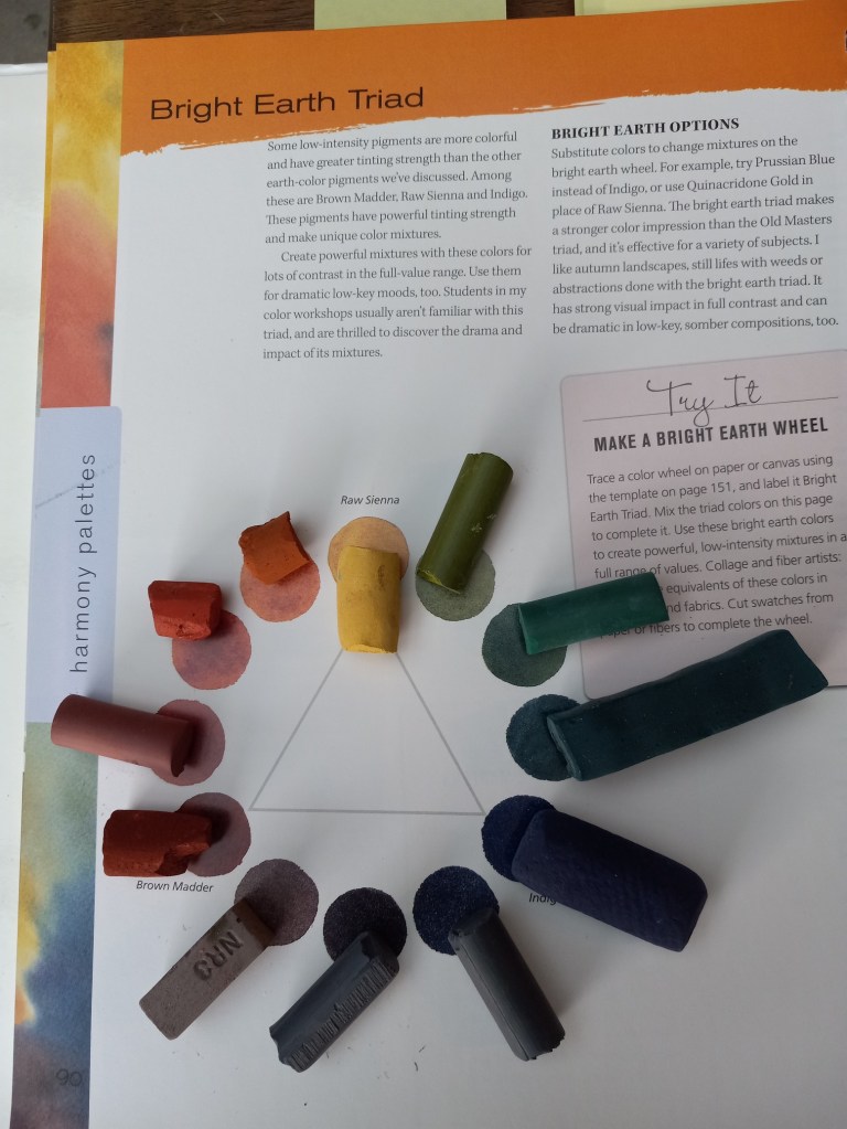
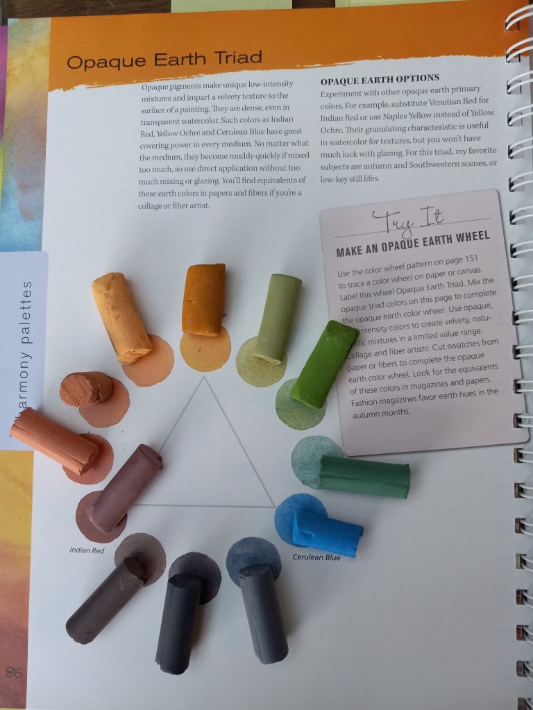
My tastes, in general, run to what Leland calls “Bright Earth” and “Opaque Earth”, both more muted palettes than bright bold ones. (I also like those, but they can be so bright and so bold it’s like a punch in the face.)

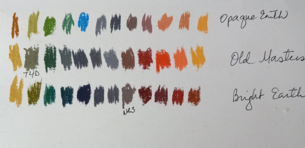
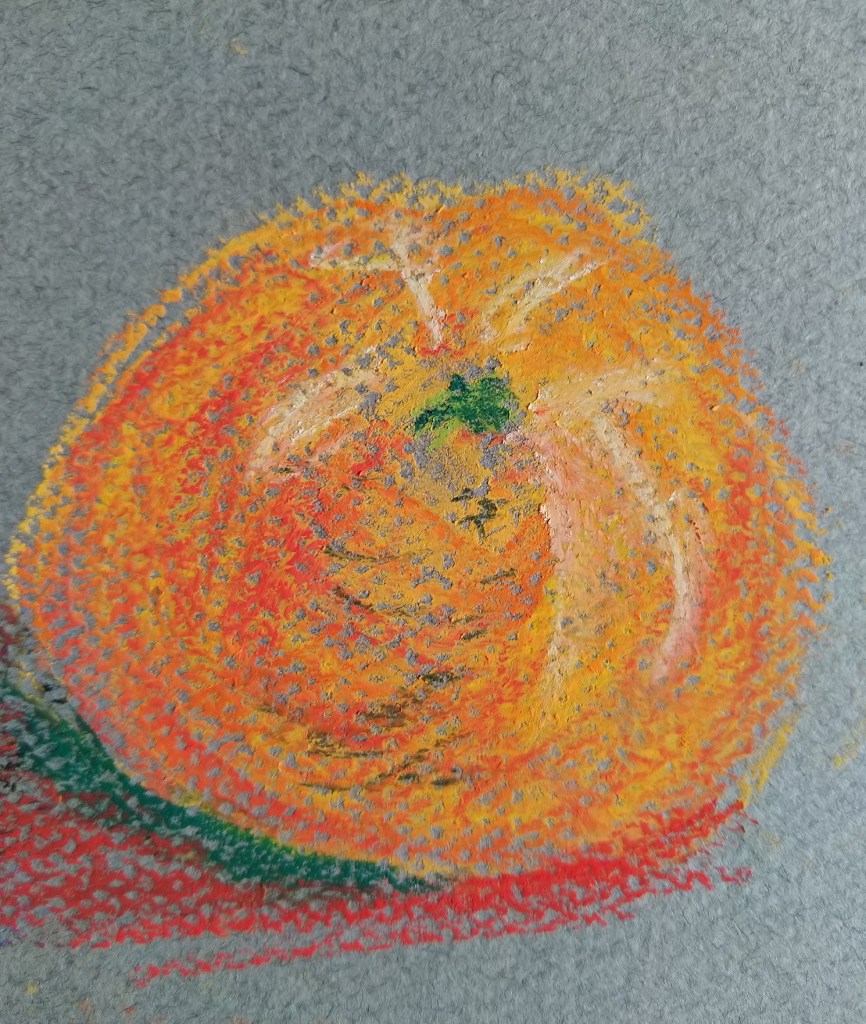
In any case, it was fun to try matching pastels I already have to the references in the book, as seen in the photos below.

Playing with Color — Apple

I don’t recall what pastel paper I used; the pastels here are mostly Blick Artist’s Soft Pastels (half sticks) that are, obviously, brand-new. I had a lot of difficulty laying down color in the way I wanted!

Afterwards, on one of Marla Baggetta’s YouTube demos in which she uses Rembrandt pastels, she mentions that the pastels are new, and she gently abraded them against the sanded paper she was using.

I have some Rembrandt half-stick pastels as well as Blick Artists pastels; they seem similar in look and feel to me. So, I used some scraps of fine sandpaper to abrade some of my Blick pastels. I hope that will help in my next painting!

Working with Pastels and Charcoal

I’ve been taking Rebecca de Mondenca’s pastel classes on arttutor.com, and this is some of my initial work from her class “A Beginner’s Guide to Pastels”.

I find I don’t care for the pastel paper that has the honeycomb look, although it can hold more pastel layering, given the “tooth” of the paper.

Most of these are from using the Dick Blick Artist’s Pastels (60 set), but the (finger) blended blues are Sennelier Landscape (30 set) pastels.