Playing with Color… Chromatic Blacks

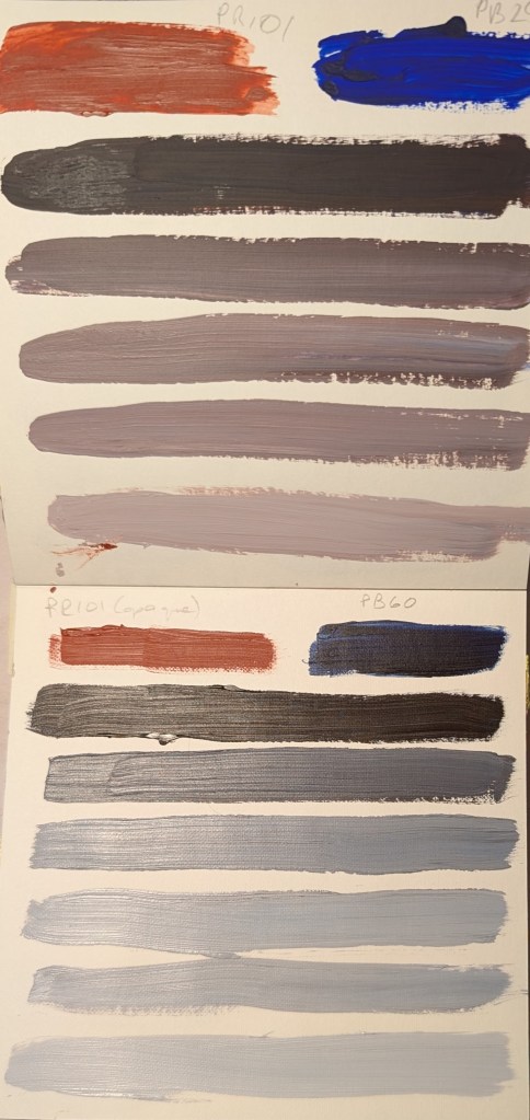
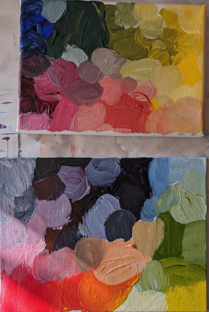
So, we know that mixing two complementary colors will get us a brown or black if we do it deliberately, and “mud” if we don’t. 🙂 You can see a Burnt Sienna (“orange”) and Ultramarine Blue chromatic black that I used here.

I mixed opaque Red Iron Oxide (PR 101) with both Ultramarine Blue (PB 29) and Anthraquinone Blue (PB 60). Both mixed to a nice dark black, but as I continued to add more white to that black, the PR 101 – PB 60 mix created a bluer gray.

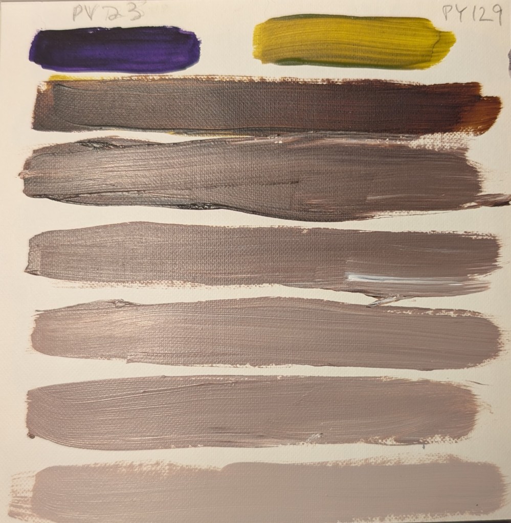
I also mixed Dioxazine Purple (PV 23) with Green Gold (PY 129) and got a dark brown rather than a black.

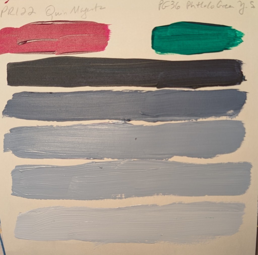
Finally I mixed Quinacridone Magenta (PR 122) with Phthalo Green Yellow Shade (PG 36) and then with Phthalo Green Blue Shade (PG 7). The chromatic black for both of these mixtures was far and away the deepest black (much more evident than in the photos). What was striking to me was how blue the tinted version of the “black” mix of PR 122 and PG 7. (See bottom photo.)

Playing with Color… Shades of Orange

I have a couple of shades of red and a couple of shades of yellow, so wanted to see how a mixed orange would play out, and then how it would tint. Turns out my Naphthol Crimson (PR 170) is quite close to my current favorite Anthraquinone Red (PR 177). And the light yellow is more of a lemon (cool) color, while the medium yellow is considerably warmer.

I recently bought some Primary Red (PV 19) which turns out to be nearly the same as my Naphthol Crimson (PR 170) — definitely a cool (transparent) red. And I picked up a tube of Transparent Red Oxide (PR 101) and the color is not significantly different from the regular (opaque) Red Oxide (also PR 101) which I already had.

The warm yellow seemed to make more of a difference than the warm red (at bottom — pyrrole red PR 254) as far as the orange was concerned. Meaning, I don’t see much of a difference between the medium cad-free yellow mixed with PR 254, as compared to the same yellow mixed with PR 170.

Testing Out My New Watercolor Pencils

I’ve been enjoying my graphite Aquarelle pencils so well that I bought some watercolor pencils to try them out.

I purchased 3 different sets of 12 pencils: Faber-Castell Albrecht Durer; Caran d’Ache Museum Aquarelle, and Derwent Inktense Pencil Set.

I used the pencils on my 300-lb watercolor paper, applying water afterwards. One thing I noticed is that each 12-pencil set has relatively similar colors. The Albrecht Durer set includes a white pencil which I don’t see a lot of use for — unless you’re using it on toned sketch paper? My initial thought is I was gypped, lol.

The Derwent Inktense pencils, once wetted, are clearly more intense than either the Faber-Castell or Caran d’Ache pencils. On the other hand, the Faber-Castells seem to wash more smoothly (for lack of a better term) in that my back-and-forth pencil lines are less obvious than the Caran d’Ache or the Inktense pencils.

Now I need to try them out on some drawings to see how I really like them.

Metallic Acrylic Paints!

I got some Lascaux Metallic paints, and haven’t used them yet. (When DO you use metallic paint in an acrylic painting?) I painted samples, and photographed them indoors under an overhead light [left], outdoors in a shaded area [right], and outdoors in the sun [bottom].

Don’t they look cool?

Beach scene

This pastel work, done on an approx. 12×10 scrap of white Pastelmat, was based in part off an image by Somchai Sumnow from Pixabay, but also off of some of my own reference photos of Hawaiian beaches.

Mostly I was interested in the different shades of blue and also how different brands of pastel lay down on the paper. There are some weird diagonal lines, probably creases from the original 19×25 size of the Pastelmat sheet,

And, just for fun, comparing the above pastel piece with another beach piece I did 3 or 4 months ago with acrylics, sand texture, glass beads, and iridescent paint.

Testing New Paint Colors

The other day I bought some new acrylic paints from brands I haven’t used before. I needed some more yellow azo medium, so I tried Matisse Flow. I am perfectly happy with the color and the paint itself, but a negative for me is this brand has a foil covering once you take off the cap. I couldn’t pull it off by hand; had to use a knife — and found the whole thing unnecessary.

I got Green Earth and Payne’s Gray made by Old Holland. I like both colors — in particular the Payne’s Gray which would be great for a night sky. It surprised me that the Green Earth was so transparent. It would be good in a floral still life or a landscape.

The Cerulean Blue is made by Charvin. I think it’s a single pigment color. And I love the color!