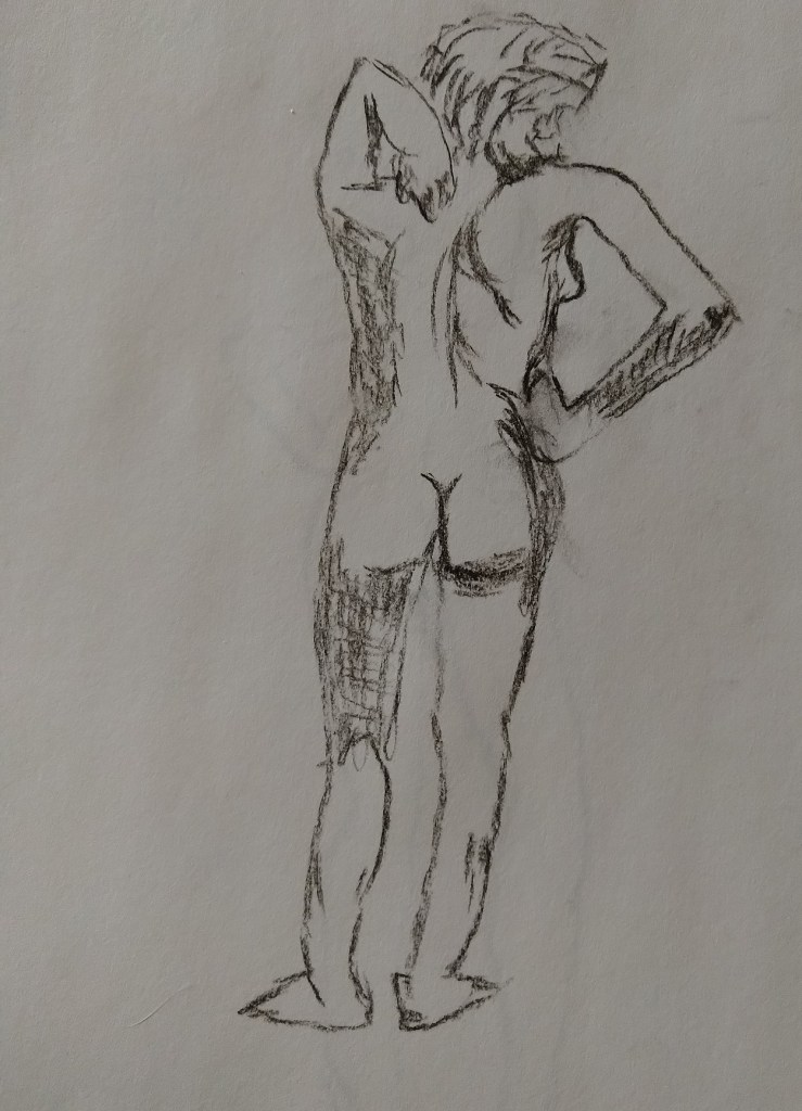
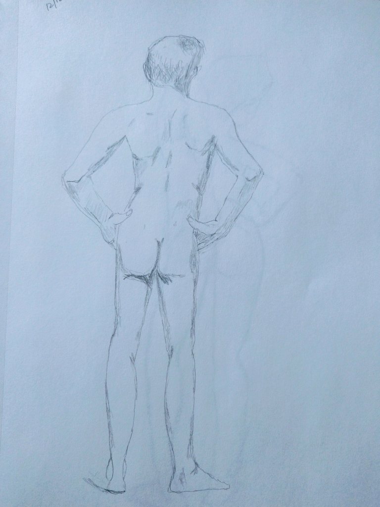
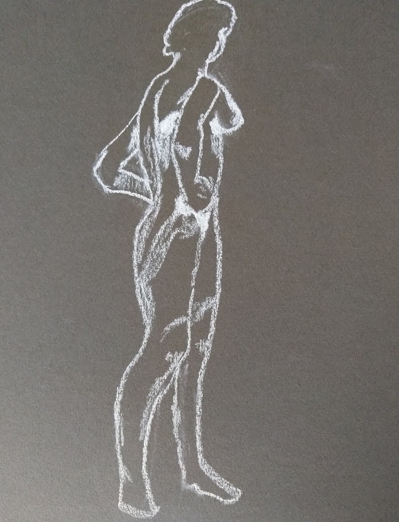
Some of the drawings I’ve done of the human figure, referring primarily to books by Giovanni Civardi on drawing the nude, and the human figure. Compressed charcoal (upper left), graphite (upper right) and white Conte crayon on Strathmore gray-toned paper (bottom right).
Charcoal
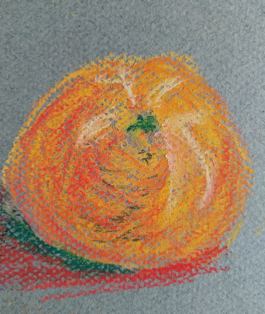
Working with Pastels and Charcoal
I’ve been taking Rebecca de Mondenca’s pastel classes on arttutor.com, and this is some of my initial work from her class “A Beginner’s Guide to Pastels”.
I find I don’t care for the pastel paper that has the honeycomb look, although it can hold more pastel layering, given the “tooth” of the paper.
Most of these are from using the Dick Blick Artist’s Pastels (60 set), but the (finger) blended blues are Sennelier Landscape (30 set) pastels.
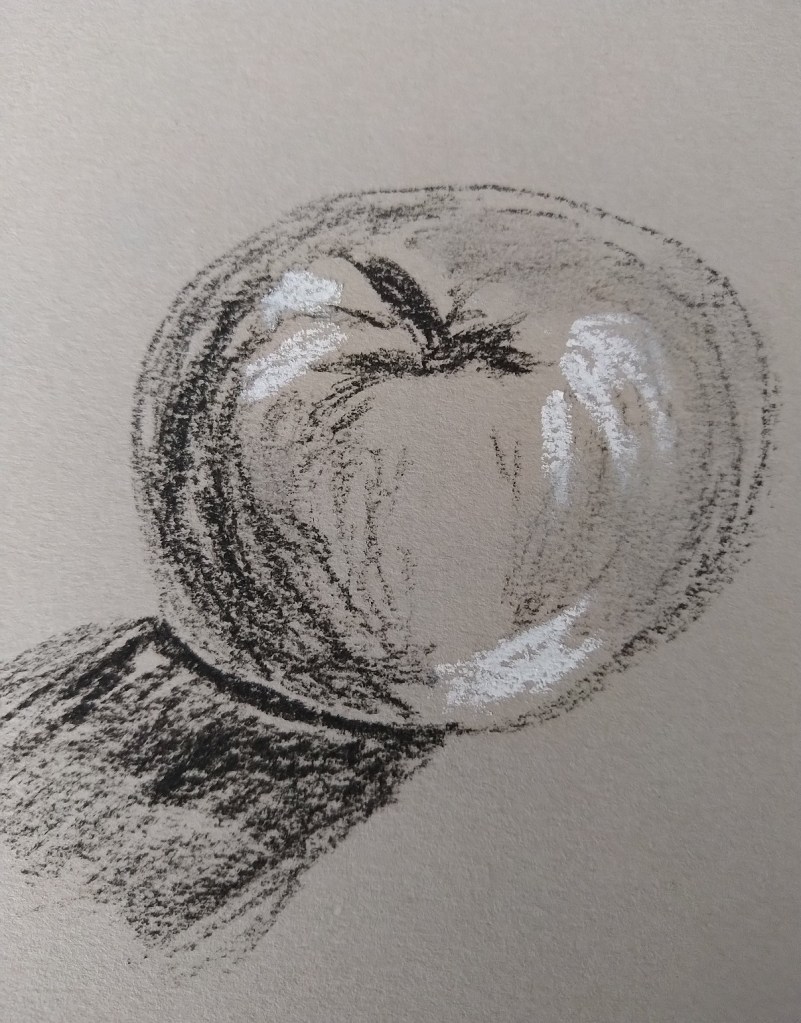


Mark Making in Charcoal
Now that I’ve completed “Drawing Essentials”, I am browsing through ArtTutor for more classes, and am interested in trying out charcoal. (I have memories of using charcoal pencils in grade-school art.) In any case, in this image, I tested out charcoal pencils (upper left), Comte pencils (upper right), vine charcoal (lower left) and compressed charcoal (lower right). The white –except for the Comte pencil example — is my General’s white “charcoal” pencil. The paper used is gray-toned Strathmore.

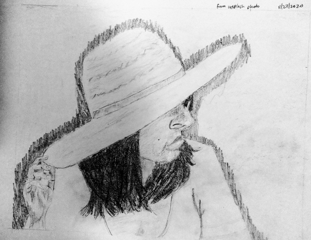
My First Portrait
This drawing is based off a photo I found on Unsplash. I need to learn how to draw hair!