Christmas Ornaments: my own version

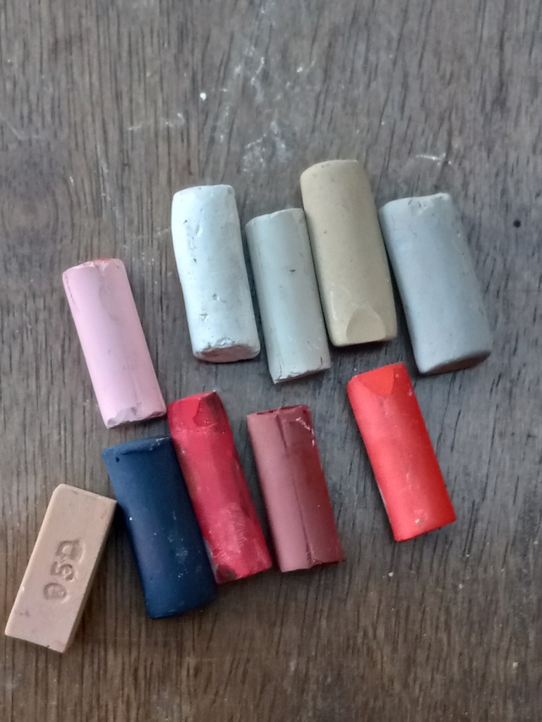
I used a Hahnemühle non-sanded pastel paper from my sampler set to draw the pair of ornaments taken from my fireplace decorations.

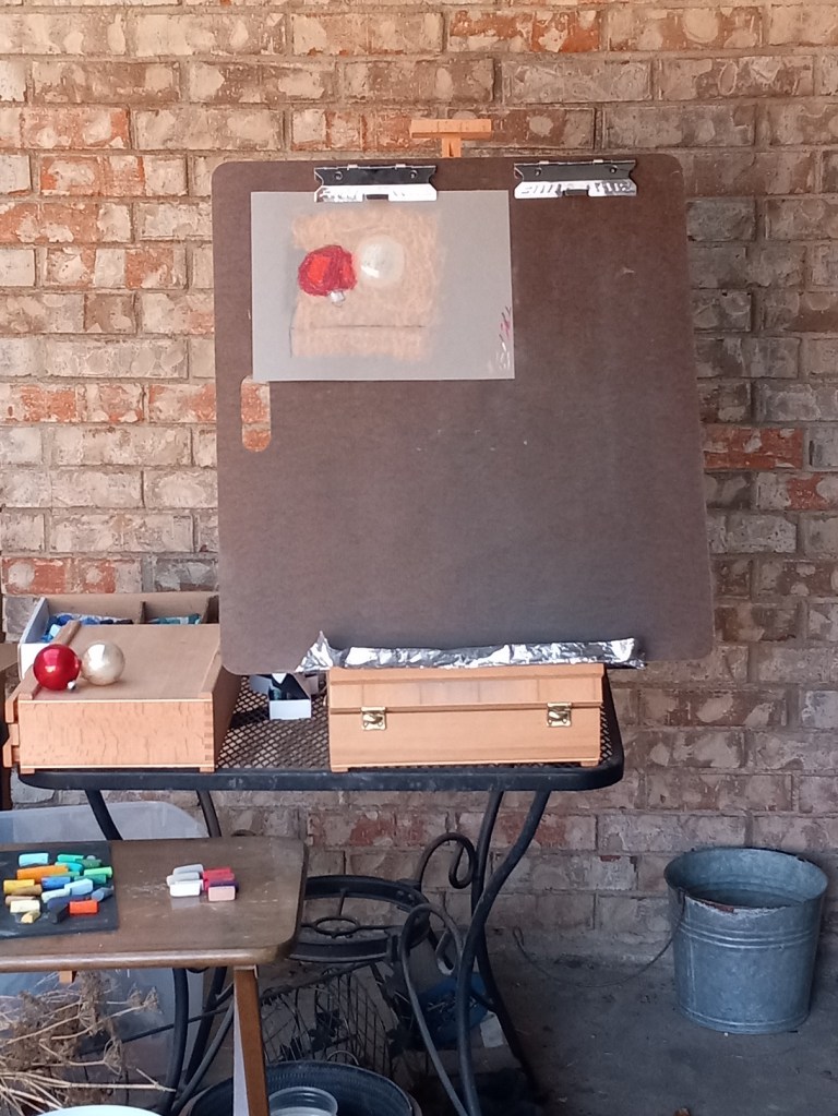
I took a photo of the entire easel scene; you can see the reference objects on the left. I also took a photo of the ornaments, and the color palette I used.

I was painting from life rather than the photo reference; the photo looks somewhat bluer and I was standing at a slightly different position taking the photo than when I was actually pasteling.

My First Landscape

Today I did my own landscape painting based on a photo of a sunrise I took several years ago in our backyard.

I used Clairefontaine Ingres paper, which is unsanded, and not too bad. It was a pale tan color (and part of my unsanded paper sample I purchased from Jackson’s Art a year ago.) The initial drawing was done in vine charcoal. And I kept the size to 8×6.

9 Pear Study – What did I learn, Part 2?

So, I ended up painting the rest of the pastel board with acrylic paint (Golden’s Fluid Acrylics in the yellow ochre color).

What was interesting is that the performance of the pastel sticks changed. Great America, NuPastel, Blick and Blue Earth skipped all over, and pigment was just falling off the painted paper! On the other hand, the Richeson Hand-Rolled and Sennelier seemed to grip the painted surface acceptably.

So, what have I learned?

  • I’ll use up my stash of Canson Touch and not buy any more
  • In the future, I’ll stick with neutral paper colors: either a light beige or a light gray, and skip colors like “Twilight” and Indigo. (Unless I paint a night scene.)
  • I’m happy with the way the Richeson Hand-rolled pastels performed on the Canson Touch paper, painted or unpainted.
  • I could use the Canson Touch with charcoal in the future.
  • I had no trouble with putting the acrylic paint to the Canson Touch paper.

Portrait in Charcoal

This portrait is based on a photo I downloaded from Pixabay. I used soft vine charcoal for the large shaded areas, For the more detailed areas, I used charcoal pencils 2B and 6B, in addition to Conte crayon in light gray, with mere touches of Conte in white. The rendering was done on Strathmore 400 gray toned sketch paper.

Based on an image by endorassi from Pixabay