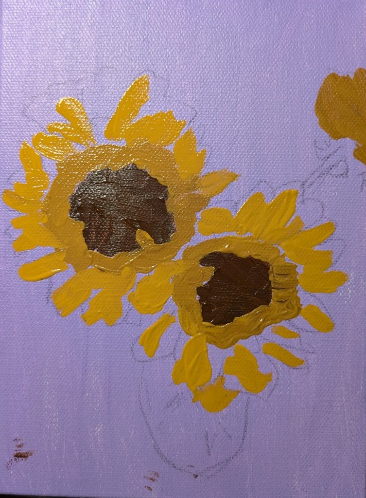
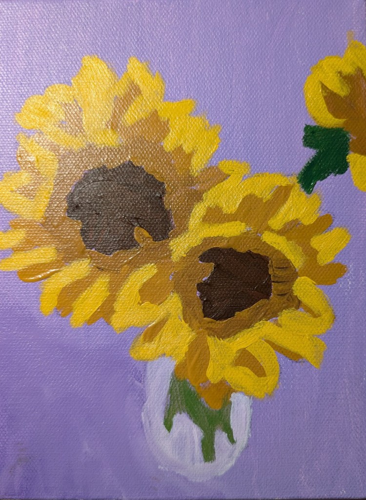
This is a painting from a “Bloom” class by Jed Dorsey at Acrylic University. I haven’t finished it yet, because, honestly, I’m a bit bored with it and want to paint other things. But I’m posting it because I’ve FINALLY started painting again.
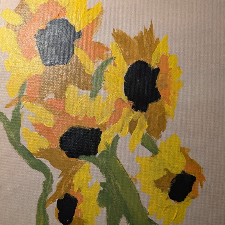
A few weeks ago I watched one of the videos on the Acrylic University site. Jed Dorsey was painting a vase of sunflowers from a reference photo (likely his own). So, tonight, I felt like painting more sunflowers and decided to just wing it mostly from memory, doing my own thing rather than copying Jed’s work, or copying the reference photo.
This is the result. 10×10 canvas panel toned in burnt umber and white. Colors used were naphthol crimson, cadmium yellow, ultramarine blue, and a bit of Mars Black.
This was fun! I wasn’t trying for realism or polish, just playing with paint.
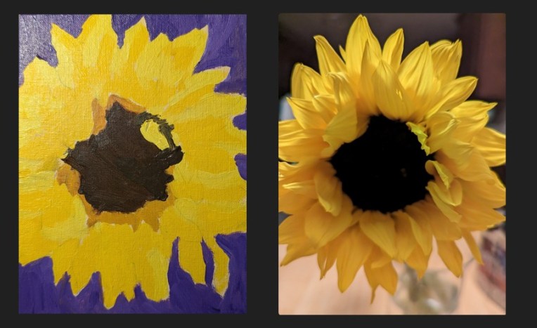
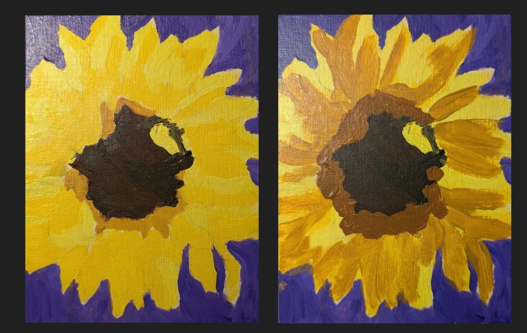
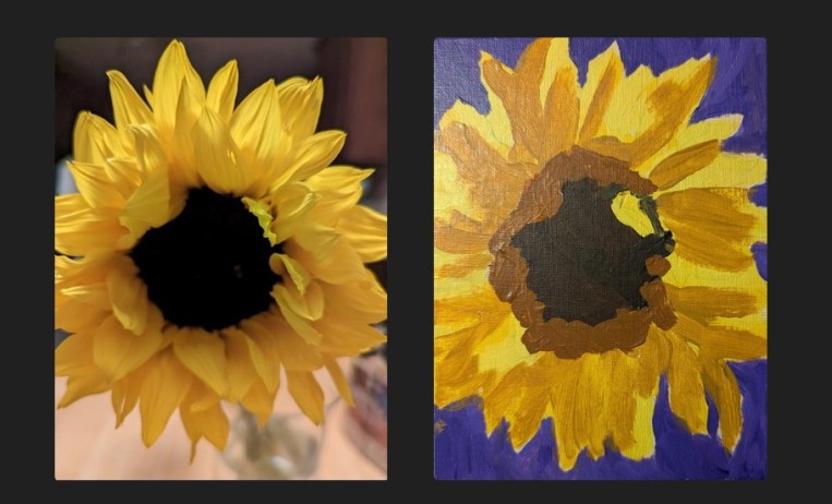
This painting was done on a 6×8 canvas (Blick Premier — I surprisingly liked it) and it’s based off of one of my own photos. The background is Dioxazine Purple (PV23) tinted with Titanium White, as a complementary color to the various tones of yellow (Yellow Ochre, and Cad Medium Yellow mixed with Yellow Ochre).
While I’m not entirely happy with this effort, on the whole, I think it’s one of my better sunflower paintings.
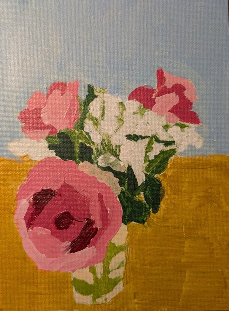
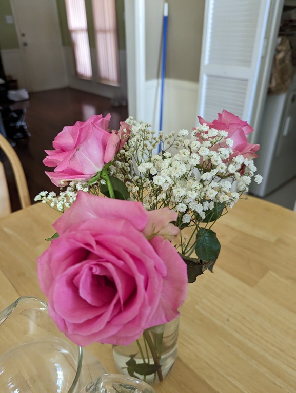
I took this photo back in the summer of 2023 and, as I was browsing through my pics of floral scenes, thought about painting it. Roses are difficult for me — but maybe I need to let go of that negative thought and tell myself roses are fun to paint! (Actually, this bouquet WAS fun to paint knowing I was doing it “solo”, and not copying someone else’s painting or using someone else’s reference photo.)
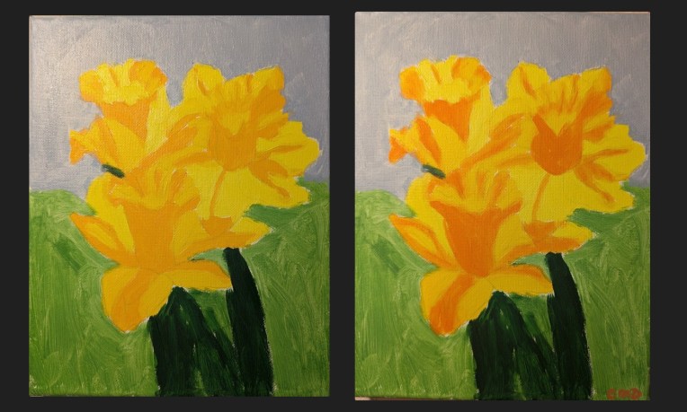
As with my sunflower painting, I decided to update the values on this painting of daffodils, just using Cadmium Orange. The color is exaggerated, yet it makes the flowers stand out. I dry-brushed the orange (no water at all) and used a small brush.
For once, I’m painting from a reference photo of my own! My first attempt was garbage, as you can see below, because my values were completely off relative to the photo on the right. You can barely see that I actually have two shades of yellow for the petals in the painted version.
So, I tried again a few days later, just painting over the old version. And this is the comparison between the old painting and the new. Still not happy with it, but it looks better from a distance, lol!
Just for grins, here’s the comparison between my photo and the new painting.
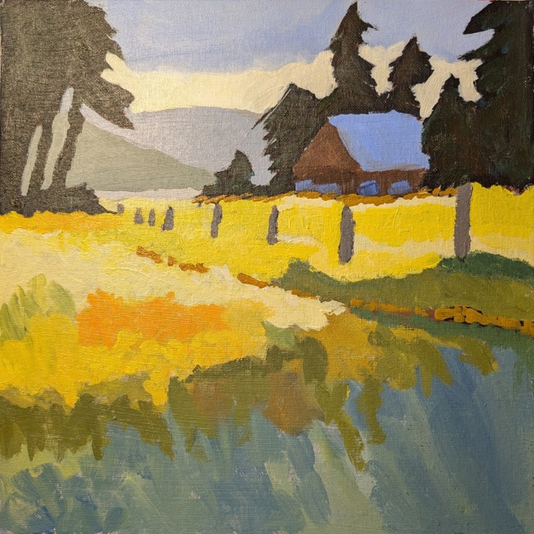
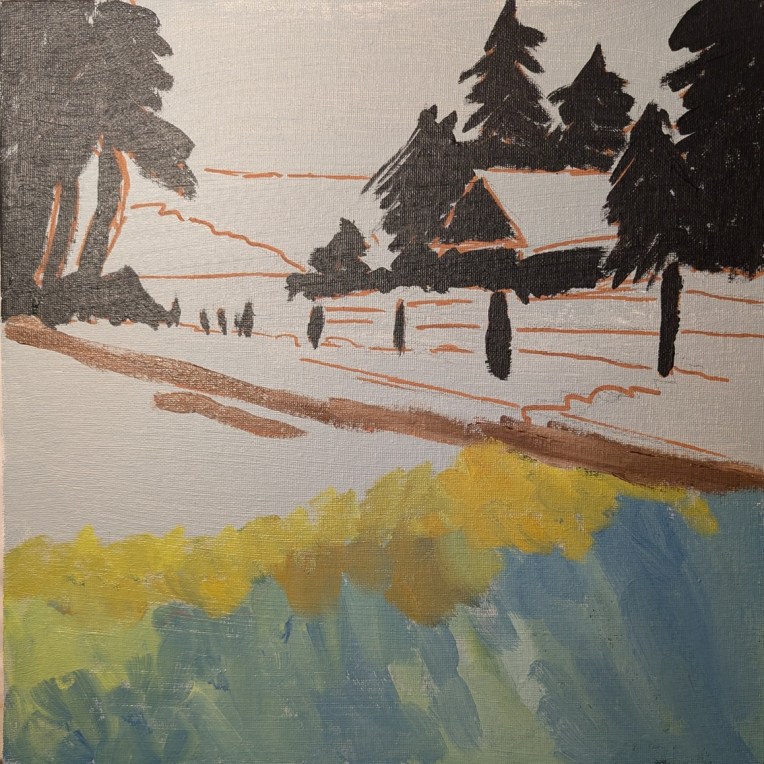
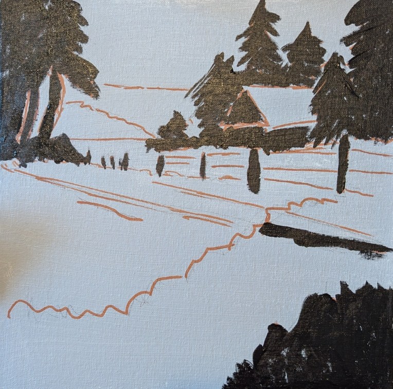
I actually finished this days ago, and then forgot to post to WordPress, so here is the finished work. (This was from the painting Jed Dorsey calls “Golden Fields & Rustic Barns” from his Jed Dorsey’s YouTube channel called “For the Love of Painting”.
12×12 canvas panel, freehand drawing, and doing my best to copy.
Now I’m going to do a few paintings based on my own photographs — “going solo” as it were. No leaning on online teachers!
Well, I finished it. Am reasonably happy but not crazy about it. I found the pink undertone quite distracting; it really threw me off! And while I didn’t intend to paint over all the pink, it appears I did!
Done on a 10×10 canvas panel as a paint-along effort from Acrylic University‘s “Bloom with Jed” video class.
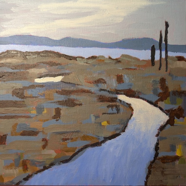
I’m working this on a 12×12 canvas, toned in neutral gray with a freehand drawing based off what I saw on the video. (This site is one in which you do NOT have to have a membership.)