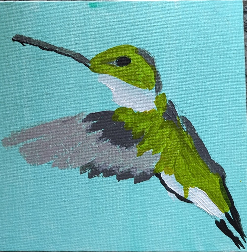
This quick study in green on a 6×6 canvas panel is based off an image by Beto from Pixabay.

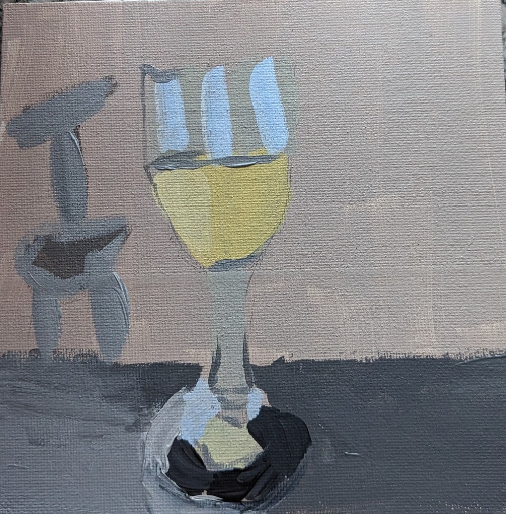
When professional artists and art teachers (in books and online — probably also in real life) say, yes, you’re going to do a lot of bad paintings, and just keep going…. well, this is one of those bad paintings, lol.
What I do like is that I got the yellow-white of the wine pretty good. The shadow, ugh, not so much.
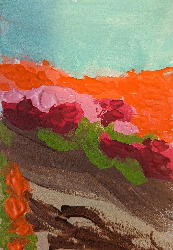
This was another ACEO I did as a quickie, using 2-1/2 x 3-1/2 watercolor paper.

I bought some LUKAS CRYL Pastos Heavy Body Artist Acrylics a while back, so I thought I’d try them out. To my surprise, they weren’t more heavy-body than Liquitex or Golden. The blue and yellow didn’t make a decent green; the red and yellow didn’t make a great orange (I had to add some Liquitex Cad-Free orange).
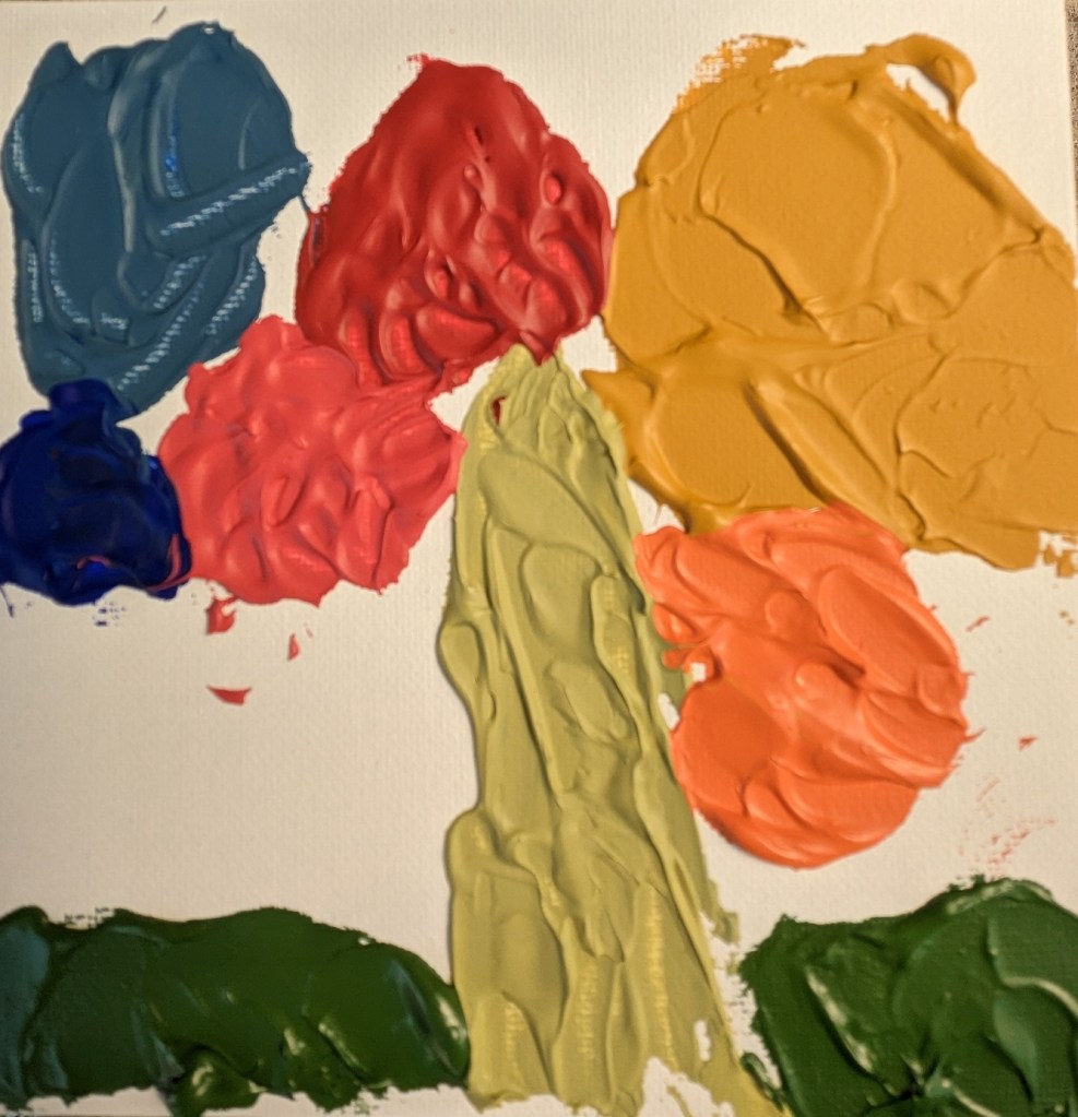
I tried out the different colors — except for black and white — on a 6×6 canvas panel. Further below, I did an abstract of azaleas on 4×6 watercolor paper.
The other online classes I bought included a color mixing class from Will Kemp, a British artist who works with oil and acrylics.
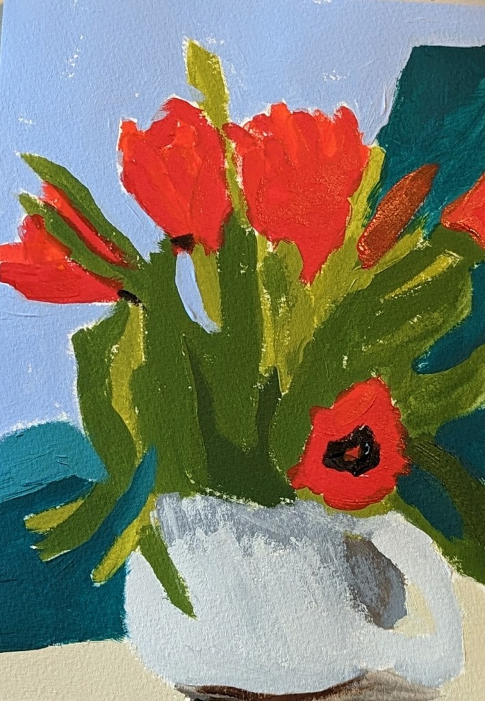
These tulips were done on 7×10 watercolor paper. The finished work is on the right, but appears too blue. The true color of the table and the vase are on the left.

The next-up item in the Marla Baggetta Adventures in Acrylic course was these red poppies. She suggested we use fluorescent orange spray paint for our background; instead, I used my perinone orange paint by Chroma Atelier Interactive, which I find wildly fluorescent!
Using the reference photo, I drew the poppies in pencil over the painted canvas, and then watched her video, closed up my laptop, and did my best from-memory version. At the very end, you use a white gel pen to outline as you see fit; here, I reviewed the image of her final work, and then just winged it.
This was fun!

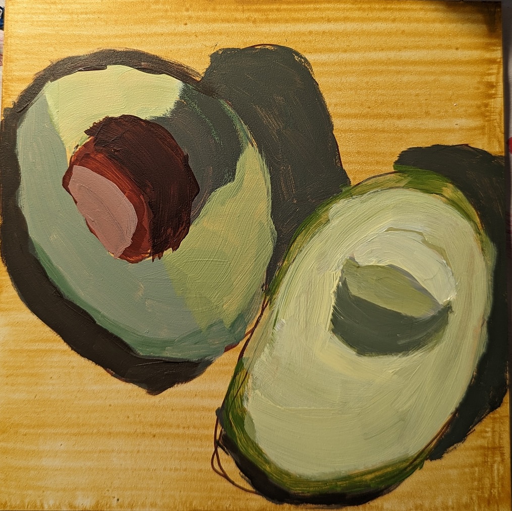
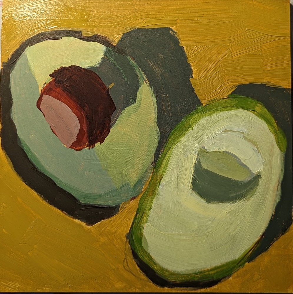
Just for the heck of it, I wanted to compare the values of my avocado painting to the values of the reference photo. As you can see, I did NOT get them right!
But the cool thing is that, with acrylics, you can paint over your mistakes, so that is on my to-do list. I will be tweaking the values of my painting, mostly making certain areas lighter, in particular the avocado slice on the right, and then the skin of the avocado on the left (with the pit) and lightening the shadow the pit is creating on the avocado meat.
And I need to blend/smooth out some of the value changes.
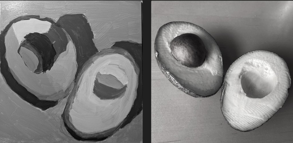
Next-up in Marla Baggetta’s Adventures in Acrylic was painting an avocado. This was on a 6×6 Ampersand gessoboard. I watched her video then shut down my laptop, and just worked off the reference photo. Here are some in-progress photos.
I used a yellow ochre glaze, and then drew out the shapes with my Liquitex burnt umber paint marker. There are excessive striations with the yellow ochre because I was using the liquid/soft body version and then mixing it with water. (That’s a mistake!) The watering-down really only makes sense (to me) when using full-body paint.

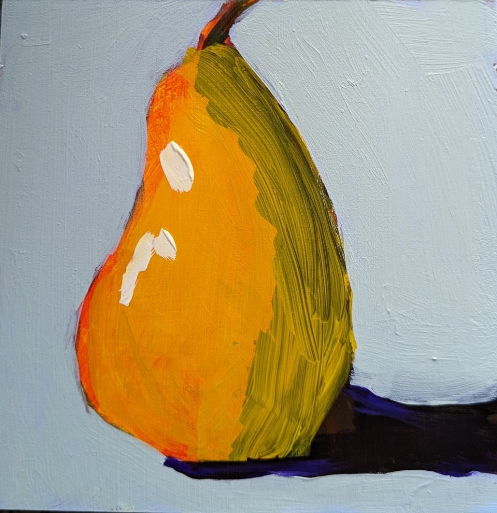
This is the last pear I did — I’m sick of pears for the moment! — and this was done on slippy-slidey gessoboard. (I’m almost done with my stash of that stuff and am in no hurry to buy more.) In this one, I did the final yellow glaze only on the pear itself, and before I added the highlight.
Funny thing, after all this pear painting, I was at the grocery store today, and for the first time I really noticed all the pears in the produce section; each type has its own shape. I think of this shape as somewhat close to a “classic” pear, but that’s really the Bosc pear. Some are short and squat more like gourds or squash.