I have completed the Winter Cabin landscape.


I have completed the Winter Cabin landscape.
As I indicated in an earlier post, I’m working on “Winter Cabin” in a follow-along from a PaintCoach post on Patreon.

I’m working on another lesson from PaintCoach’s Patreon pages. This one is called “Winter Cabin”. I’m using an 8×10 canvas, which I toned with Windsor & Newton Galeria’s Pale Umber. I sketched out the basic shapes with a Liquitex acrylic paint pen in Burnt Umber.

Driving home last night, I was struck by how yellow the sky was, in contrast to the dark trees. So I decided to paint what I remember seeing. (Didn’t bother with taking a photo with my phone, even though I was the passenger.)
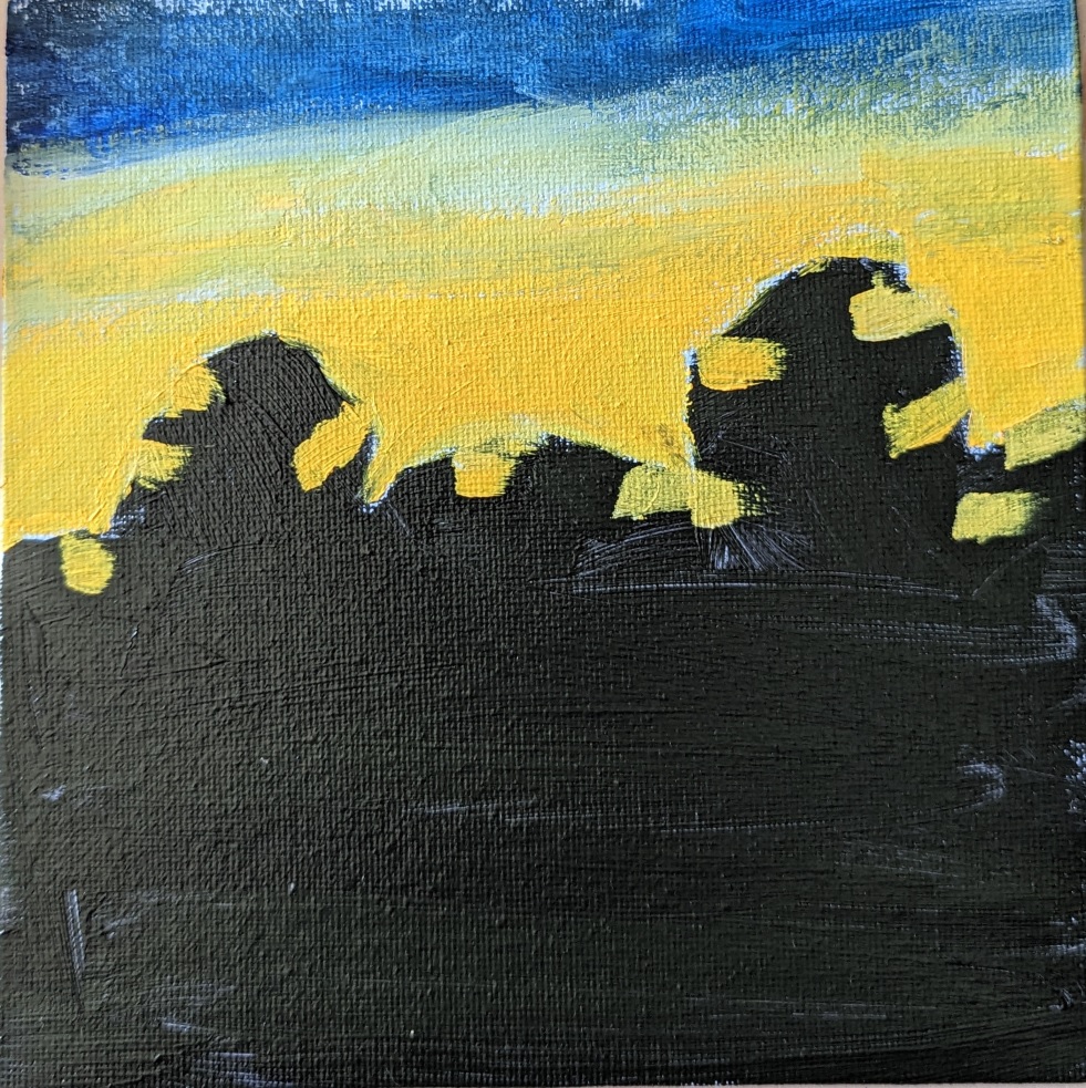
For better or worse, I’ve finished it!
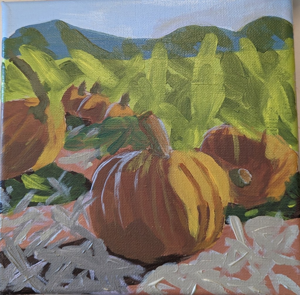
After I completed today’s work, I realized that the center pumpkins were all in a line, and I decided I didn’t like that. Bad composition. (See left image.) So I removed one of the pumpkins, and I think it looks a bit more natural.
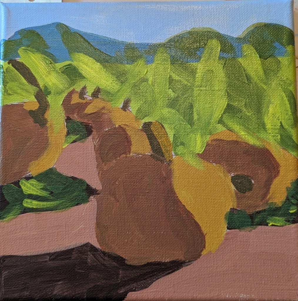
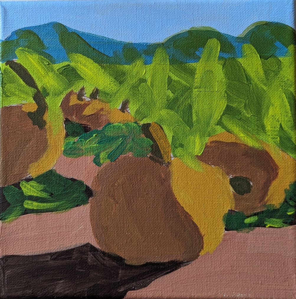
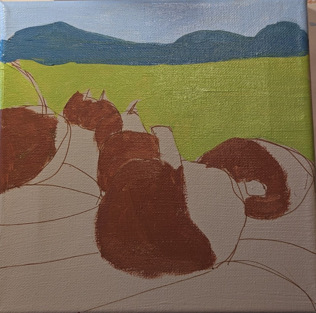
It’s finally starting to feel like fall here after a long, hot summer. So, I’m in the mood for fall-themed paintings. This one is from a lesson for patrons of PaintCoach. The idea is to map out the large shapes first, and get the values set before filling in the detail.
I’m doing this on an 8×8 canvas, which I painted with Winsor & Newton Galeria in Pale Umber, drawing out the lines with an acrylic paint pen. (Some of the lines are “wrong”, but I’ll be painting over them anyway.)

I did these paintings based on a lesson from PaintCoach on Patreon. The first one I did, I barely looked at the photo, and instead was following along with the video. The scene ended up being excessively abstract (top right). The second effort is marginally better, but I’m still not satisfied.


Some time back I had painted this 6×6 canvas panel with cerulean blue, so today I used that for my sunflower. The petals are layered with cadmium-free orange as the base (although it looks like yellow ochre now that it’s painted on the blue). Then I mixed azo yellow with some yellow ochre. Finally, the top layer is cadmium-free yellow. The center is burnt umber light, with some yellow ochre, and then purple and yellow denoting the seeds.

