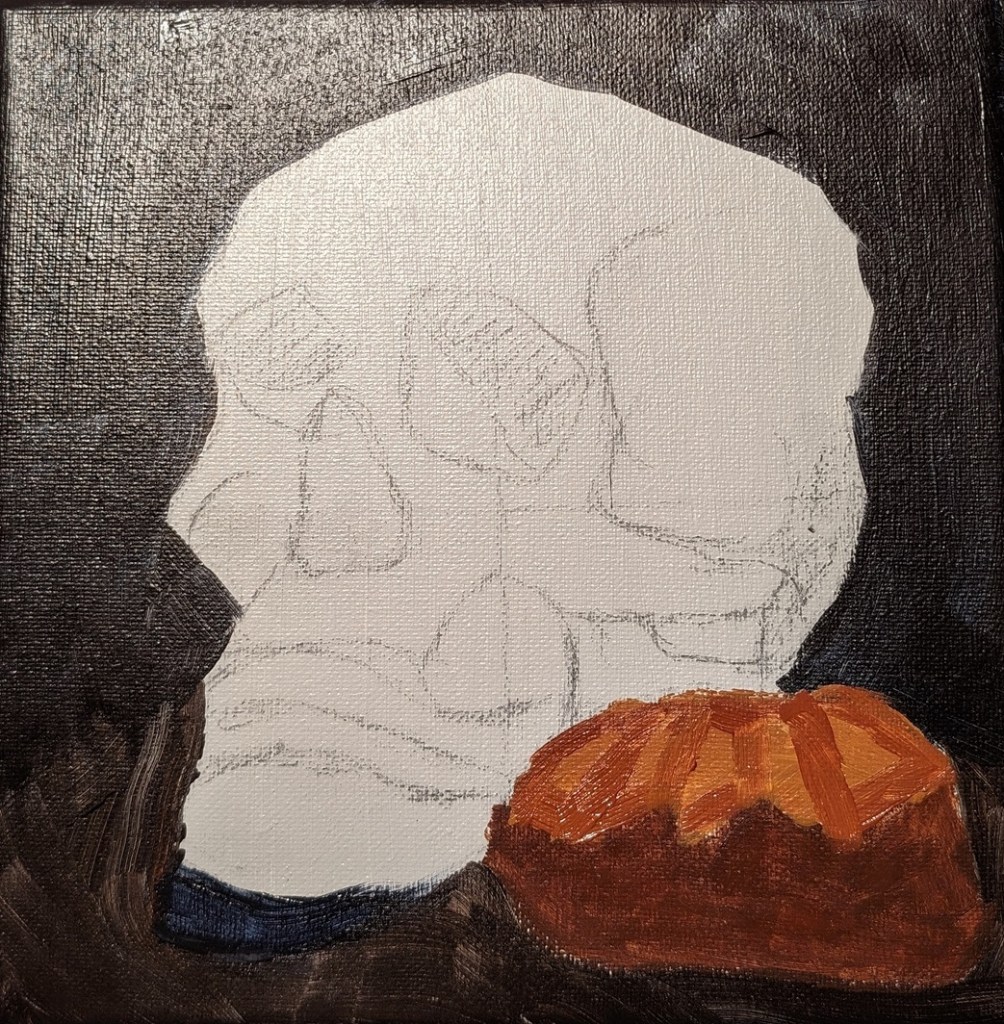
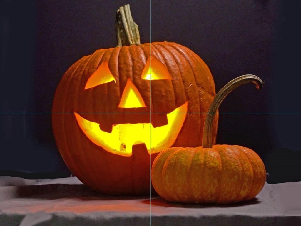
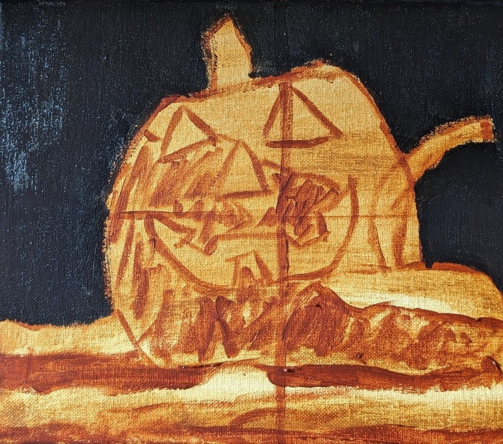
Testing New Paint Colors

The other day I bought some new acrylic paints from brands I haven’t used before. I needed some more yellow azo medium, so I tried Matisse Flow. I am perfectly happy with the color and the paint itself, but a negative for me is this brand has a foil covering once you take off the cap. I couldn’t pull it off by hand; had to use a knife — and found the whole thing unnecessary.

I got Green Earth and Payne’s Gray made by Old Holland. I like both colors — in particular the Payne’s Gray which would be great for a night sky. It surprised me that the Green Earth was so transparent. It would be good in a floral still life or a landscape.

The Cerulean Blue is made by Charvin. I think it’s a single pigment color. And I love the color!

Quick Study: December Evening Sky

For this study, I used another of my own photos — this one taken one evening in early December of 2021 from my backyard. The Moon was actually a crescent at the time, but I had a cheap smartphone at the time with a lousy camera, so it looks full, and I carried on with that in my painting. Jupiter is shining above the Moon, and Venus is near the silhouette of the chimney.

This was done on a 4×6 piece of 300 lb. cold-pressed watercolor paper. The house silhouette is blue-black, and the sky was painted in tints of dioxazine purple. The Moon, Jupiter and Venus are painted in a yellow-white mix.

Quick Study: November Morning Sky

This painting was done in acrylic on a 4×6 piece of 300 lb. cold-pressed watercolor paper. It’s based off of a photo I took of the waning crescent Moon one morning back in November 2021.

I felt the original image of the sky was too gray and blue, so I changed it up at bit. The sky was painted with Liquitex BASICS blue gray; the pink is Cadmium Red Medium Hue from Golden, and the Moon is Titanium White mixed with Hansa Yellow Light (PY 73).

Skies over home

This 4×6 painting in acrylic on 300 lb. cold-pressed watercolor paper is based off a photo I took in Dec 2021 near sunset.

Colors used for the tree and roof silhouette: Chromium Oxide Green, Alizarin Crimson, and a touch of Cerulean Blue

Colors used for the sky: Cerulean Blue, Phthalo Blue, Cad-free Orange, Cad-free Yellow, Titanium White, Blue Gray

Quick Study: Sea & Sky

This painting was a quickie, from imagination, after having browsed through images — photos and paintings — of the sea and sky.

My primary focus was the clouds.

This is 4×6 done on 300 lb. cold-pressed watercolor paper, so I could wet my acrylics a bit.

Black Labrador

This is my first animal “portrait”, based on an image by Nikki Luijpers from Pixabay.

I love black Labs! Never had one, but a roomie from 40 years ago had a black Lab named Emma, and I just loved that dog! BEST DOG EVER.

This quick study was done on 6×8 gessoboard, which I gessoed again to get rid of the smooth surface, and then painted over with Neutral Gray 5.

Sunflower #2: Complete

Here’s the finished sunflower.

I used Yellow Ochre for the shaded parts of the petals, and Liquitex Soft Body Yellow Azo Med (PY 74) for the brighter parts of the petals. The yellow is fairly transparent, so I deliberately wanted to leave brush marks to give some additional definition to the petals.

I may come back around and paint over the greenish areas where I overpainted the yellow on to the background. Then again, maybe not, as from afar it looks a bit like shadow. We’ll see.

Based on an image by Couleur from Pixabay