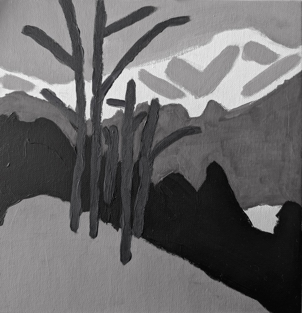
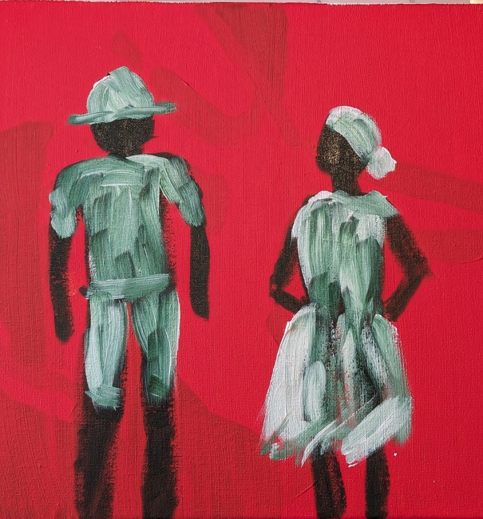
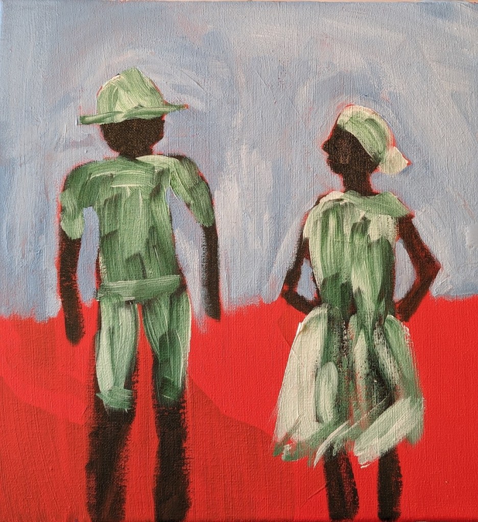
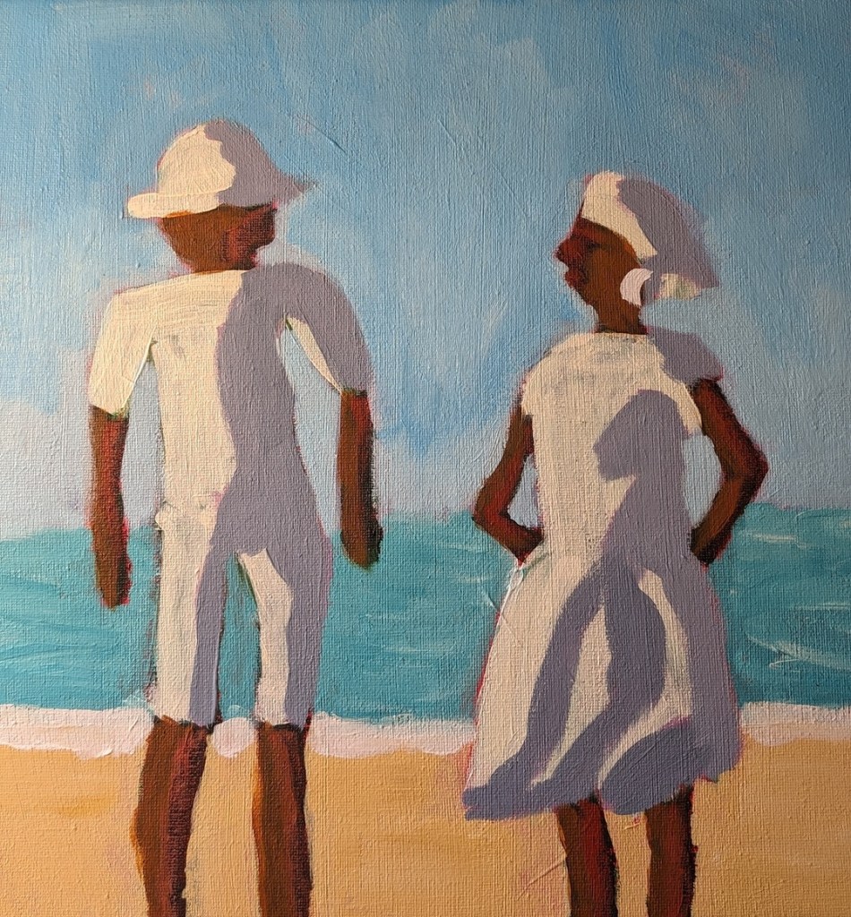
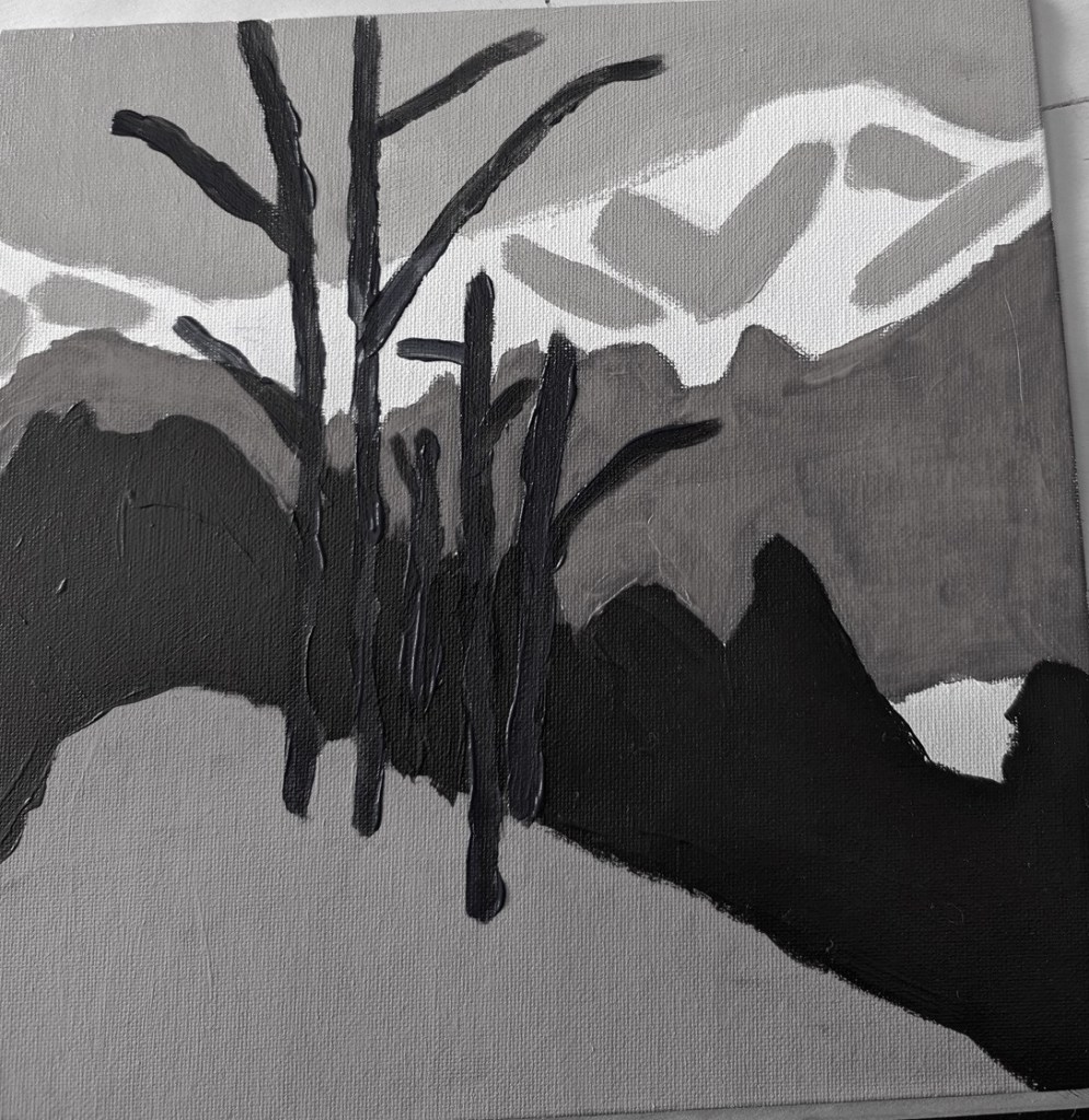
This is an exercise from one of the foundational courses (Acrylics 101) at Acrylic University wherein you do a value map of your painting using black, white and gray, and then applying color on top of the different value areas, using care to make sure your values — post-color — remain. It’s a more detailed version of the quickie free course I mentioned here.
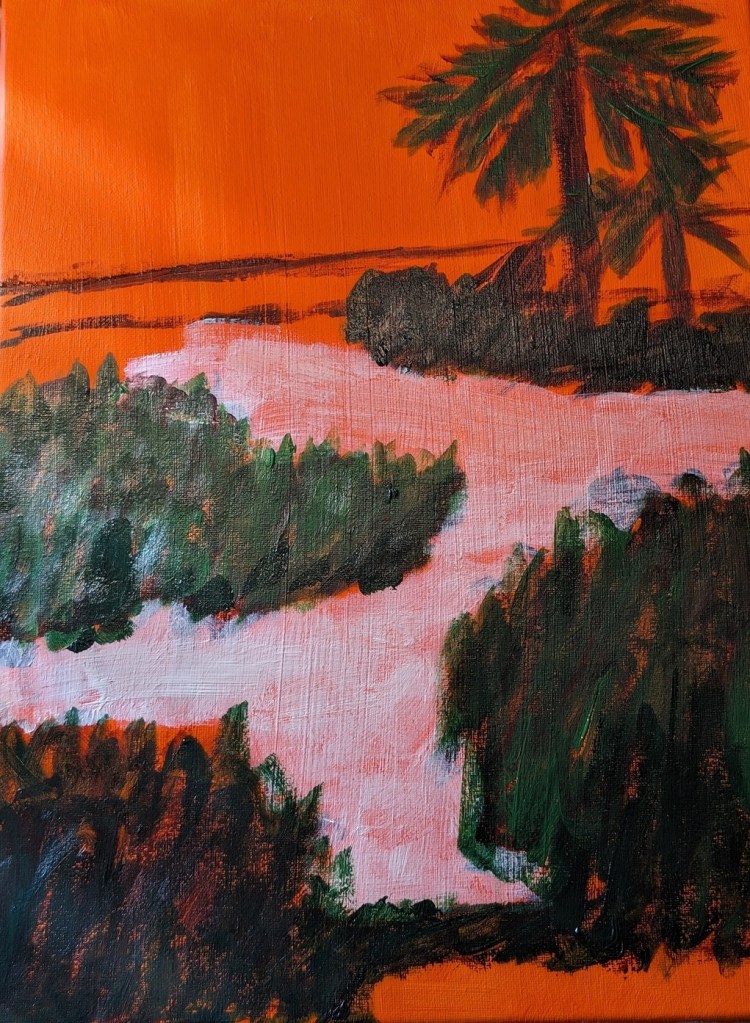
Here’s my original painting done in grayscale, done as part of the Acrylics 101 online class, using their reference photo.

I did a value check on my primary colors and mixed secondaries.


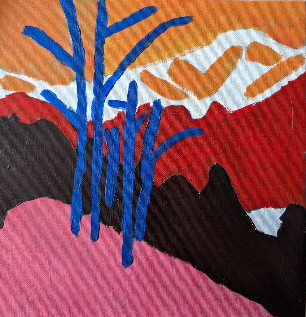
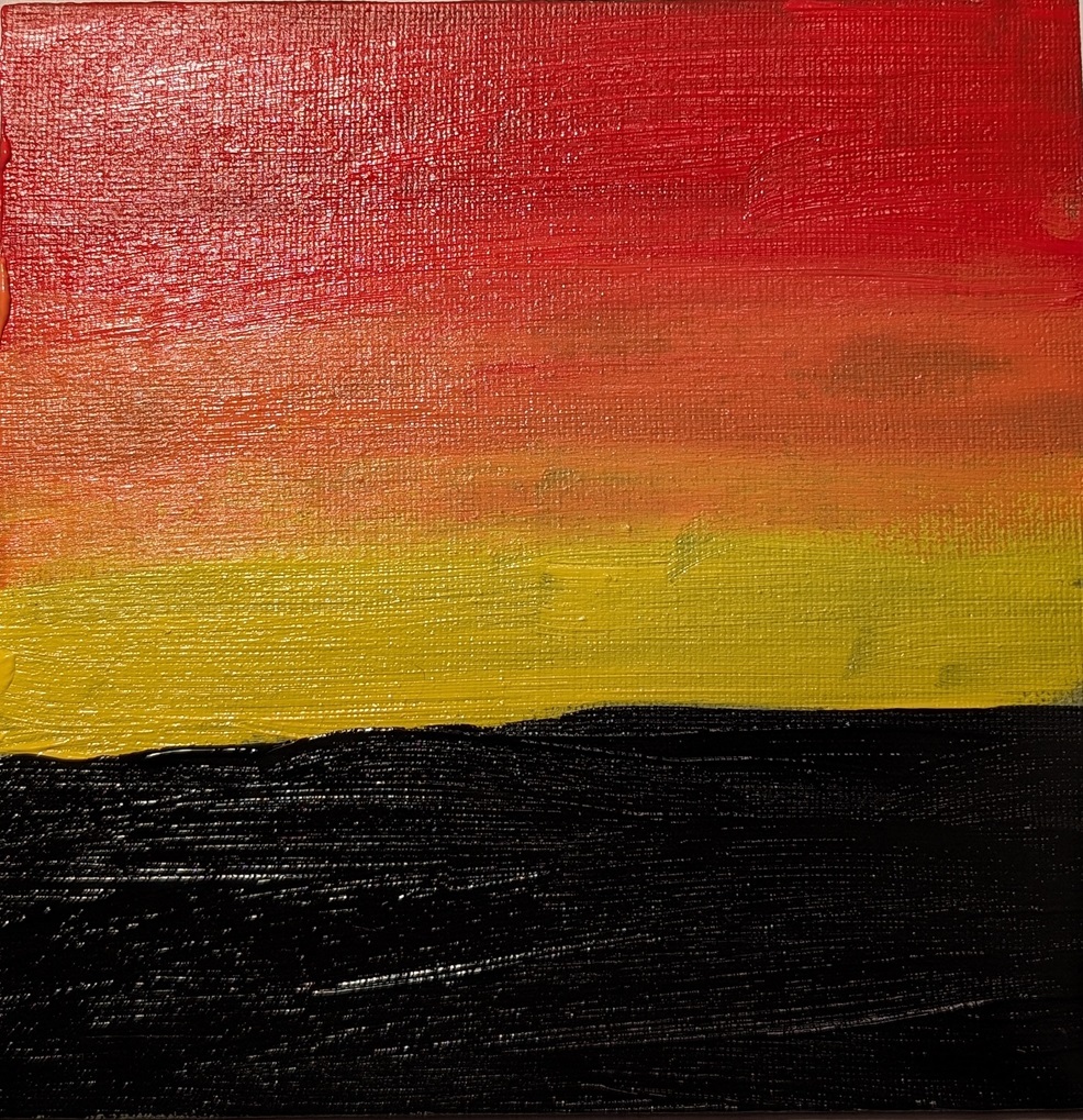
The next task was to choose colors that aligned to the value map/painting I already did. This was my first effort. The abstract trees were a bit too dark, compared to my original (above), pretty much the same as the (abstract) forest.
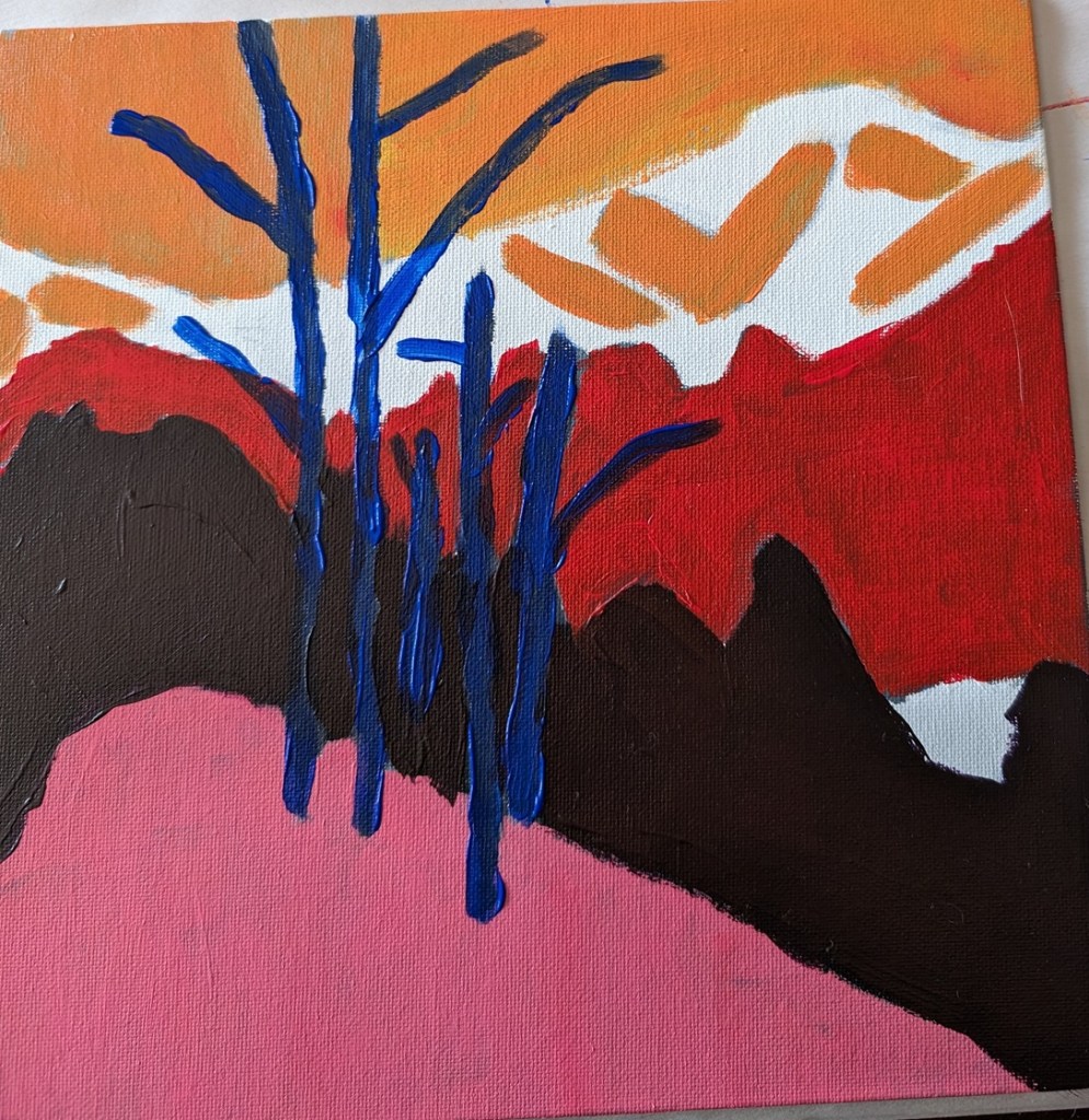
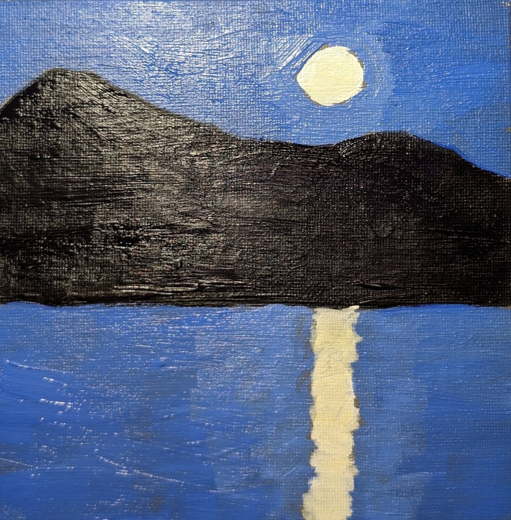
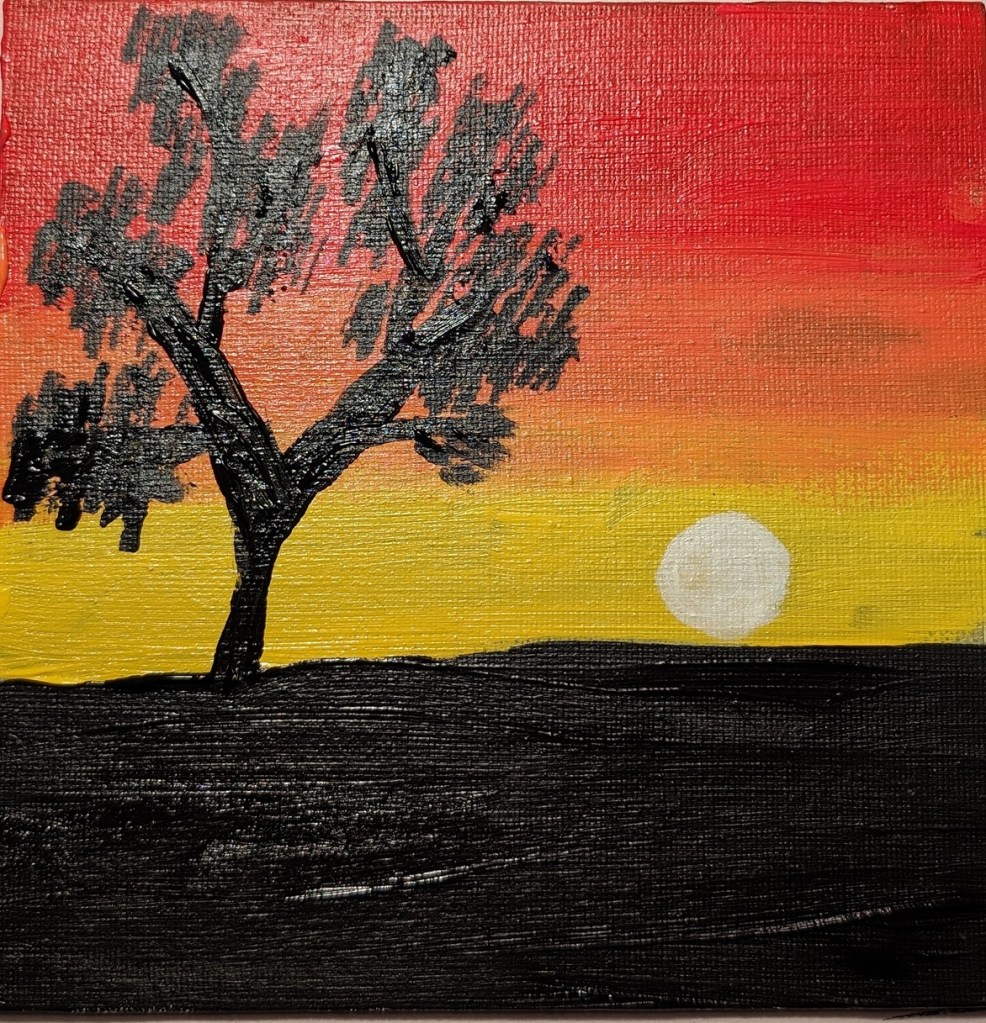
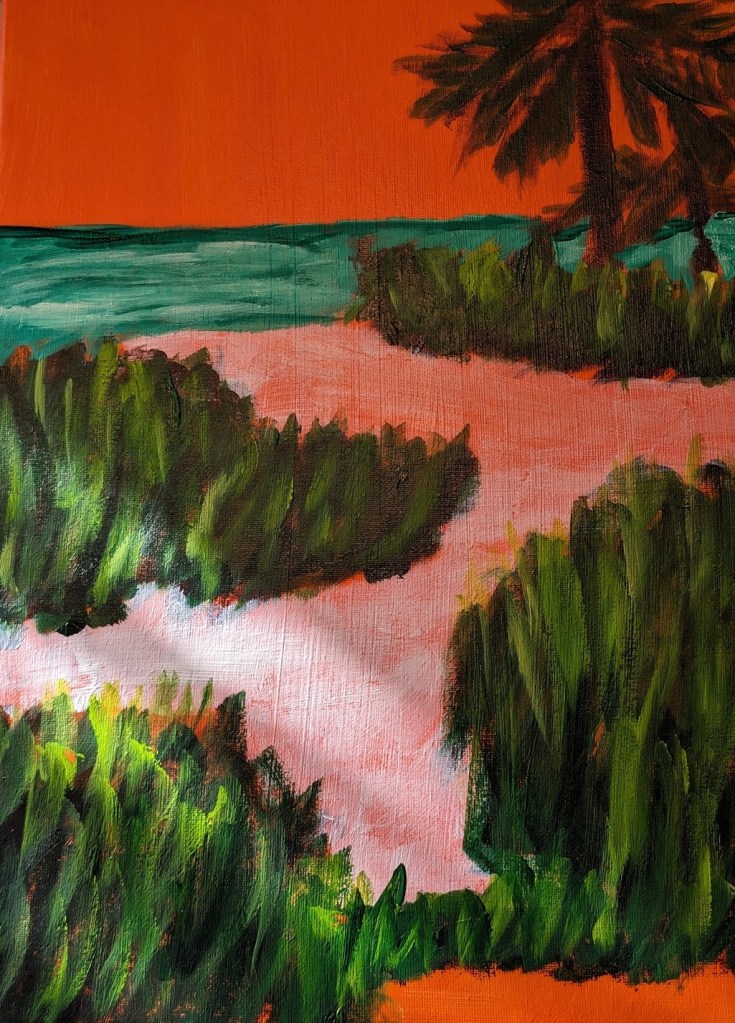
This was my next attempt, which I think is better. Also I turned on the grid function on my Pixel camera; it makes a real difference!