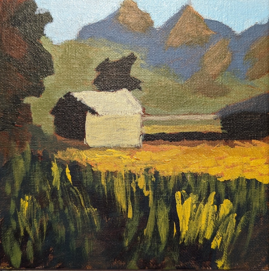
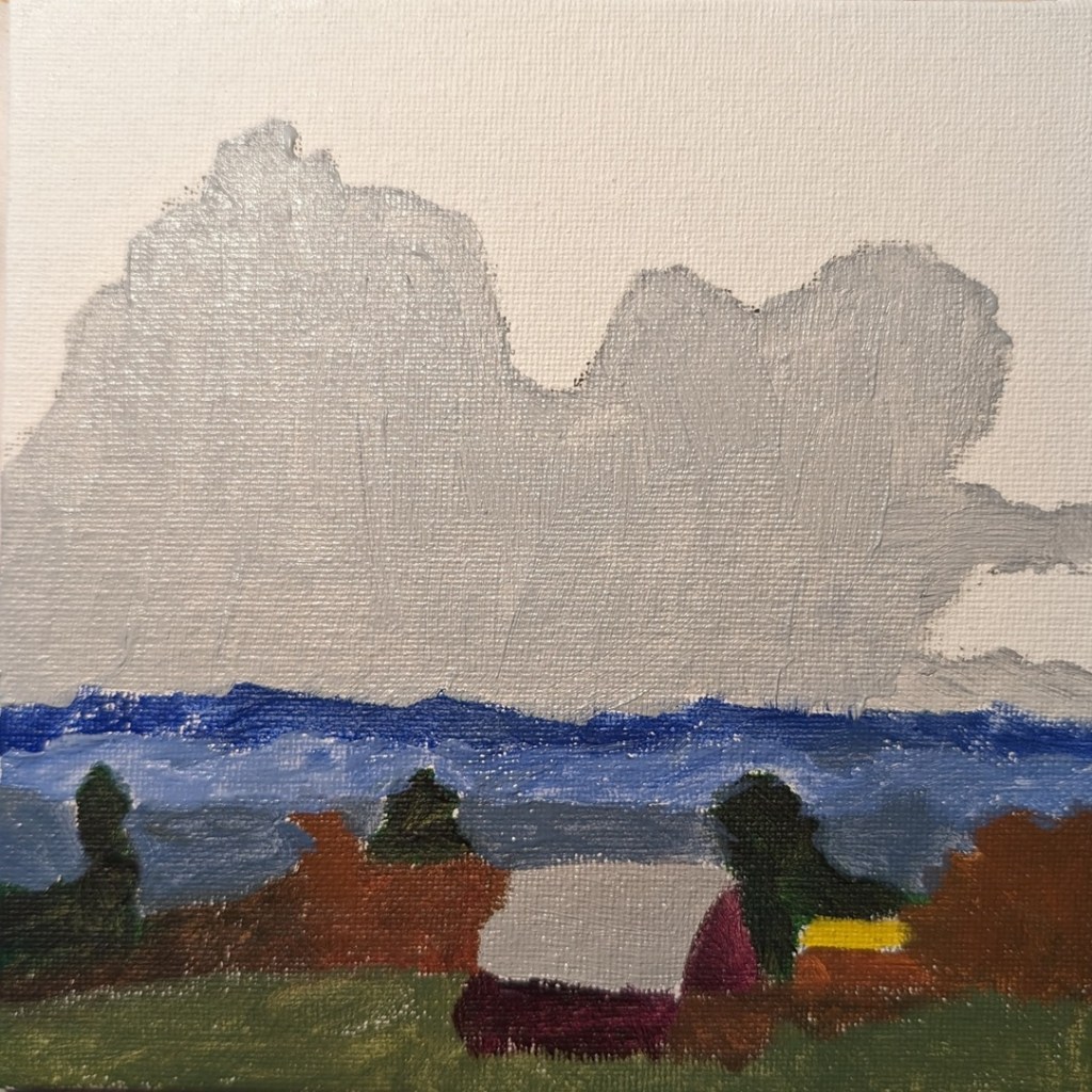
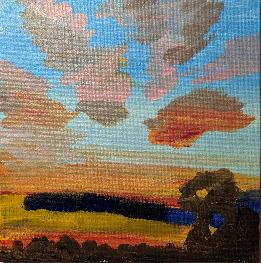
Master Copy: Jane Slivka & Painting a Tropical Landscape (In Progress)

After doing the human figures in the paint-along by the Florida artist named Jane Slivka, I bought two of her video classes, one of which was this Tropical Landscape. 

I used Transparent Orange (PO 73) by Chroma Atelier as a background, then Sap Green mixed with Carmine (Amsterdam Acrylic) for blocking out the greenery. For the grasses, I used the Amsterdam’s Sap Green and Yellow Green, as well as Winsor Galeria’s Sap Green (much lighter than Amsterdam’s Sap Green). The sky is Light Blue Permanent by Liquitex Basic; the ocean is Phthalo Green mixed with Titanium White.

The sand has been blocked out with transparent Zinc White. I still need to paint the sand and its shadow colors, and add some color (sunlight and shadows) to the bark of the palm trees.

Master Copy: Jane Slivka & Painting the Human Form

Yesterday I was on YouTube watching some Acrylic University videos, and in the recommendations, I saw a clip from a Florida artist named Jane Slivka on painting the human form in acrylics. So, I checked it out. I liked the demo so much I ended up buying two of her video classes which I was able to download — so I’ll be doing those shortly.

But today I decided to use repurpose an old 12×12 canvas, and paint along with the video I watched last night. It was fun!

So, Slivka started out with an orangey underpainting, and then painted the forms in either Sap Green (which I used) or Hooker’s Green. For my background, I used Pyrrole Red (PR 254) mixed with Cadmium Yellow Hue (Liquitex Basics). (The blotchy look in the background is from my original unfinished painting.)

Then, while the figures were not yet dry, I followed along, painting their clothing in Titanium White, as Slivka did.

Painting the sky came next. I used Cerulean Blue (Utrecht Fluid brand) with some Titanium White.

Next was the ocean and the sand. Slivka uses some aqua green and Naples Yellow, respectively. I used Liquitex Basics Turquoise Green and created a kind of “Naples Yellow” by mixing Yellow Ochre with Titanium White. The sun-bright clothing was Titanium White softened with Cadmium Yellow Light Hue.

Slivka used Raw Sienna and Cadmium Red for the skin; I used Raw Sienna and Red Oxide. For the clothing shadows, Slivka used a violet with white. I used Liquitex Basics Gray Blue with some white.

I repainted the sky from Cerulean to Light Blue Permanent (Liquitex brand) mixed with additional Titanium White. I may repaint the ocean, and get the horizon line straighter; regardless, this exercise was just a lot of fun!

Snowman!

This snowman (painted on an 8×8 canvas) was inspired in part by snowmen done in pastel by Karen Margulis. It’s been warmer than normal here for December, but we might actually have a freeze tomorrow. No sign of snow, though. (Sigh.) So I thought painting a snowman would put me in a winter mood.

I’m not sure if you can tell, but the (viewer’s) right side of the snowman is a gray-white, while the (viewer’s) left side of the snowman is a sky blue-white mix.

The other colors are Pyrrole Red (straight from the tube), Yellow Ochre (mixed with the red for the carrot stick nose), Sap Green and Mars Black (straight from the tube) and the lavender background is a dash of Dioxazine Purple with Titanium White.

Online Class “Terrific Trees” : Pine tree

Over Black Friday, I bought access to a handful of online classes at Kara Bullock Art. One was the “Terrific Trees” class by Kim VanDerHoek.

I ‘m working on painting pine trees, so I can make some Christmas cards on a Christmas tree theme. The tree on the left was painted on a 6×6 canvas panel, and is based on Kim’s class (a follow-along).

The tree on the right was painted on a 8×8 black stretched canvas. The shadow of the tree is unpainted; I’m just using the black of the canvas.

More Portrait Practice in Acrylics.. After Hashim Akib

As with the work done in this earlier post, I did another follow-along/demo portrait from Hashim Akib’s book Painting Portraits in Acrylic. I bought some student-grade acrylics (Amsterdam brand) since this is merely practice. The background was toned in a Quinacridone Rose (PV 19) as directed, but I drew out the figure using willow charcoal. As for the skin colors, again I followed along mostly: the primary skin colors are burnt sienna, orange (PO 73) and yellow ochre (PY 42).

I painted the folds on the scarf using a palette knife; I did not go back and add touches of a pinkish yellow white representing sparkles reflecting the light on the scarf. Maybe later.

Her lips should be pinker and darker; the top of the scarf away from her head should be darker and bluer.

Portrait Practice — Painting the Asaro (Variant) Head

My last few works — a portrait and a “portrait” of the Asaro head — have been in the cartoon realm, so I’m skipping posting those for now!

Instead, I found a video on YouTube that walks you through drawing the “Loomis Head” and converting it (for lack of a better term) to a planar head (what the artist calls the “memorized Asaro head”). After watching that, I drew the planar head on my 8×10 canvas with willow charcoal.

What I discovered in my failed attempt at painting the Asaro head is that the color Ivory Black is fairly transparent, and doesn’t cover well. I ended up going to Michael’s and bought some Mars Black from Liquitex Basics. It’s student grade compared to the artist grade Ivory Black, but wow, what a difference!

Anyway, here’s the Asaro head done; sage green for the background.

Below is a copy of the reference photo I used to paint, as well as a close-up of my value changes. In some cases like the upper lip, the value change is too abrupt, while in other cases there’s not enough of a value change. I’ll have to keep practicing.