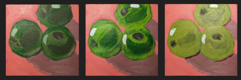
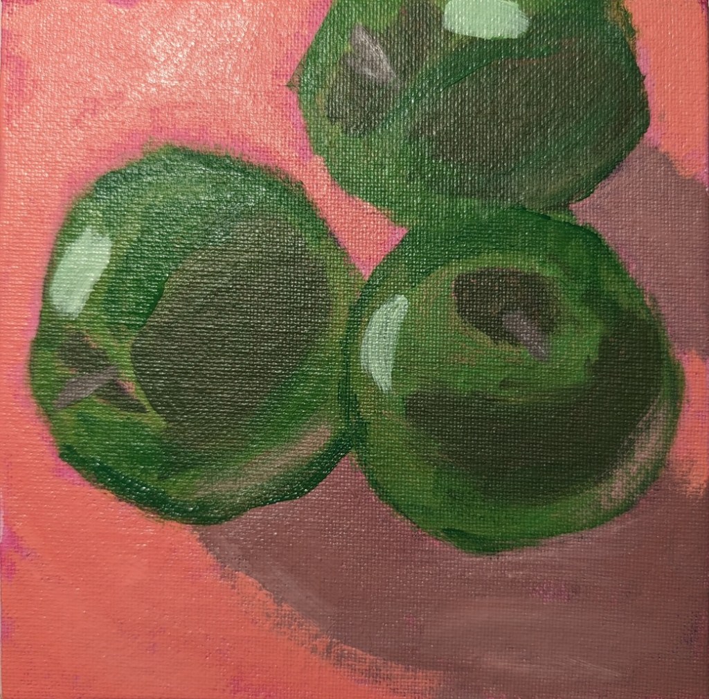
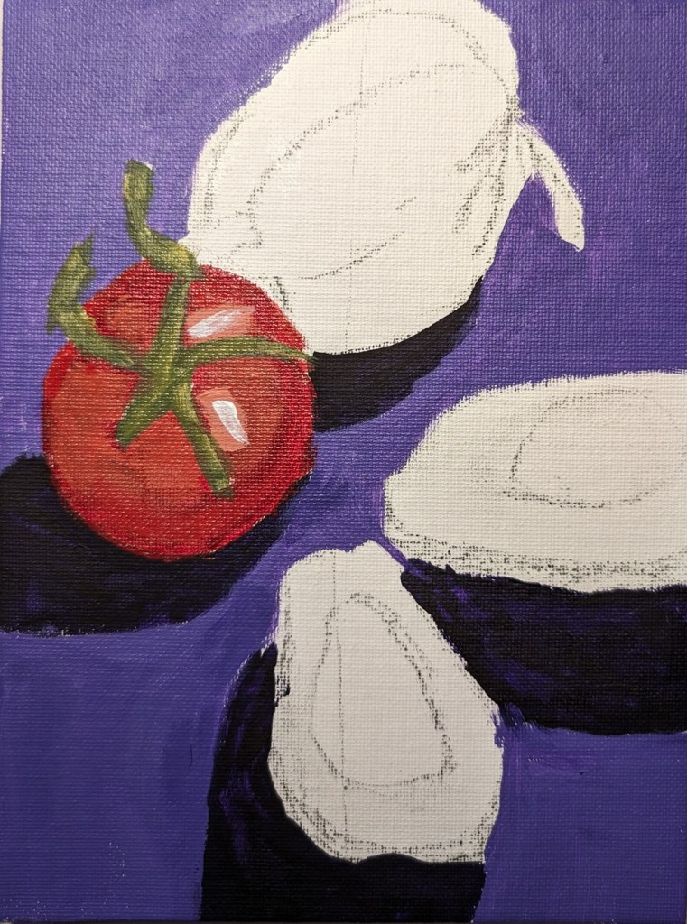
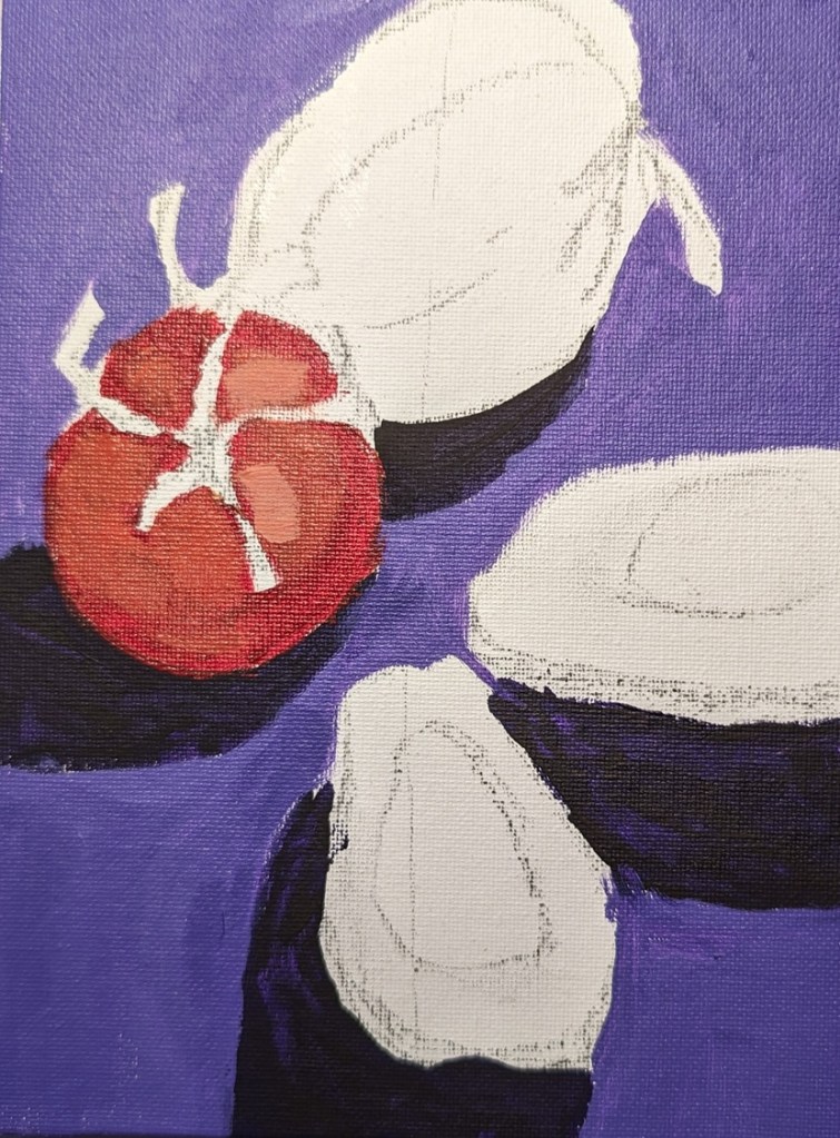
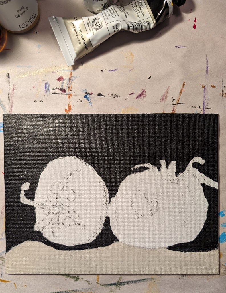
So, after making my apples too green (and dark) with mostly Winsor & Newton Sap Green (and some yellow, believe it or not, I tried a “convenience” color (Yellow Green from Amsterdam). That got me closer, but at that point, I was over-painting the original dark green apples. The third try, I got closer to the color I wanted, but I ceased paying attention to the darker shapes in the reference image (including the shadows).
The only thing I’m relatively satisfied with right now is the dark area around the apple stems. AND that I finally got reasonably close to the local color of the apples.
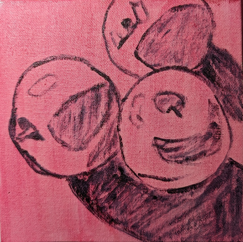
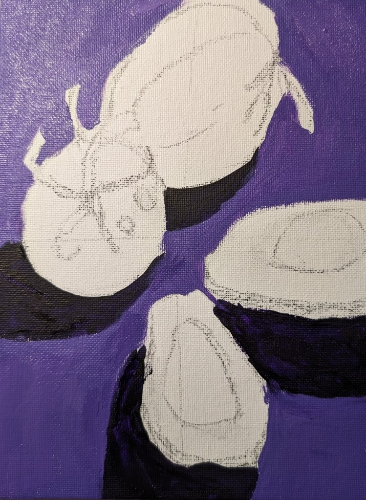
I need to paint this again from scratch, but frankly, I’m temporarily sick of apples! 🙂
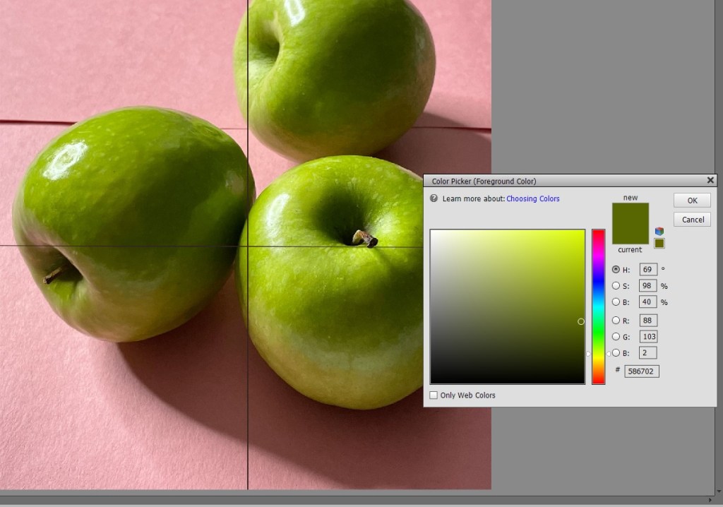
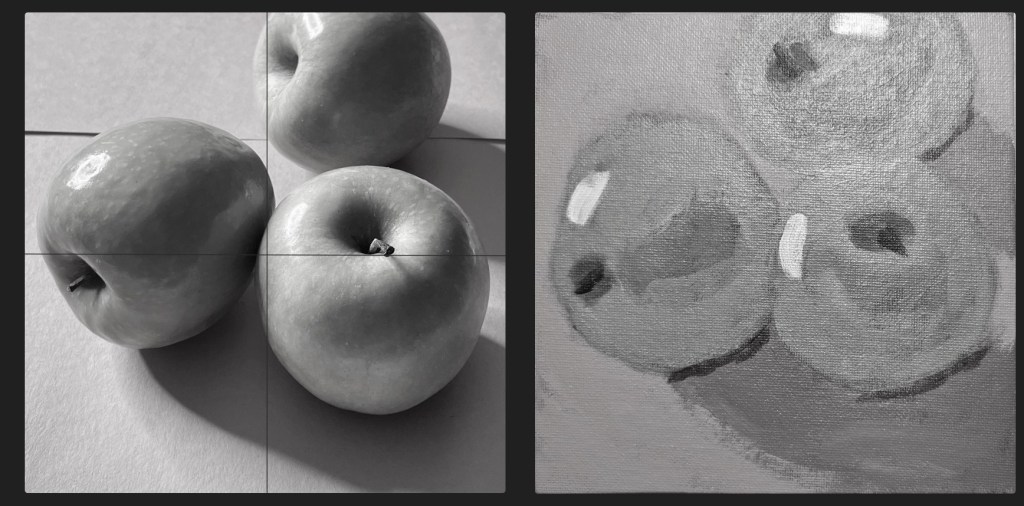
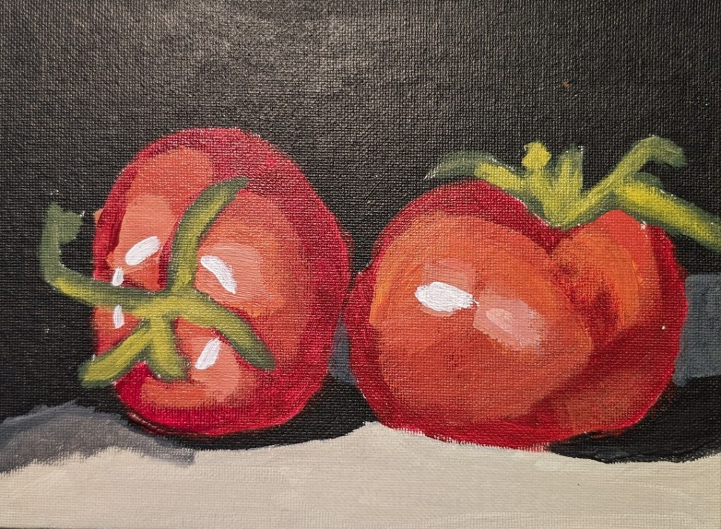
Here are the value comparisons between the reference photo and the original painted green apples, and the reference compared to the final painting.
Originally, my lights were too dark, while some darks (the cast shadows) weren’t dark enough. Now my lights are okay but the darks aren’t dark enough. And the apple at the left is misshapen.