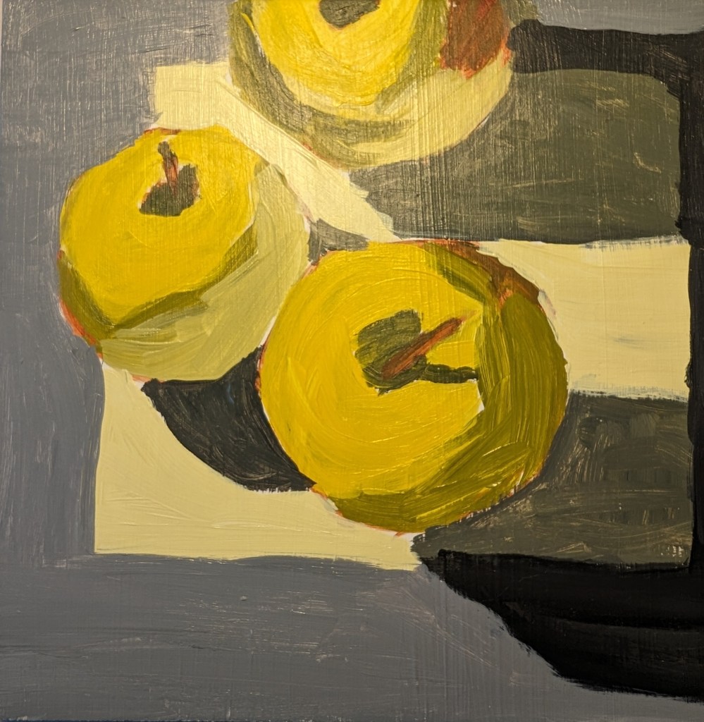
These trees are based off an image by Inna Sherman from Pixabay. I stuck with the primary palette (cad-free yellow medium, pyrrole red and ultramarine blue), black and white, but I also used a bit of yellow ochre, mainly for the grasses. I worked it on a 6×8 canvas panel.
Acrylics
52 Mini Paintings Challenge: Week #3
This was week 3 for Jed Dorsey’s Mini Painting Challenge at Acrylic University. It’s based on a picture he took of a hazy morning with the grass full of dew, in an area near his home. It reminds me a lot of the English cottage landscape I did at Paint Coach Patreon.
This was done on a 6×6 canvas panel. I used the 3 primaries, plus black and white.
(Acrylic University) Acrylics 101: Mini Practice Paintings #3
This was the third of the 3 mini practice paintings where we the students copy some of Jed’s paintings. In the next round, we copy bigger paintings which are more challenging. Then we move on to more detailed studies of subjects like color mixing, perspective, design/composition, etc. (All with practice paintings of course!)
I had bought some black 8×8 canvases during the holiday season so I used one of those rather than tone a white canvas with Mars Black. Same difference — I just don’t like the black canvas. It skews my sense of color. Ugh. I just want to paint all over it to cover it up!
(Acrylic University) Acrylics 101: Mini Practice Paintings #2
This is the second of 3 miniature paintings from the Acrylics 101 course at Acrylics University. (See also this post.) I used a medium neutral gray as the toning color, and a red soft pastel to draw out the design.
(Acrylic University) Acrylics 101: Mini Practice Paintings #1
So I’m going through the Foundations classes in the library of Acrylic University — basically the reason I paid for a year’s subscription. In Acrylics 101 we cover the basic tools (brushes, easels, types of acrylic paint), the importance of thumbnail sketches, values, color (opaque vs. transparent, color mixing, etc.) and then finally we do some practice paintings. Three are minis (6×6) and three are larger sized (up to 16×20).
Jed Dorsey, our instructor, says that he has found that beginners do better — and gain confidence more quickly — when they attempt to copy a painting rather than work with a reference photo (or plein air) primarily, I assume, because the artistic decisions have already been made. He demos painting a copy of his own painting, explaining why he did what he did.
So, with that lead-in, here’s my painting of his painting. I used Diarylide Yellow as my toning color, and painted on 6×6 canvas paper using only a #8 flat brush.
(Acrylic University) Primary Palette 101: Exercise, Part 2
These paintings are from Part 2 of an color-study exercise I’m doing on the Acrylic University site. The class is taught by Jed Dorsey; it is his reference photo and his follow-along painting vids I am using for my own studies below.
Part 2 features different versions of the primary hues; I am using Liquitex Cad-Free Yellow Light (cool), Ultramarine Blue (warm), and Anthraquinone Red (cool).
(Acrylic University) Primary Palette 101: Exercise
These paintings are from Part 1 of an color-study exercise I’m doing on the Acrylic University site. The class is taught by Jed Dorsey; it is his reference photo and his follow-along painting vids I am using for my own studies below.
Part 1 focuses on a warm yellow (I used Liquitex Cad-Free Yellow Medium), a cool blue (Phthalo) and a warm red (I used Pyrrole Red).
Part 2 will feature different versions of the primary hues; I’ll be using Liquitex Cad-Free Yellow Light (cool), Ultramarine Blue (warm), and Anthraquinone Red (cool).
Color Mixing Practice
I did this exercise based on Colors 101 at Acrylic University.
The top one was created with Ultramarine Blue (PB29), Anthraquinone Red (PR177) and Cad-Free Yellow Medium (as well as Titanium White).
The bottom one was created with Anthraquinone Blue (PB60), Pyrrole Red (PR254) and Azo Yellow Medium (PY74).

Cottonwood Tree
For this I used my own photo of the neighbor’s cottonwood tree as I view it from my backyard. I was struck by how white the tips of the branches were in the early morning sun.
At first I used Liquitex Light Blue Permanent (which is a 3-pigment mix, including Phthalo Green). At first it seemed a decent match for the sky — the lower half of the panel includes more Titanium White – but once dry it seemed too green.
I drew out the tree using willow charcoal, and then painted it using Raw Umber (Golden Acrylics) with some Matte Medium to keep it flowing, and then mixed with that color with white for the sunlit parts. The immediate painting looked awful — the greenish sky made the tree colors look wrong to me — but now that it’s dry it doesn’t look so bad.
In any case, that’s what prompted my second effort (on Soho canvas paper) in which I used cerulean blue (Utrecht Fluid) mixed with white, and painted the sky after painting the tree. The tree was done using the same paints as above.


