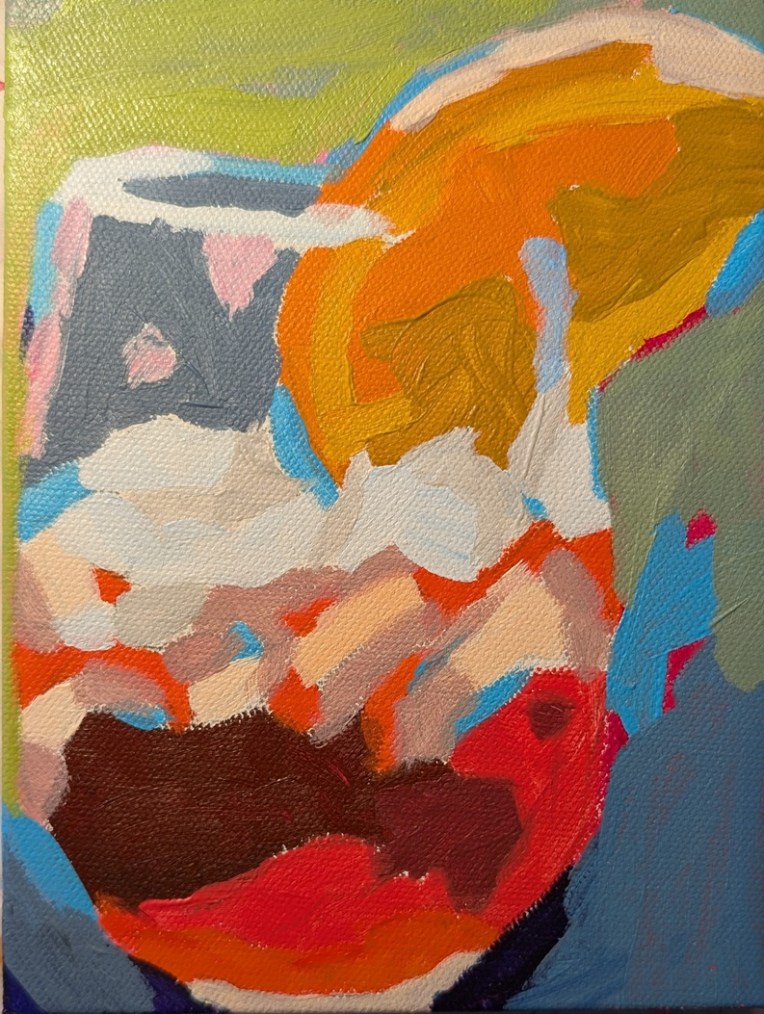
This painting was done on an 6×8 canvas panel (Blick Premier — which I really like, actually), and is based off a 2021 “Paint Along” done by Ali Kay of the Fresh Paint art class site. I think she calls it an aperol spritzer — but compari comes to mind for me.
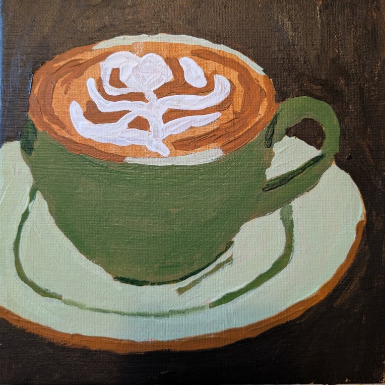
This painting was done on an 8×8 canvas panel, and is based off a reference photo on Ali Kay‘s Fresh Paint site. I followed the reference, not Ali’s process. What I like the best is the decorative foam.
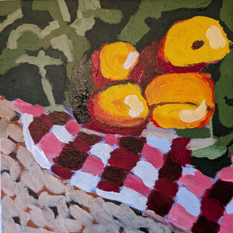
Okay, these don’t look too much like apples! This painting was done on an 8×8 canvas panel, and is based off a reference photo on Ali Kay‘s Fresh Paint site.
I got rather “lost” following Ali’s process layering multiple colors that really didn’t relate — in my opinion — to the actual reference. Oh well, moving on…
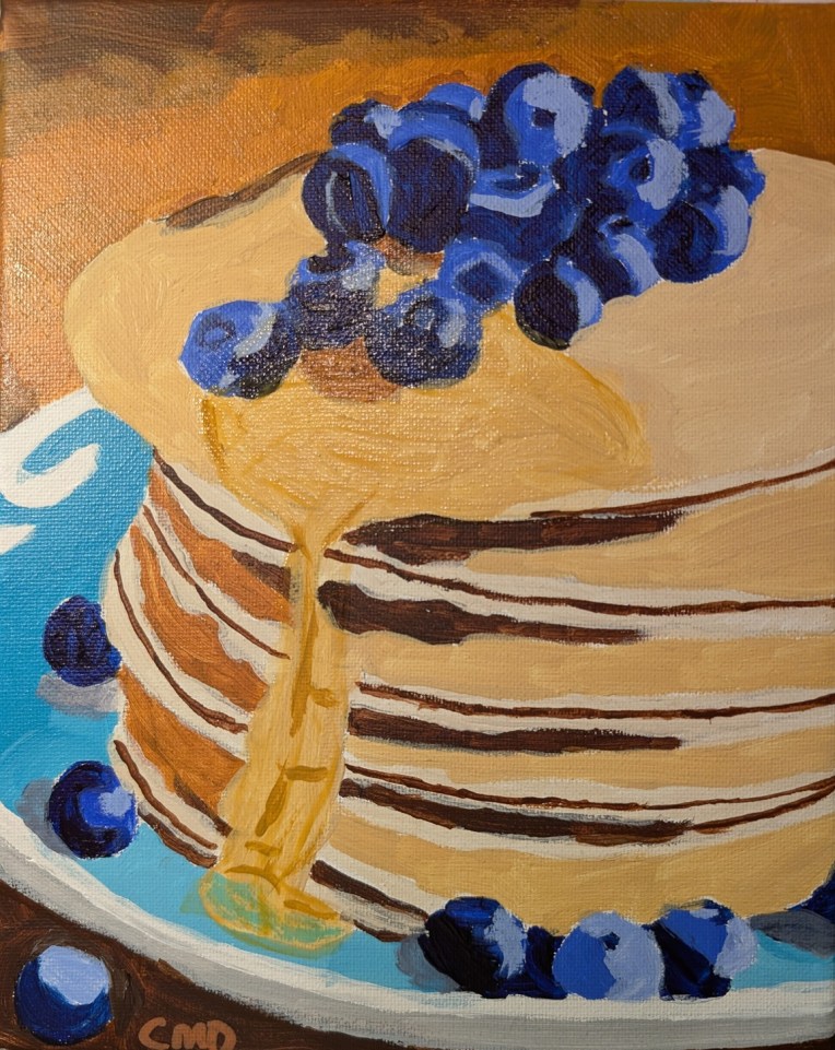
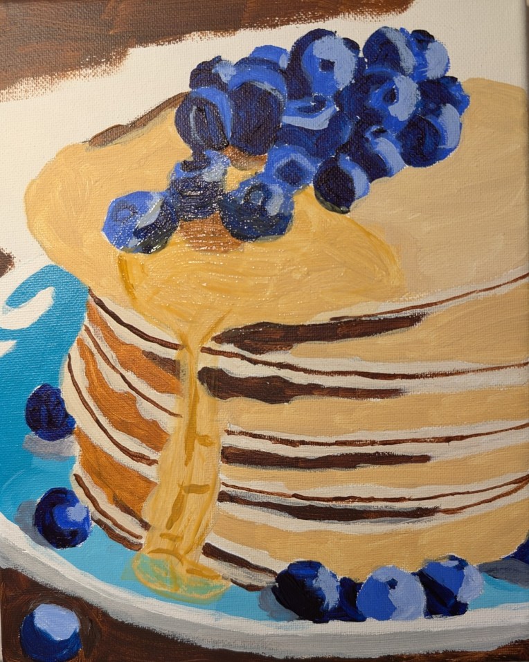
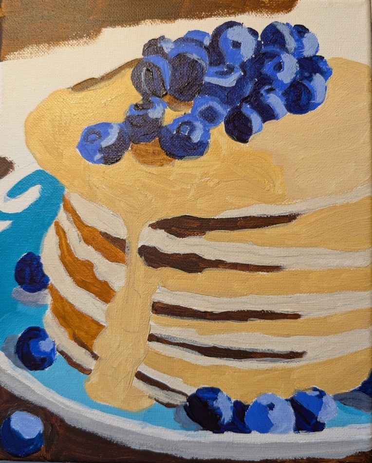
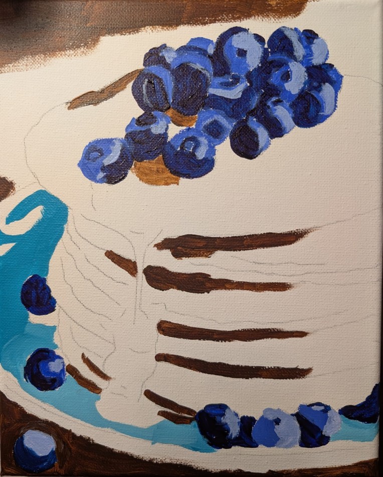
This painting was done on an 8×10 canvas, and is based off a reference photo on Ali Kay‘s Fresh Paint site. Ali will demo her version of this stack of pancakes and blueberries in a few days; I wanted to do my own version).
I’m happiest with the blueberries, which I painted with Anthraquinone Blue straight from the tube, Ultramarine Blue, and Ultramarine Blue with Titanium White. For the syrup, I used a glazing medium with Liquitex’s Raw Sienna.
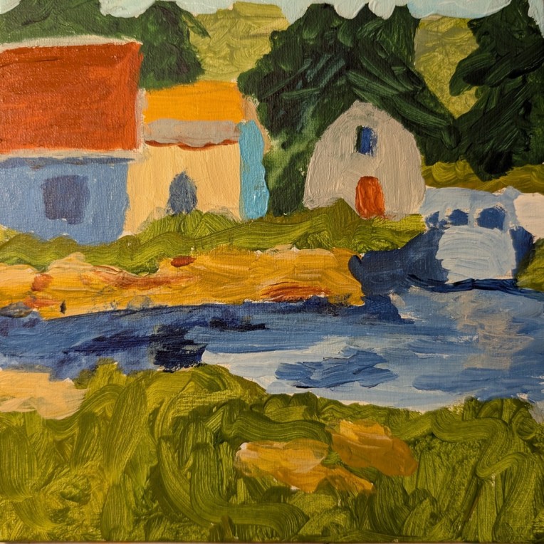
This was painted on a 6×6 canvas panel, and the swirly brushstrokes in green — meant to represent grass! — remind me of some of Van Gogh’s swirly painting (but not in good way, ha-ha!) To the right is supposed to be a boat, but since I painted it in the same colors as the water, it now appears “lost” or, rather, more like a bridge.
The thing is, I’m so focused on painting other things, I don’t care enough to paint it in, say, black and white so that it appears as a boat.
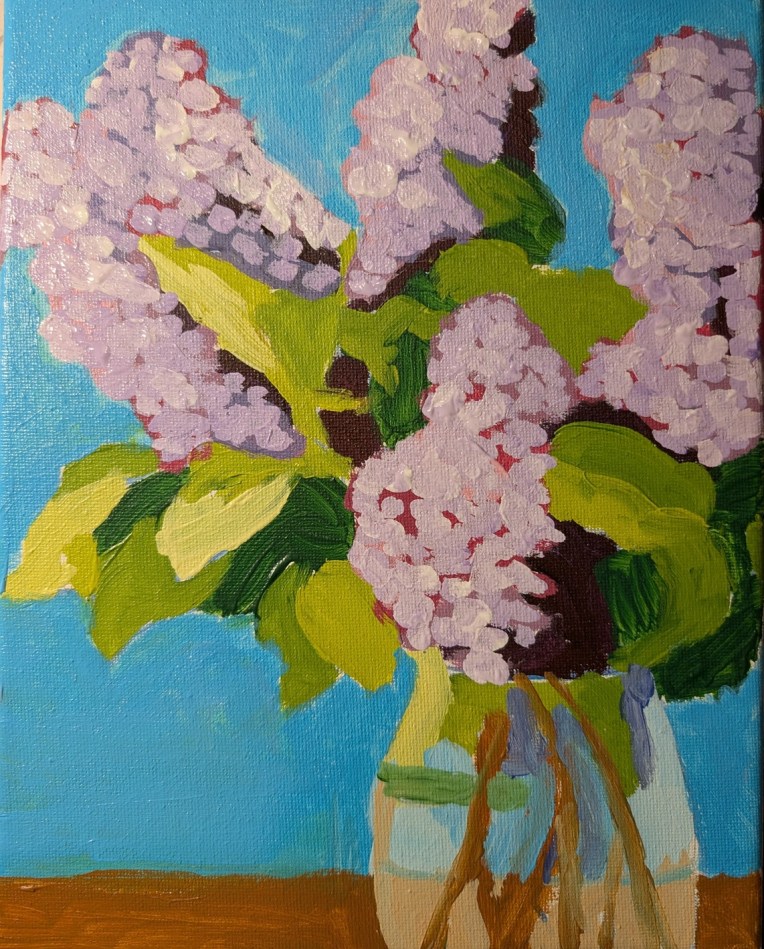
I outlined these lilacs on an 8×10 canvas over a year ago (based on a template found on Ali Kay‘s Fresh Paint site.) Finally got around to painting it — using the reference photo Ali Kay provided, and NOT copying her style at all.
Overall, I’m more satisfied with the lilacs — which put me in mind of spring in New England during my college years — than with the daffodils in the vase I did a while back.
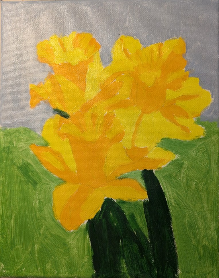
This painting was done on a 8×10 canvas, and is based on a photo I’m not sure where it came from — probably Pixabay, but possibly from my own collection, as I love daffs and photograph them when I can.
Even though I drew out the flowers on the canvas first, I still struggled a bit — but hopefully these look more like daffodils than some of the earlier paintings I posted a week or so ago.
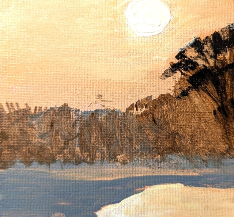
This painting was done on a 6×6 canvas panel, and is based on a photo I found on Pixabay. I’ve had this reference photo (significantly cropped from the original) for quite some time. I enjoyed painting it. However, my own photo of my painting is not that great, despite my fiddling with the properties. Around the white sun, I actually have more yellow blended into the orange of the sky. Ditto for the reflection at the bottom right.
Oh, and for the first time, I used my fan brush in painting the vegetation.
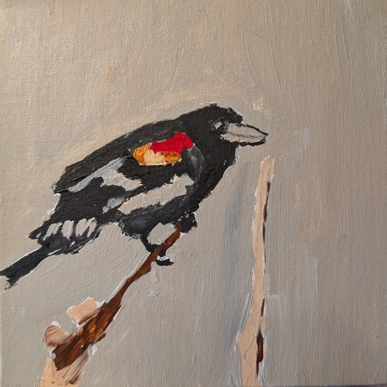
This painting was done on a 6×6 canvas panel, and is based on a photo I found on Pixabay. I’ve had this reference photo for seemingly forever, but it wasn’t as exciting to paint as I thought it would be. (I live near a creek with lots of reeds, where red-winged blackbirds hang out.)