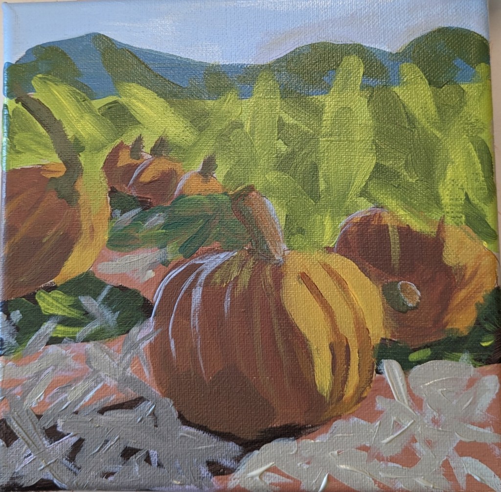
Cloud Challenge #1 – Acrylic University

The other day I was on Instagram, and something came up in my feed about Acrylic University, an art site I wasn’t aware of until that moment. I checked it out and signed up for an 8-week “Cloud Challenge” class taught by Dianna Shyne. This painting was done today in that class.

  1. I had fun!
  2. Clouds are more difficult to paint than they seem.
  3. I really do not like phthalo blue as a color — it’s much too intense, and much too much of a greenish blue.
  4. The “black” in this painting is a chromatic black — ultramarine blue, phthalo blue, Anthraquinone Red (marketed as alizarin crimson) and the merest touch of cad yellow hue.

Overall, I like the colors, but this looks more like a stained-glass abstract than puffy clouds. 

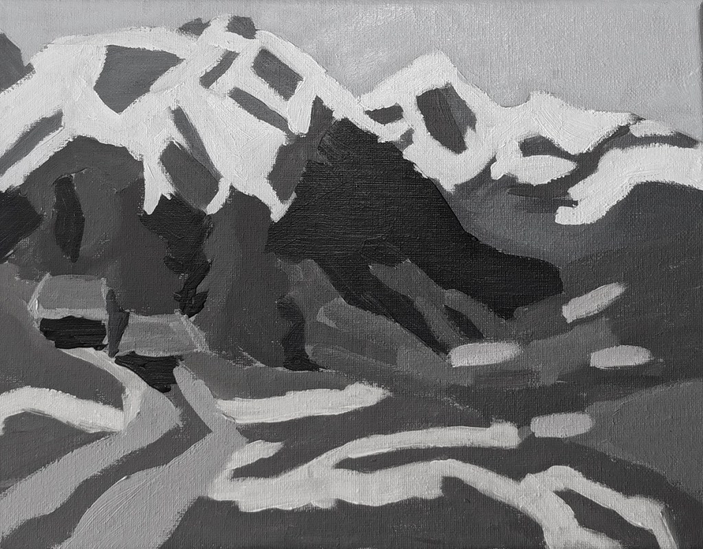
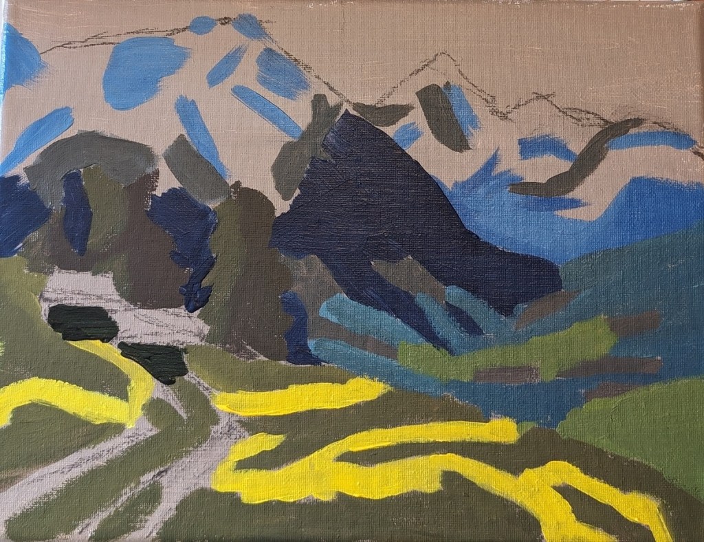
Mountain Valley Landscape – Solid Planes.. Work in Progress

This is another exercise from PaintCoach Patreon’s page. The idea is that, if your solid shapes of values works, your painting will work once the detail is filled in. And it’s also to help beginners like me think in terms of shapes rather than things.

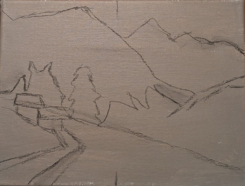
I used a raw umber and white tone on a 9×12 canvas, and sketched out in charcoal (a few days ago) — again, because I was also watching postseason baseball.

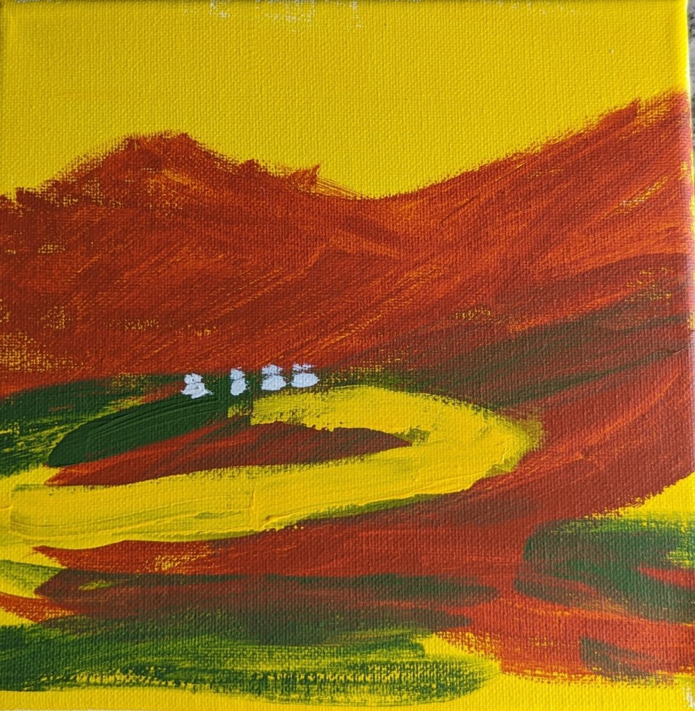
Abstract: “New Mexico”

I haven’t painted (or drawn) for weeks, so today I was just playing with paint without any ideas in my head of what to paint. But after the red oxide paint dried, I rotated the 8×8 canvas, and it suddenly seemed to me like the Sangre de Christo mountains in New Mexico. To that end, I added the chromium green, the yellow “road” and the white dots (lights in houses along the road?)

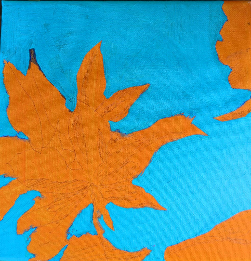
Negative Spaces Study: Adventures in Acrylic

One more study I’ve done in the Adventures in Acrylic class. I did not do the fluorescent orange spray paint, and this time, instead of using my Perinone Orange (a close substitute), I went with Liquitex’s Cad-Free Orange paint, more soothing to my eyes.

Then I did a free-hand drawing in pencil of some of the orange leaves from the reference photo provided in the class, and did some light shading of the shadow areas as I saw them.

My blue was a mix of Utrecht’s cerulean blue (fluid) and Liquitex’s soft-body Light Blue Permanent (I think it is). I used a long-handled small bright brush to paint in the negative spaces.

This is really an in-progress painting, but I’m tempted to leave it as it is and go on to something else. We’ll see!

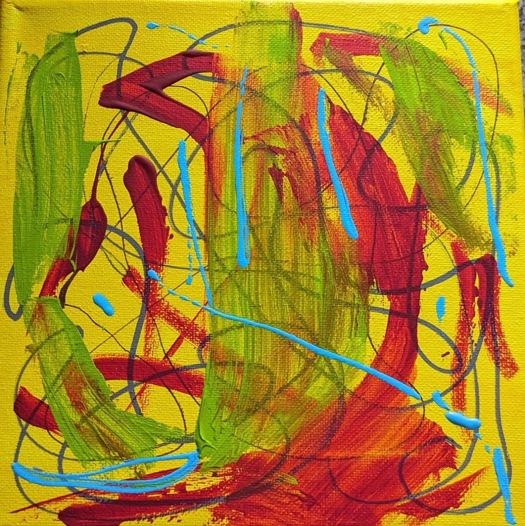
More Bright Yellow & Testing out Paint Markers

As noted yesterday, I had extra yellow paint, so I had painted an 8×8 canvas. I decided to test out some of the acrylic paint markers I just bought, as well as some of the new paint I bought (Amsterdam Expert — a brand I haven’t tried before).

The Amsterdam Expert paint in yellowish green was so thick that I wiped off much of it with a paper towel, hence the smear. I also used some of my alizarin crimson, and Liquitex soft body light blue.

The paint markers are cool; I first heard about them from the Still Life Acrylics e-book I bought from Will Kemp Art School. Kemp uses the paint marker as his drawing tool. (I’ve tried compressed charcoal and charcoal pencil for my drawing tool, and the charcoal smears into the paint.)