I didn’t have time to work with my pastels today, so I did this drawing instead.


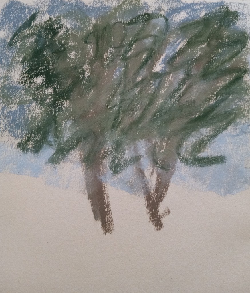
I had no idea what to paint today, so I just started randomly putting NuPastel on paper, and then I rubbed it in with a paper towel. Now I had an underpainting (of sorts) but didn’t know what to do with it — at first. Then I realized it reminded me of autumn trees.
My trees are cartoonish, but the whole picture is straight from my imagination, based on the colors and shapes of the random “underpainting”.

Yesterday’s sunset looked a bit like a fried egg, didn’t it? So I tried it one more time. This time I used Art Spectrum Colourfix paper, in the Terracotta shade.
While this painting is hardly a masterpiece, I feel most satisfied with it, and I finally got the reflection looking a bit more realistic than on my previous tries.

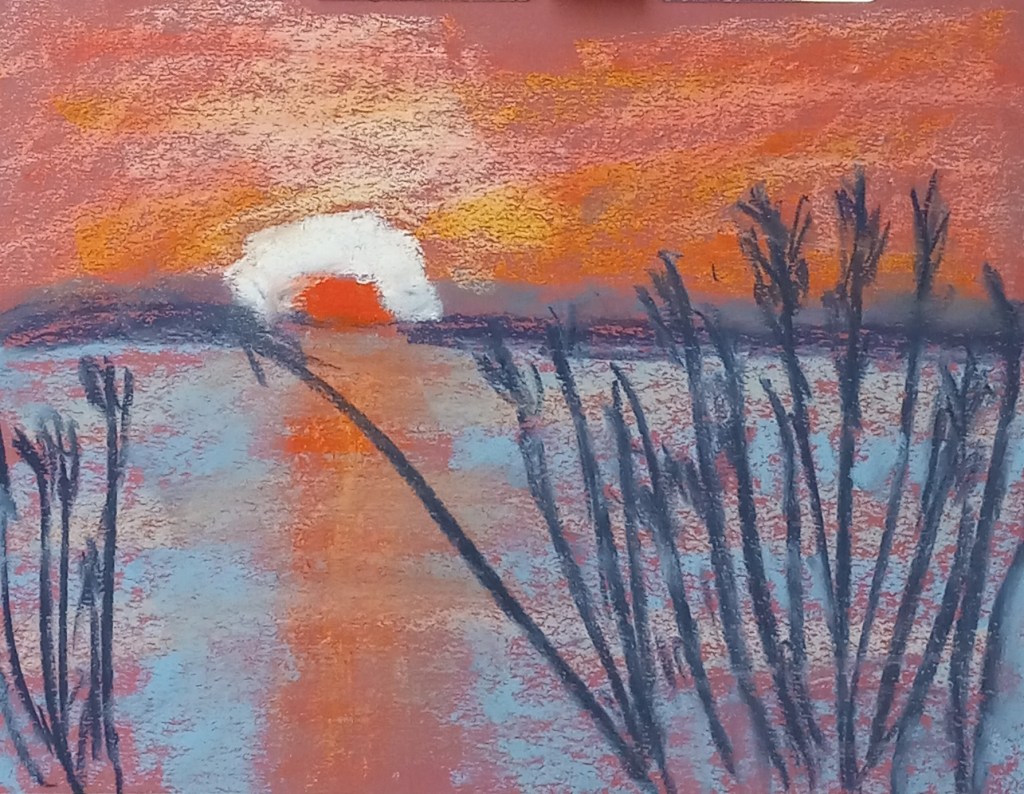
Today I did another study of the reedy lake (again on Canson Mi-Teintes Red Earth colored paper). I used a different pastel palette than I did before, and I did not do any underpainting.
This time, I think I did a better job of painting the sun’s reflection on the water.
Most of the pastels used were Richeson hand-rolled pastels, which seems to work for me on the Mi-Teintes paper, although it’s clear you can see a lot of the paper’s color coming through.
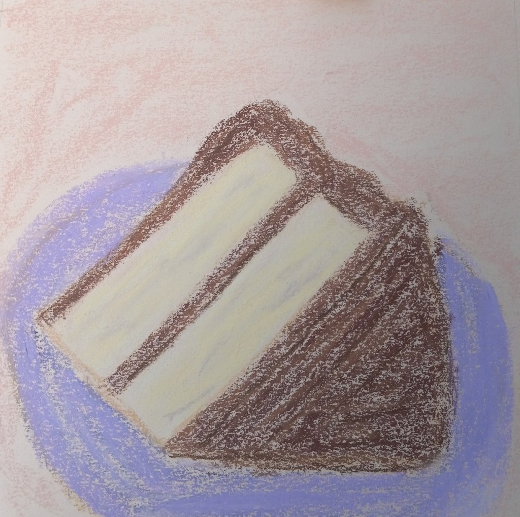
My mom just had her birthday, and I’m trying not to eat a lot of sweets now that it’s after the holiday season. So, the next best thing — to draw the sweets! Here’s a slice of yellow cake with chocolate frosting.
I used the online color picker “Color Picker Online” to check the palette for the cake — it’s not just a straight yellow.
For the cake itself, there are multiple shades of yellow, as well as purples, oranges, and browns. For the frosting, I used multiple shades of brown and dark orange. I did the work on Canson Mi-Teintes (smooth side) in Honeysuckle.
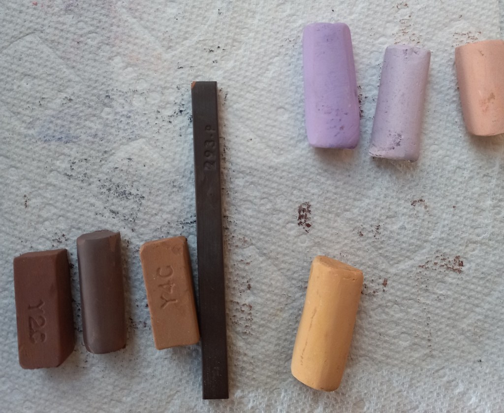
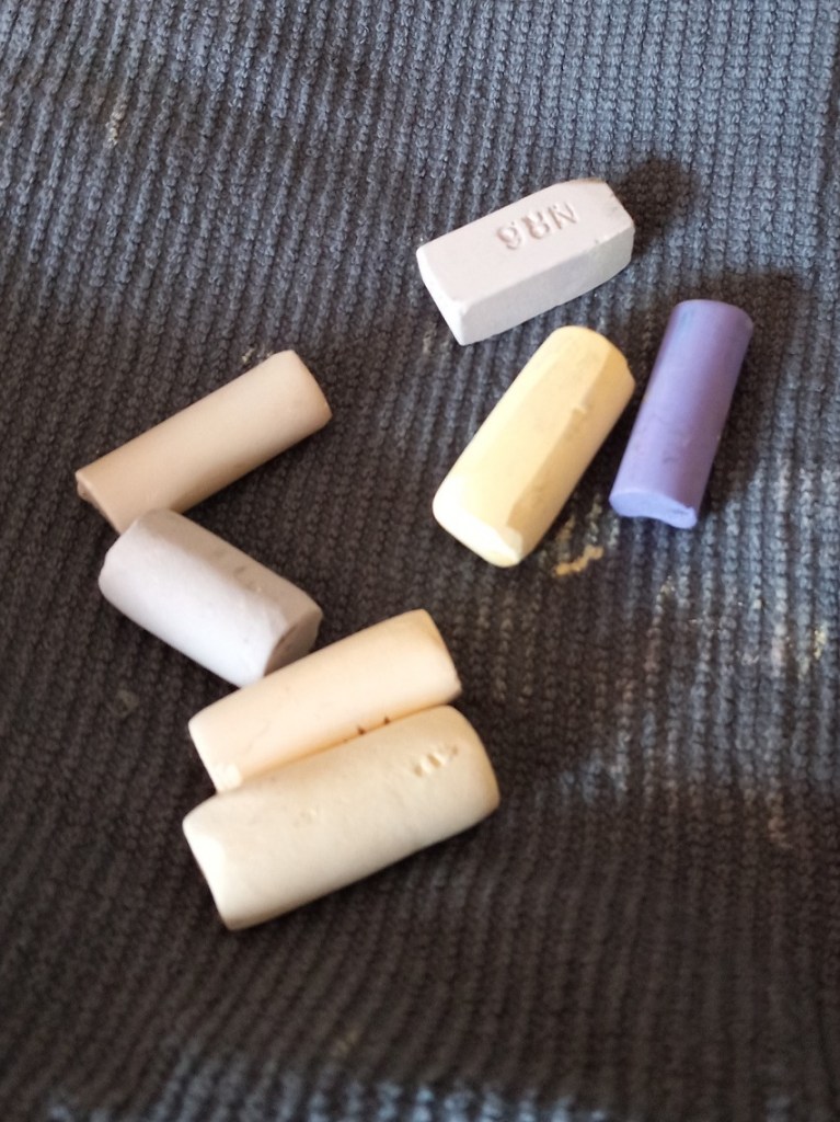


Not at all! Not according to Maggie Price, in her 2007 book Painting with Pastels: Easy Techniques to Master the Medium.
She says there is no requirement to use an underpainting, and then gives examples of when you might not want to. One is for when you’re using unsanded papers such as Canson Mi-Teintes, simply because those kinds of papers cannot hold many layers of pastel. Every layer will go towards filling the minimal tooth — plus Canson has so many different colors you can select a color to serve as your “underpainting”.
Price goes on to make the same point with regard to Art Spectrum’s Colourfix sanded paper — that brand, too, has many different shades available for purchase, and presumably, if you’re using a specific shade, you’ve selected that shade for the way it will work with what you will paint on it.
This is good to know, as right now, my main paper stash is made of Mi-Teintes, and Colourfix!
Reference: Maggie Price, Painting with Pastels: Easy Techniques to Master the Medium (Cincinnati, Ohio: North Light Books, 2007), p. 71.
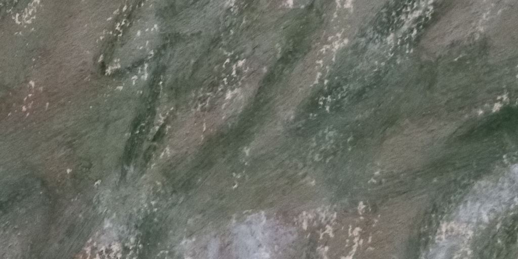
Early on while I was working on the “500 scenes”, it was a warm blustery day and it seemed to me the tree was energetic so I was using the pastel sticks energetically myself. And completely forgetting I was using Canson Mi-Teintes paper, which cannot take a lot of layers of pastels! When I added the dark green — or tried to – the stick just skittered off. Nothing was really taking, and the appearance was reminiscent of mud. I did NOT want the dark green to look like scribbles! Oh well.
Yes, I had heard of that occurring once the tooth of the pastel paper (any pastel paper!) is filled, but really, experience is the best teacher. Now that I’ve filled the tooth of the paper myself, and experienced the skipping and the muddy look, I totally get it.
I am currently reading Maggie Price’s 2007 book Painting with Pastels: Easy Techniques to Master the Medium. In it, she mentions taking the “500 challenge” — something she learned from attending a demonstration by pastelist Eric Michaels. The idea is, you paint from life, “en plein air” — and do it 500 times. Ideally, you work small (8×10 or smaller) and fast (no more than 1 hour). Finishing a painting is not the goal; rather, the point is to just get out there and paint. Regularly.
Maggie says, “It was the single best piece of advice I ever had about painting”. (p. 117) She also says not to worry about finishing any given piece — she called them “color studies” — and to number and date them so you can go back and see the change in your work. She noticed a change in her own work after just 50 paintings, with improvement in skill markedly showing at 100 and again at 200.
This actually relates to Karen Margulis‘ “daily painting” concept on which she built her blog. The more you paint, the quicker you’ll accrue skill.
To that end, here is #1 of my “plein air” color studies — of the neighbor’s oak tree I can see part of from my backyard. Right now, I’m shooting for 200 plein air “color studies”. We’ll see what happens after I reach #50, #100 and #200.

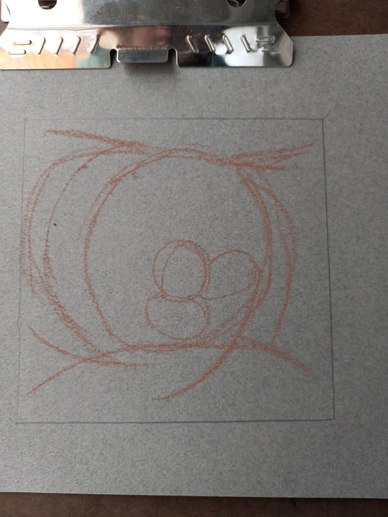
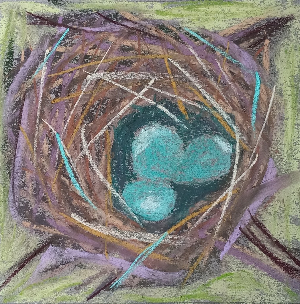
Today I painted a bird’s nest based off of one of Karen Margulis‘ paintings. The step-by-step demo is on her Patreon site and can be accessed here (paywall; subscriber site). All the colors used are based on her work. Karen says in this Patreon post: “I DO give permission for you to share your paintings done from my demos on social media provided that you credit me and link to this Patreon group.“
I did this practice work on a gray-toned sheet of Canson Mi-Teintes.
We had a robin who nested in our persimmon tree this past summer and I took pictures of the babies in the nest, as well as the mother bird sitting on the nest. Now that I have an idea how to paint a bird’s nest in pastel, I’m going to use my own reference photo. We had a robin who nested in our persimmon tree this past summer and I took pictures of the babies in the nest, as well as the mother bird sitting on the nest