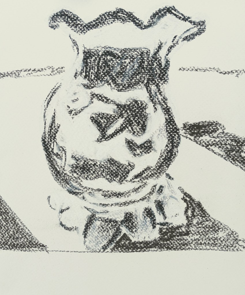
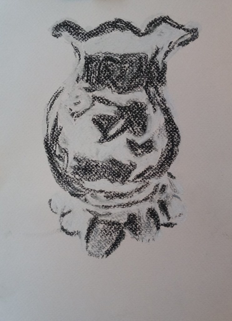
Today I put the finishing touches on my grayscale study of my cranberry glass. It’s no longer floating in space!
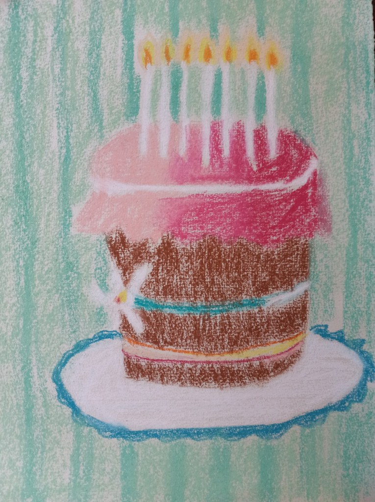
I was too busy today to do another sunset study, or some of the assignments from the online workshops I’m taking. However, I wanted to use some of my non-sanded pastel paper from the sampler I bought a year ago.
Today’s work is on Hahnemuhle Ingres paper, and I used only NuPastels.
What I like best is the candle flames. What I’m clearly struggling with is smoothly transitioning from one color to another! Part of that might be due to the hardness of the NuPastels; they don’t blend as well as soft pastels. The image is based on a very old birthday card.
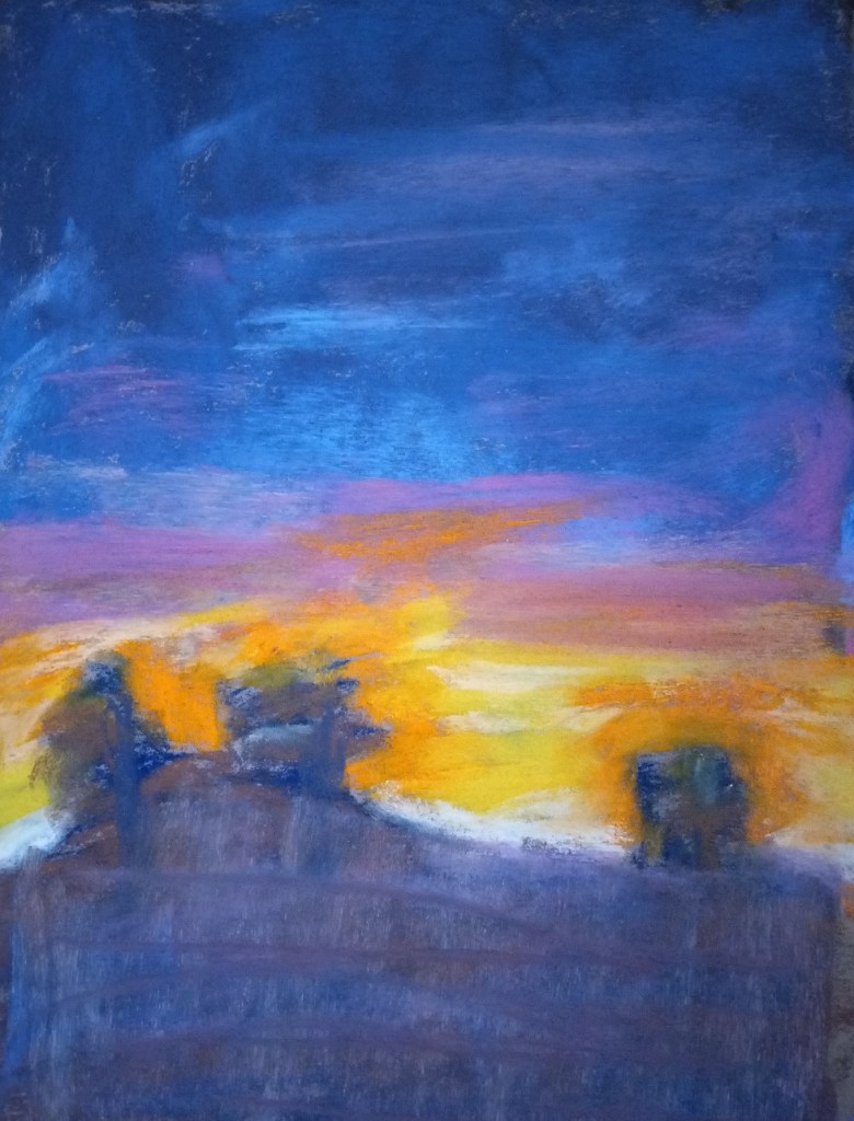
Today’s painting is my own version of a “Desert Glow” sunset after I followed along in Assignment #1 of Marla Baggetta’s “Sunsets in Pastel” online workshop. (I’ve now signed up for 3 of her workshops — and then, with the Black Friday sales still on until this Friday, also signed up for a subscription to her monthly pastel workshops).
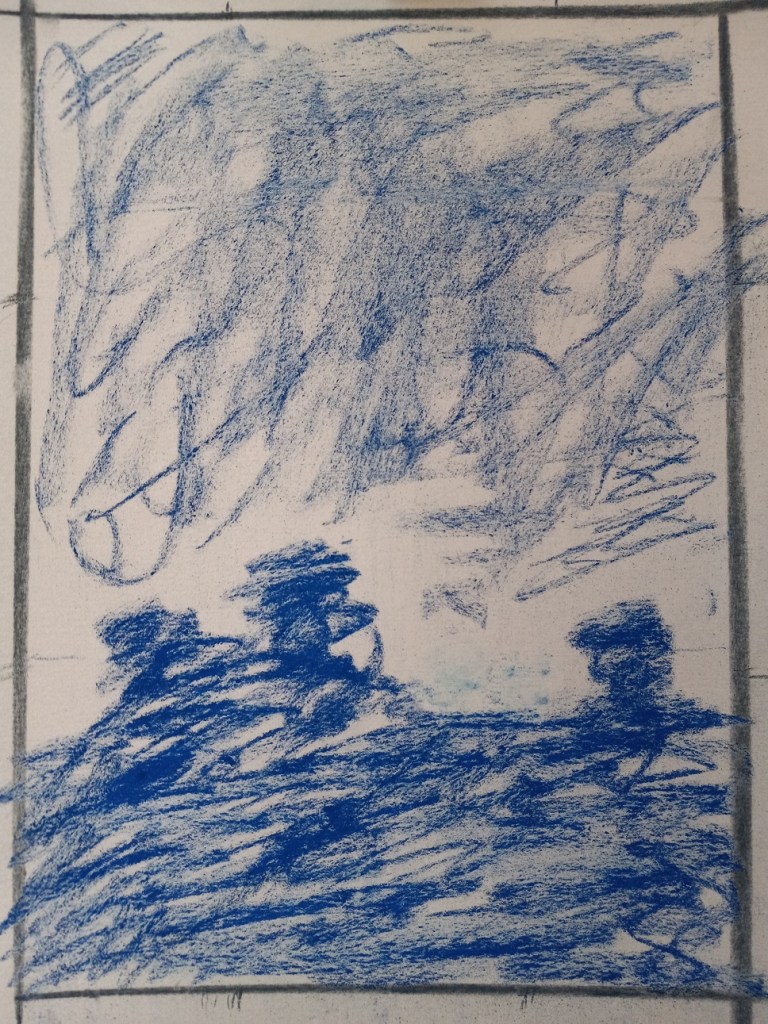
The first thing I did was to draw some thumbnails, using my Vincent Van Gogh brand of hard pastels, and vine charcoal. I decided to go with the vertical thumbnail on the bottom left as the reference for the sunset picture.
The next step was to proportionately size up the thumbnail sketch to the paper being used (Pastel Premier in Clay) and do the value sketch/underpainting. My thumbnail was, luckily, 2-1/2″ x 3-1/2″ so my picture was sized up to 7-1/2″ x 10-1/2″. I used Indigo Blue NuPastel for this part.
Next step was the fun part — choosing the colors!!
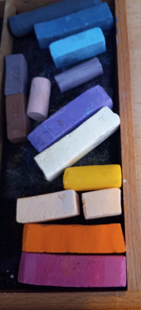
Gorgeous colors! These are almost all Great American, with some Blue Earth, a Terry Ludwig (light blue), and Mount Vision (darkest blue), and Dick Blick Artists’ Soft Pastels. The yellow is one of my Richeson Hand-Rolled yellows.
Here’s the completed study.
The first thing I have to say is that the photo — taken from my Samsung phone — does not sufficiently pick up the magenta, which is a bummer. It also picks up too much blue from the ground, which may (?) be due to the indigo blue underpainting (and of course the use of some darker blues in the ground area.)
Self-critiquing — I could go on and on. Marla Baggetta has a whole list of questions for us to ask ourselves, the first one being “Were you the director? Or did the piece direct you?” I got carried away laying down color, that’s for sure. It was a blast to use all those bright colors! I completely forgot about my thumbnail, and the idea of putting in a striated sky. And I got “lost” in the ground area, not having planned anything out (a structure like a house? Some telephone poles? Some greenery?) So the foreground is a poorly-thought-out mess.
What was good about this? I loved, loved, loved this paper texture! Totally fun to work with. AND I loved all the pastels I used.
For next time:
better planning for the foreground
More sky, less earth.
Underpainting — use the NuPastels again. but experiment with different colors.
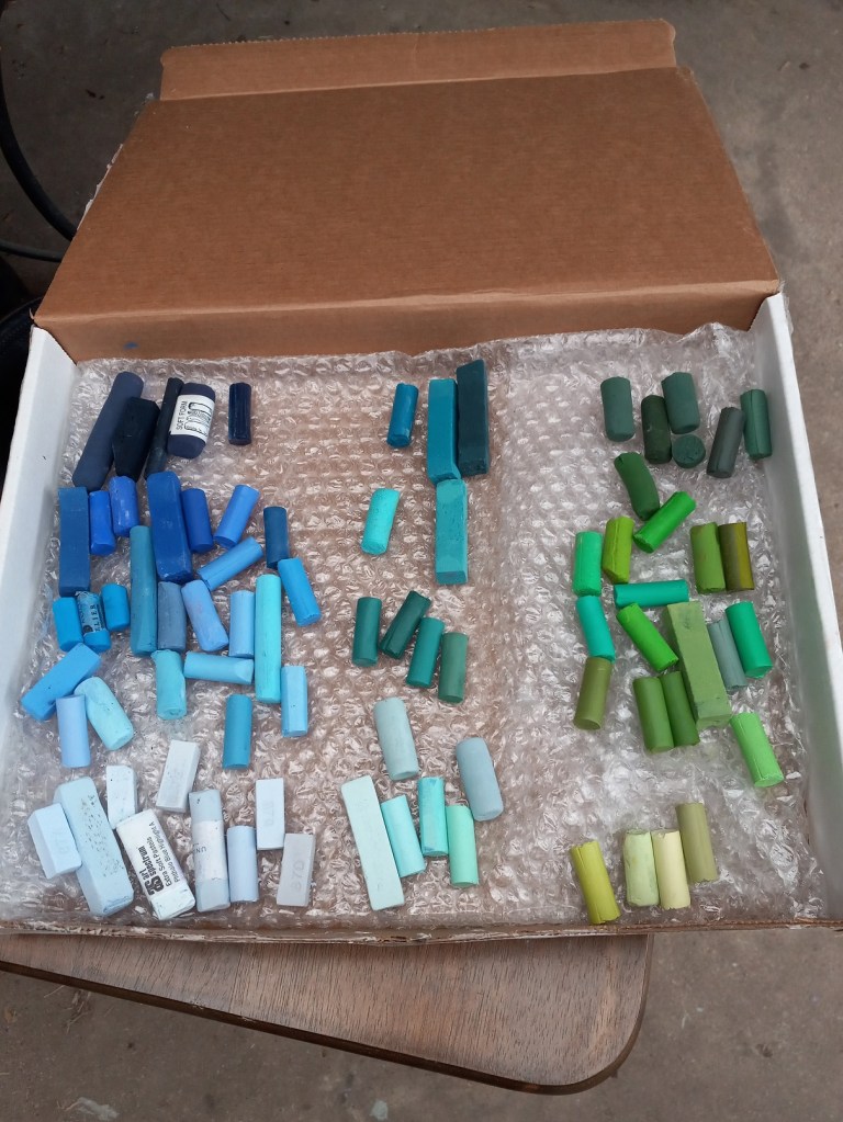
I’ve finally done it… I’ve gotten all my pastels out of their respective boxes, and removed the labels. I don’t have a fancy wooden tray yet, but I did buy from Jerry’s Artarama a 3-drawer wooden storage cabinet. It will hold some but not all of the pastel pieces I have, so I’ll be improvising with cardboard boxes for now.
I’ll post final pictures when I’m done. What I’m finding is that, now that I’m putting the pastels together by hue, it becomes more obvious that one stick should go over with the group of oranges, but another “fits” better with the group of yellows.
I also found that the Great American sticks have a tendency to crumble a bit when removing the wrapper, even though I worked as delicately as I could. And that the wrappers on the Richeson Hand-rolled pastels were, by far, the most difficult to remove as they have an additional layer of tape on the label.
I will trust that the pastelists whose YouTube videos and/or blogs I follow (e.g. Marla Baggetta, Karen Margulis,Alain Picard, Gail Sibley) are correct in saying that you’re better off grouping your sticks by hue and value, with the labels off your pastel sticks (to use the entire stick freely on the paper).
Today’s pastel painting was done on Rembrandt pastel paper, using 3 NuPastels: Warm Deep Gray, Warm Very Light Gray, and touches of Warm Medium Gray. This was a value study in preparation of a color piece which I’ll be doing on a sample scrap of Sennelier Pastel Card (bought last year as a part of a sampler from Jackson’s Art).
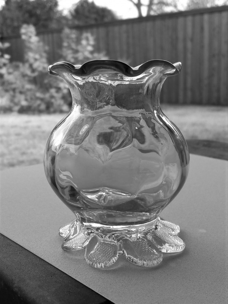
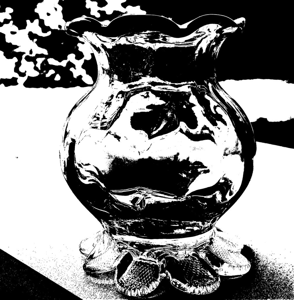
The original picture in color is below. I also downloaded the Android app Color Grab, and played a bit with color choices. While that was fun, I quickly became overwhelmed at the thought of using so many colors for the vase!
I decided to simplify to an extreme by editing my photo to be grayscale, and then using Adobe Photoshop Elements to posterize the grayscale photo to get the two extremes of values. The posterized version was the reference for my pastel.
I am underwhelmed by the texture of the Rembrandt pastel paper; I do not care for the honeycomb look at all.
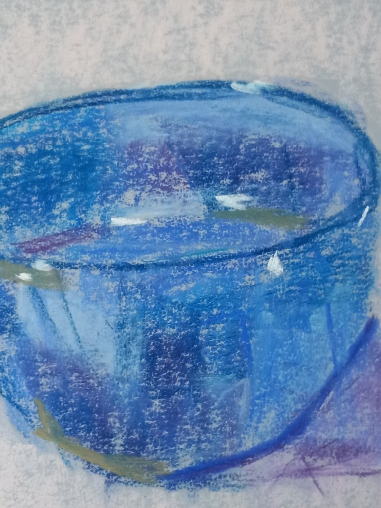
I watched Marla Baggetta‘s video of her painting a blue glass bowl and made my own attempt. I imitated Marla in using the “Blue Spruce” NuPastel to sketch the bowl, but that’s not something I would do again — my own preference would be to sketch in a much lighter color pastel.
I think the pastels are quite “muddy”, and I had an Aha moment later when I realized I lay down the color with a heavy hand. I think I filled up the tooth of the paper.
I also had a difficult time imitating Marla’s strokes; although I used the side of the pastel, either the pastel was too “slippery” or the paper not toothy enough. It felt to me the pastel was “skipping”.
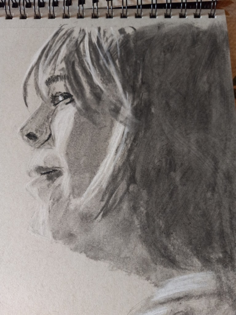
This portrait is based on a photo I downloaded from Pixabay. I used soft vine charcoal for the large shaded areas, For the more detailed areas, I used charcoal pencils 2B and 6B, in addition to Conte crayon in light gray, with mere touches of Conte in white. The rendering was done on Strathmore 400 gray toned sketch paper.
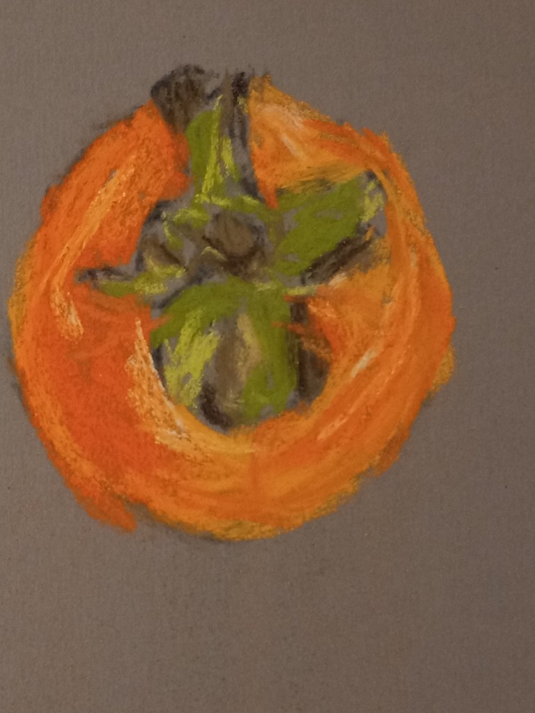
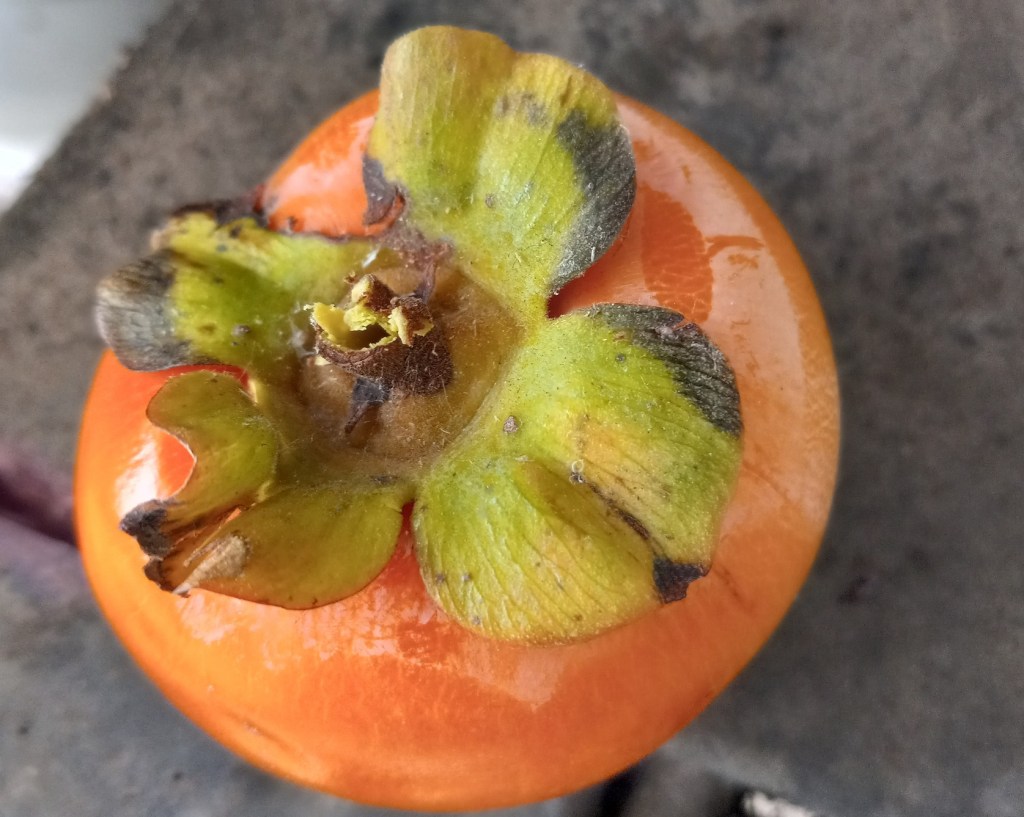
This persimmon is from our tree (which has largely been picked over by now, by my husband harvesting, and by the local blue jays pecking at the fruit).
I held the persimmon in my left hand, looking down at it as I painted with my right hand. My goal was to paint the detail as realistically as possible. The primary pastel I used was one from Great American, called Marigold (585.0) I love the vibrant color — perfect for this fruit!
The photo is of the specific persimmon, but was taken afterward, and is rotated 90 degrees to the viewer’s left relative to the sketch.