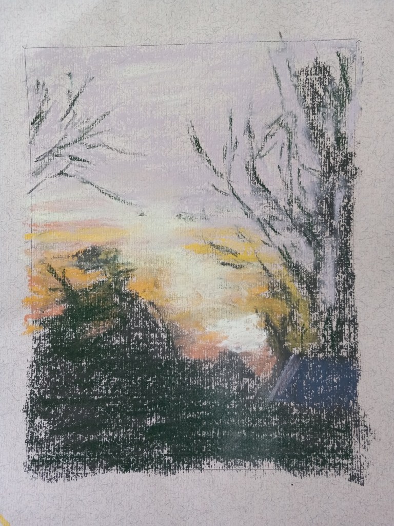
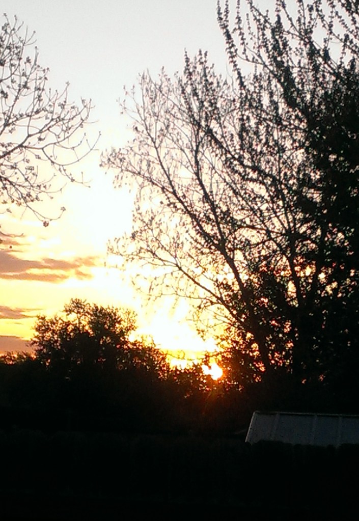
Today I did my own landscape painting based on a photo of a sunrise I took several years ago in our backyard.
I used Clairefontaine Ingres paper, which is unsanded, and not too bad. It was a pale tan color (and part of my unsanded paper sample I purchased from Jackson’s Art a year ago.) The initial drawing was done in vine charcoal. And I kept the size to 8×6.
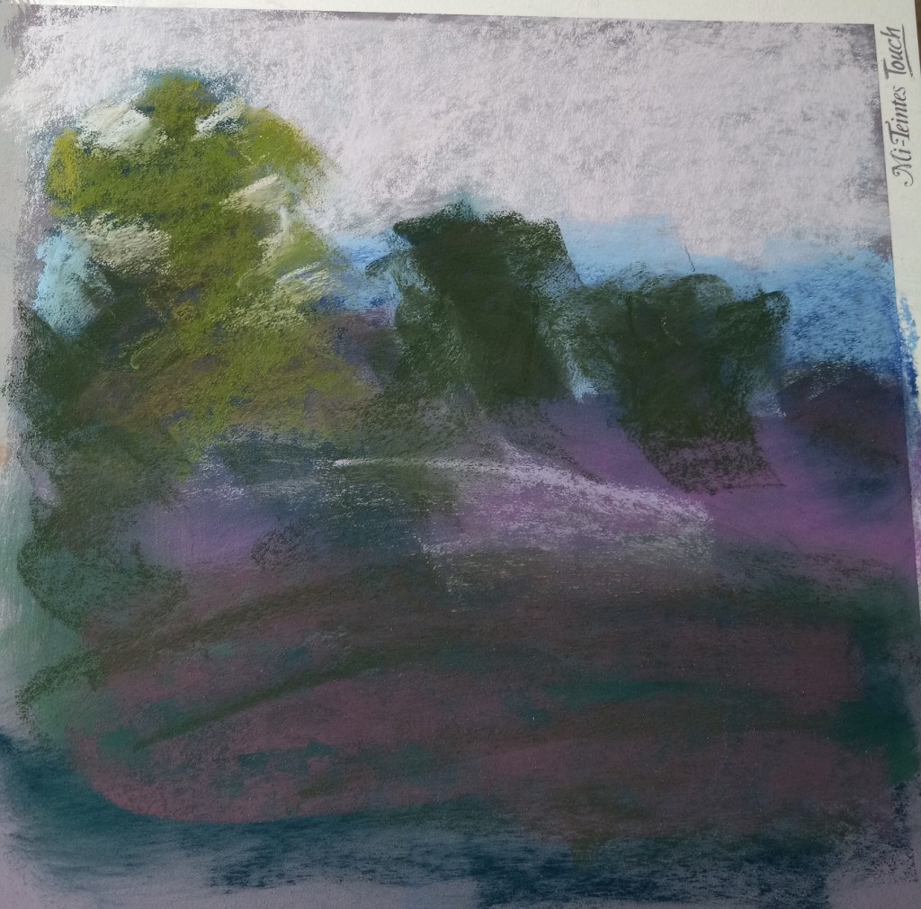
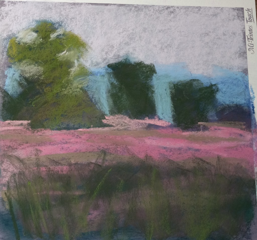
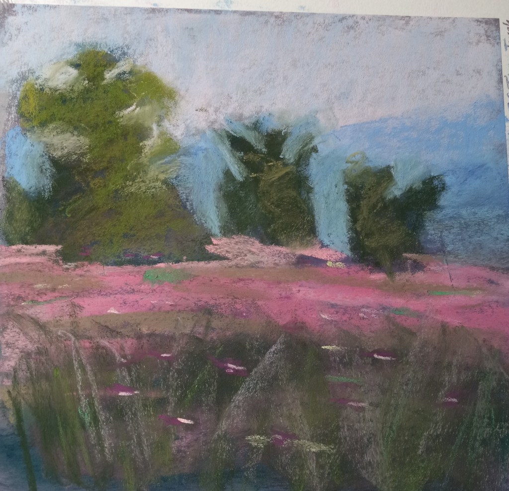
Today I watched a YouTube video (click here) by Karen Margulis about successful strategies for a daily painting habit. She demonstrated painting a landscape in pastel in 20 minutes and after I watched it once I decided to follow-along and try my hand at her style.
Below are step-by-step pictures of my attempt. I used a portion of my Canson Touch board in Twilight color. Karen’s painting is much superior to mine, but this was actually fun! It really did take 20 minutes. AND I feel ready to give a shot to doing a painting using one of my own photos.
The big tree really only looks like a tree from a distance, so I included a distant shot. I don’t yet have the skill Margulis has so I would want to draw out my trees a bit more. I can’t quite make the connection from abstract value shape to something I view as a tree after painting.
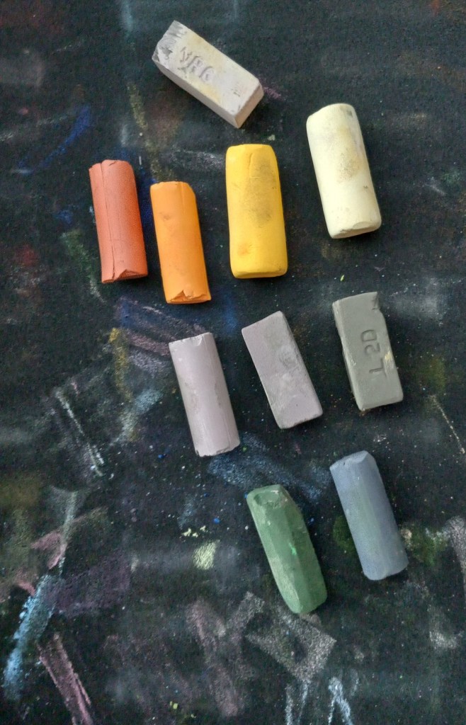
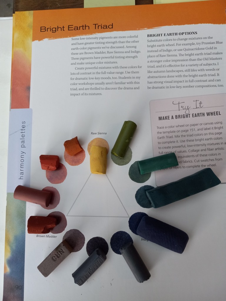
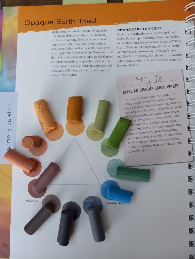
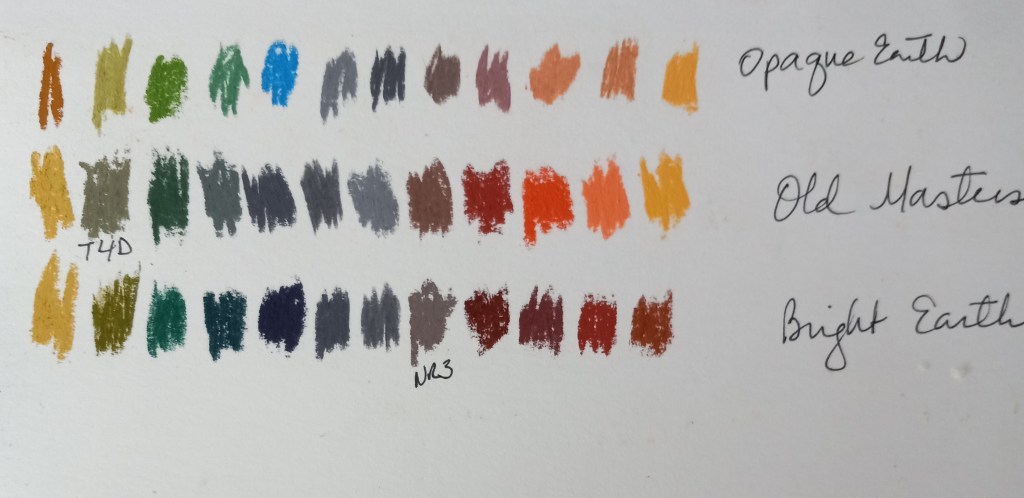
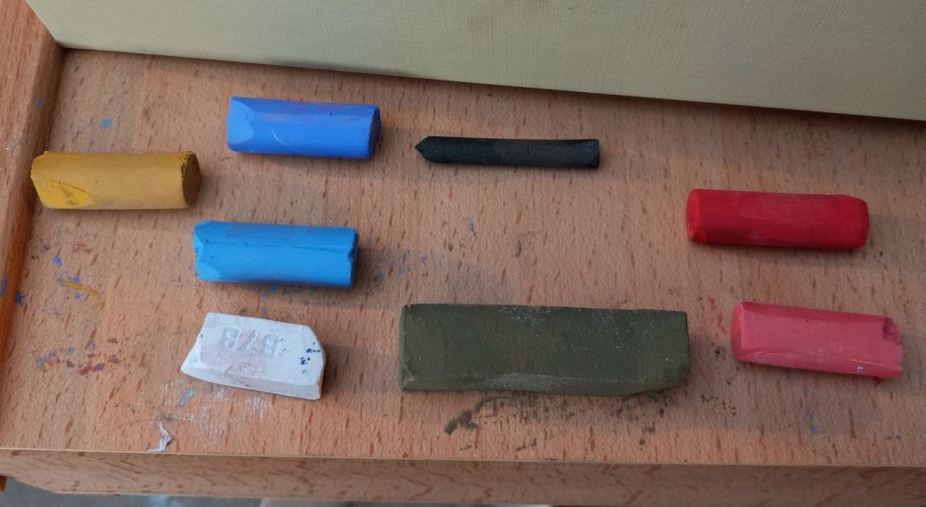
A week or so ago I was reading a posts about color palettes on Karen Margulis’ blog. She referred to 2 books on color by Nita Leland: Confident Color and Exploring Color Workshop (30th anniversary edition). I have Leland’sCreative Collage Techniques book so I was familiar with her name. So I decided to buy Confident Color used from a seller on Amazon because I could view more pages from it than the color workshop book.
My tastes, in general, run to what Leland calls “Bright Earth” and “Opaque Earth”, both more muted palettes than bright bold ones. (I also like those, but they can be so bright and so bold it’s like a punch in the face.)
In any case, it was fun to try matching pastels I already have to the references in the book, as seen in the photos below.
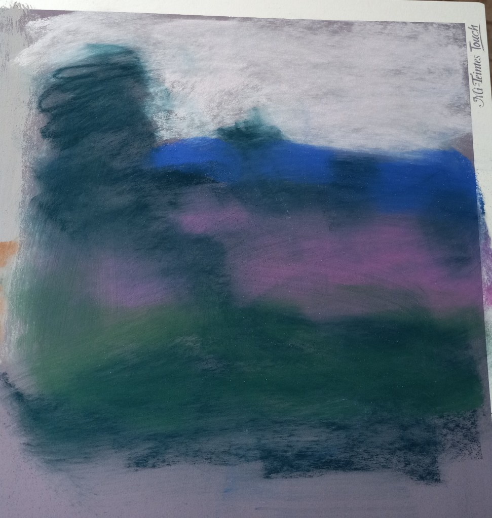
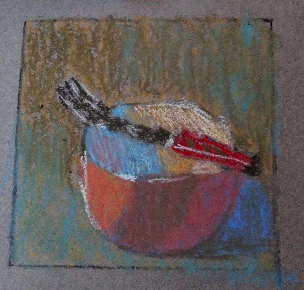
Gail Sibley has a video on YouTube wherein she uses white pastel paper, and a set of Terry Ludwig’s “Best Loved Basics” to paint a red-orange bowl with a fork balanced on it.
I decided to try my own hand at painting the red bowl. The paper I used was a gray-toned Canson Mi Teintes, and, since I don’t have Terry Ludwig pastels, I used a random set of 8 pastels (only 7 shown), making my best guess as to a close match to what Gail was using. I used vine charcoal to sketch the bowl on the pastel paper, and 2B charcoal pencil in the preliminary planning sketch.
I also created a grayscale version of the photo of the bowl, and the values are skewed. The background should not be darker than the cast shadow. Ditto for the shadow in the middle of the bowl, appearing like a gray stripe. It should not have been darker than the cast shadow.
I may tweak this painting tomorrow, if the paper can hold any more pastel.
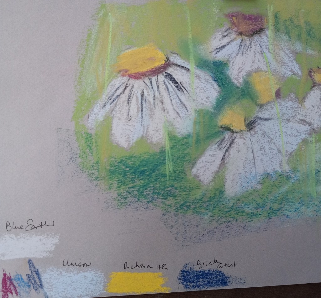
Today I used some of my pieces of Canson Mi-Teintes paper, after reading some of Karen Margulis’ blog posts about loving the paper.
Since I’m still focused on pears and different mark-making styles, I decided to use stippling on a sheet of Terracotta tinted Mi-Teintes paper.
Then, after admiring the way Margulis makes her daisies, I attempted to copy her style (also on a piece of Mi-Teintes). I took Margulis’ advice to use a light touch, but I also did not do too much layering.
My experiment was largely to see which pastels work best on this paper. I noted the results at the bottom — Blue Earth and Richeson Hand-Rolled covered the paper much better than Unison or Blick Artists’ Soft Pastels. (Of course, that may also be the function of my skill level.)
I decided not to entirely give up on the Canson Touch paper — after all, I have 9 more 20×30 sheets of it! I need to learn how best to use it.!
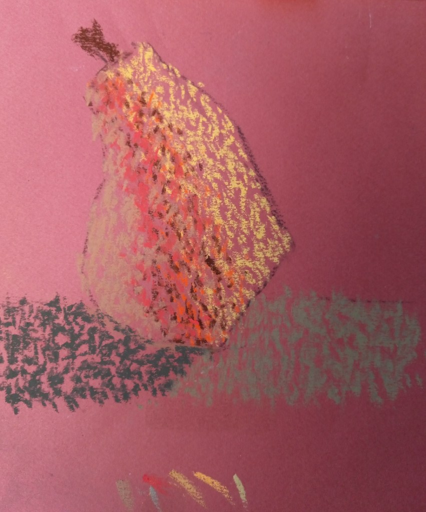
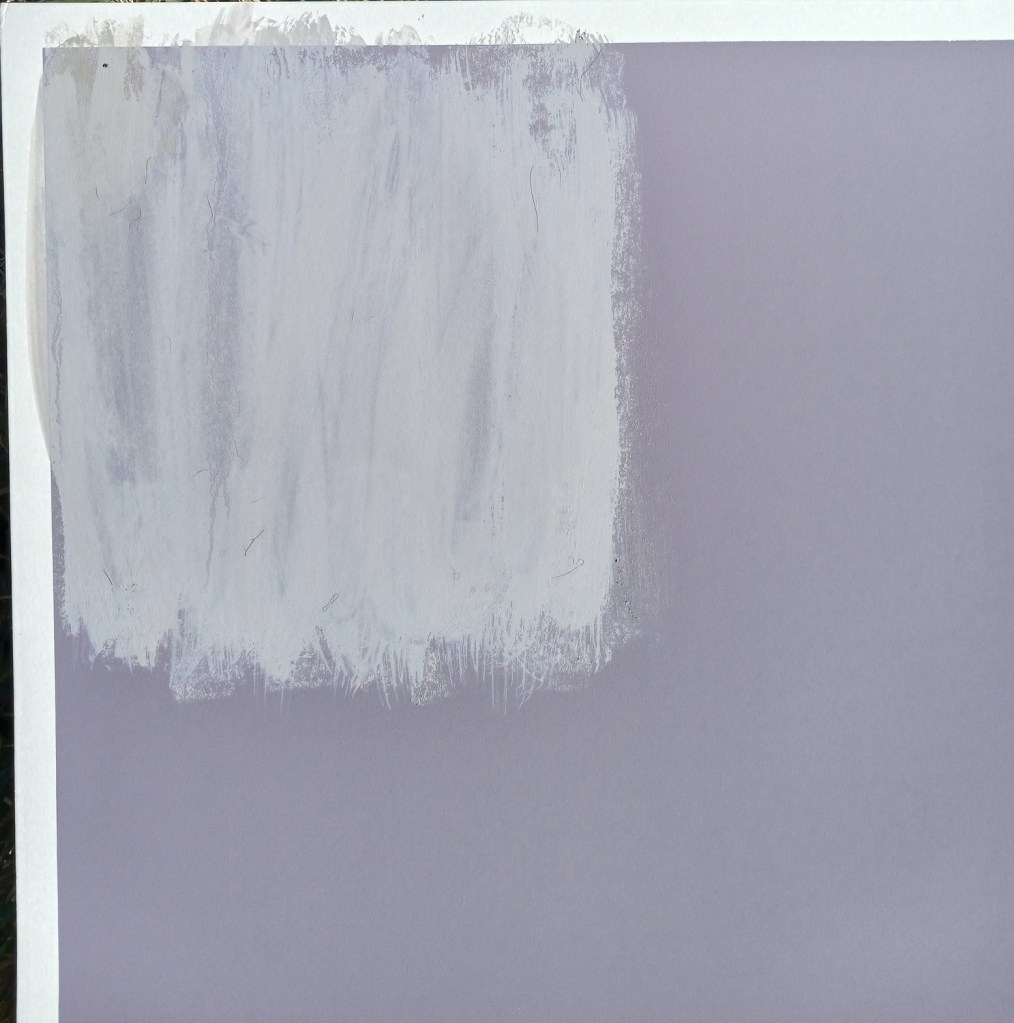
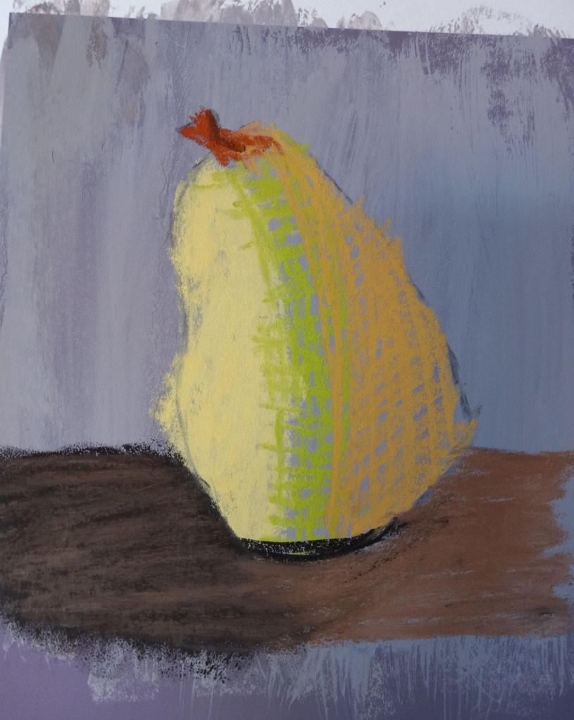
After reading more blog posts by Karen Margulis, and the online workshop PDFs by Marla Baggetta, I decided to try using water on the pastel. I laid down some gray pastel, and then used an older watercolor brush to lightly wet down the pastel and mix it into the paper.
After letting it fully dry — which was at least 30 minutes — I painted the pear below. The dark brown cast shadow is from a Blue Earth pastel; the lighter brown is a NuPastel, the yellow and the orange are Richeson Hand-rolled pastels. I’m delighted with how the color laid down on the modified surface of the Canson Touch paper.
So, I ended up painting the rest of the pastel board with acrylic paint (Golden’s Fluid Acrylics in the yellow ochre color).
What was interesting is that the performance of the pastel sticks changed. Great America, NuPastel, Blick and Blue Earth skipped all over, and pigment was just falling off the painted paper! On the other hand, the Richeson Hand-Rolled and Sennelier seemed to grip the painted surface acceptably.
So, what have I learned?
I’ll use up my stash of Canson Touch and not buy any more
In the future, I’ll stick with neutral paper colors: either a light beige or a light gray, and skip colors like “Twilight” and Indigo. (Unless I paint a night scene.)
I’m happy with the way the Richeson Hand-rolled pastels performed on the Canson Touch paper, painted or unpainted.
I could use the Canson Touch with charcoal in the future.
I had no trouble with putting the acrylic paint to the Canson Touch paper.
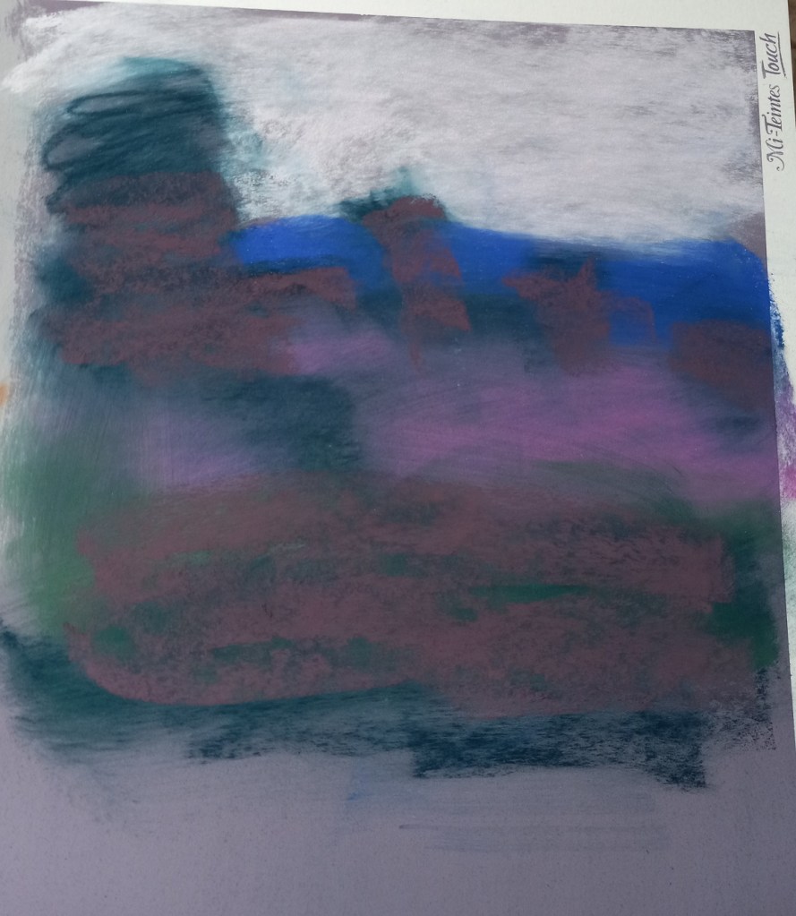
Ugh. This did not turn out as I had wanted. Instead of learning how to make different marks with pastel sticks, I learned about which pastels work on which paper.
This paper was Canson Mi-Teintes Touch in Twilight. Sadly, I have 4 more boards of this stuff — and 5 boards (same size) in Indigo color. I regret buying the stuff and will never buy it again!
The pastels that don’t lay down color well on this paper are NuPastels, the Dick Blick Soft Artist’s sticks, Rembrandts, and Sennelier (at least from the 30 Landscape half-stick collection).
On the other hand, Richeson Hand-Rolled was not too bad! Neither was Blue Earth. The best of all, though, was Great American. (They’re having supply chain issues at the moment, sadly; else I’d buy some more sticks right now!) Willow charcoal is also great — perhaps I’ll do some charcoal work so as not to waste this paper.
Of course, the wildcard in all this is my beginner skill level. Could a pro lay down color better than I? It’s certainly possible. As it was, I was grinding the pastels into the “paper” and losing massive pigment in the process!
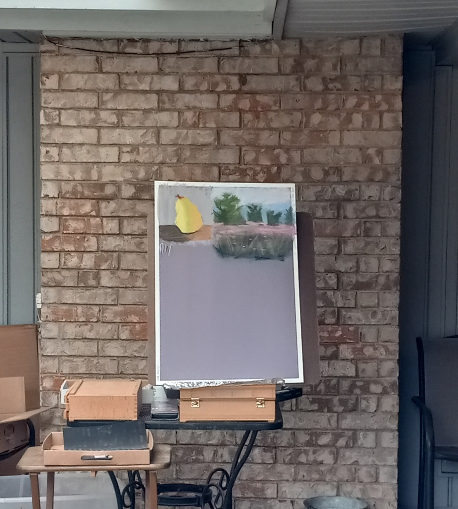
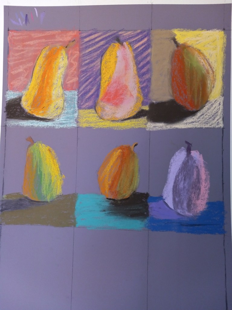
For pear #1, (top left) I stupidly did some blending with my finger of the background. Now it looks worse than before, plus the dust just rolled off. Fortunately, I’m working outside in the patio and have a jerry-rigged dust catcher at the bottom of the easel.
I’ve given up on doing 9 pears on this purple toned paper. What I plan to do for the last three pears is to wash the paper with fluid acrylic in yellow ochre — at least that’s somewhat of a pear color. I’ll let that dry, and try putting pastel on top of that to see what happens.
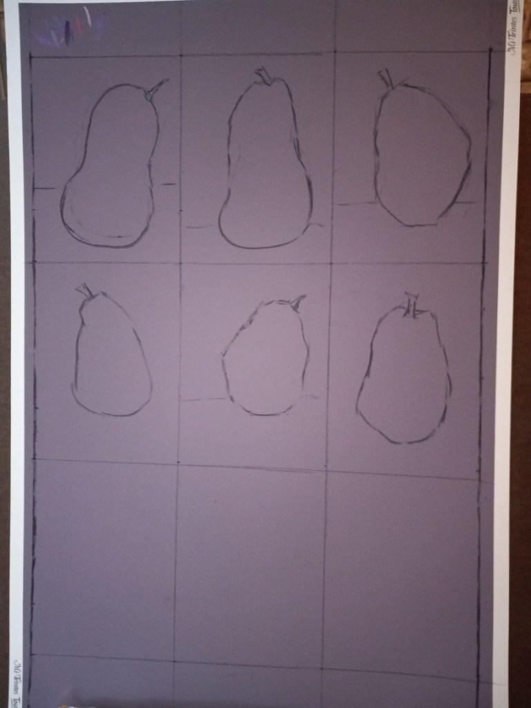
I spent some time today prepping for the first of two 9 pear studies (from Marla Baggetta’s “Making Your Mark” online workshop).
I’m using Canson Mi-Teintes Touch board in the Twilight color, and each pear study will be 8″ x 6″. I’m drawing the outlines in vine charcoal, and may make further adjustments as some of these pears look more like butternut squashes.
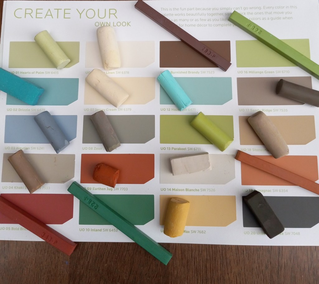
I also chose my palette, based on the “Urban Organic” palette from Sherwin-Williams HGTV back in 2012 (also the palette for the rooms in my house). It looked great as far as matching pastels — although I have nothing particularly close to the green blues — but when I put the pastels in their case, I realized there are too many that are too similar.
So I made adjustments, swapping out some of the creams and browns for magenta and purple. Looking forward to getting started tomorrow!