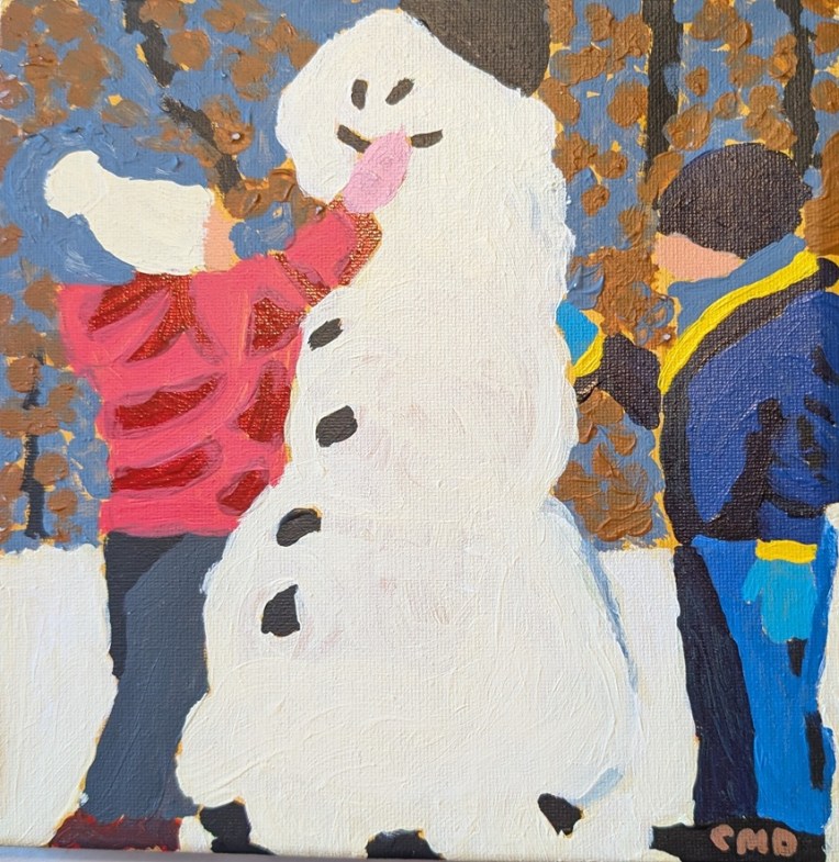
I’m doing several holiday-oriented paintings at once (via Ali Kay’s VIP Fresh Paint) so this is the latest update on the black cat (also posted here). I’m following Ali’s lesson.
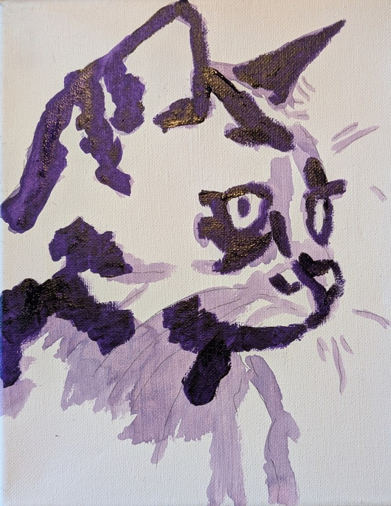

I’m doing several holiday-oriented paintings at once (via Ali Kay’s VIP Fresh Paint) so this is the latest update on the black cat (also posted here). I’m following Ali’s lesson.
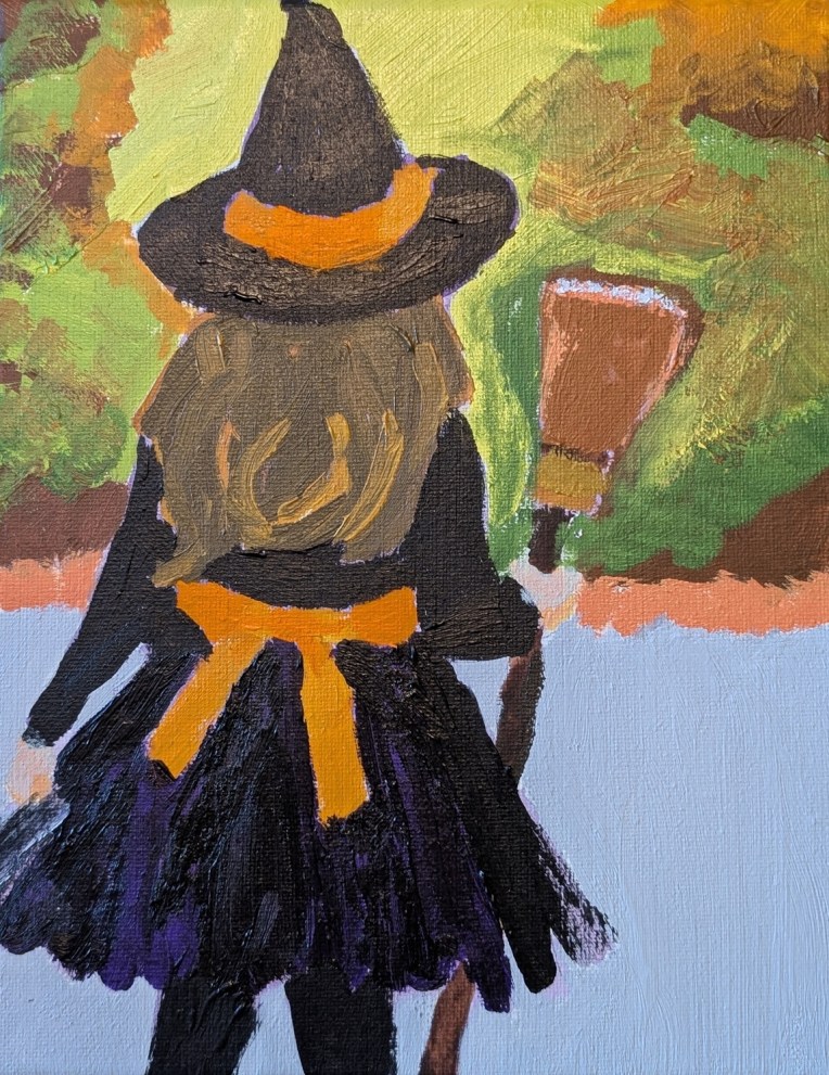
This painting, which I mentioned in this post, is from a reference in Ali Kay’s Fresh Paint VIP membership.
One of the perks of the VIP membership is getting seasonal reference images / classes. I did not “attend” the video class, just using the reference image.
I highlighted the black outfit with dioxazine purple (PV23). I dry-brushed the sides of the skirt to get a tulle effect (as the dress in the reference image appears to have some tulle layers).
What I would change were I to do paint this again — the trees and sunlight (substantially blurred in the ref image) as it’s too busy. The hat needs purple highlights; it looks like I painted black on black. AND I need to work on making hair more realistic!
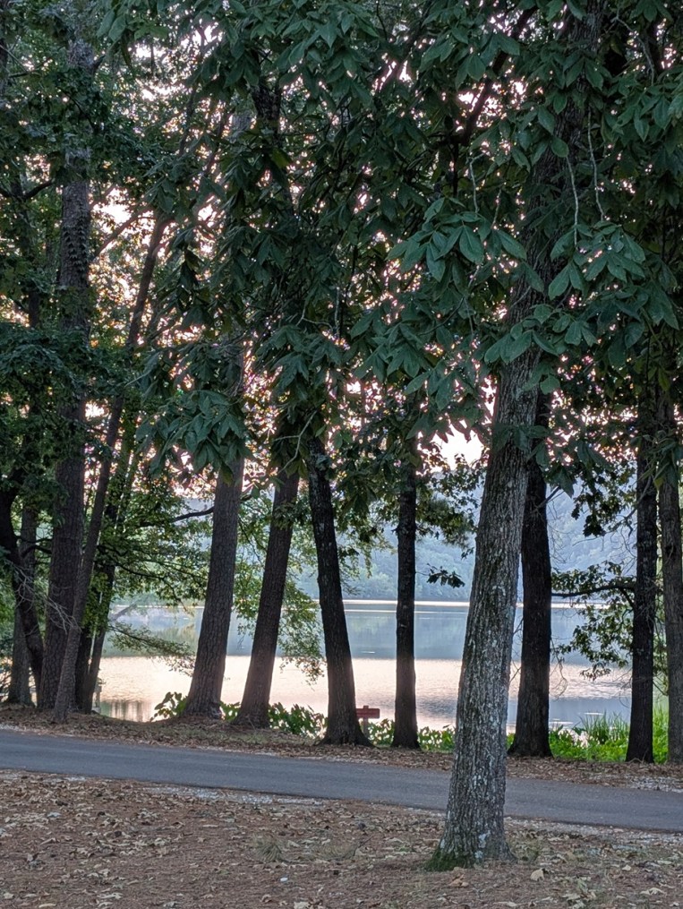
We headed out to Lake Catherine State Park near Hot Springs, Arkansas, with extended family for a long weekend. I had never been there before. The cabins were really nice — modern amenities (powerful AC, microwave, Keurig coffee maker, DirectTV, etc.) — and the campgrounds were full. The lake was quite peaceful, and it was good to get away for a few days. The only downer was that it was hot (100F +) and fairly muggy.
I would definitely come back. (This photo was taken around sunrise.)
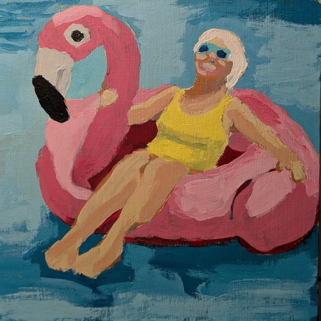
I really liked the vivid colors in the reference image from Ali Kay‘s Fresh Paint class, but there are a few things I learned from this process.
First, I just loathe Phthalo Blue and Phthalo Green — both are way too intense, which just irritates the heck out of me. Plus, I just couldn’t get a good mix of the two for the swimming pool water. (Perhaps I’ll try Cobalt Teal next time, although it’s quite expensive.)
Second, I ruined a beautiful velvety canvas panel by using clear gesso on it after doing the trace. I won’t do that again — it was like painting on sandpaper.
Third, if I paint more figures I need to use a panel larger than 8×8 so I can get the detail properly painted. Once I’m more skilled, maybe I can go small, but right now, it felt like I needed a toothpick to paint the lady’s facial features. Ugh! Her left leg looks deformed at the ankle — I didn’t catch that until now — but her torso looks realistic.
I’m including the entire line-up of WIP photos below.
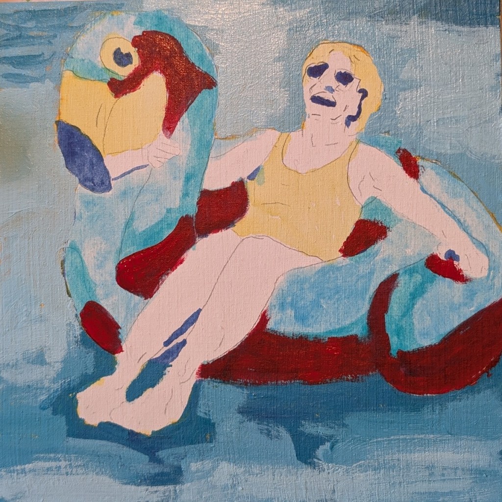
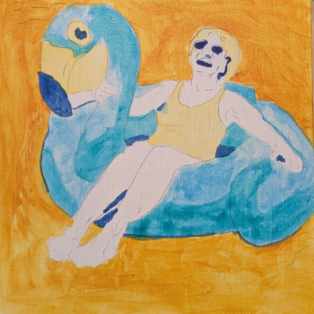
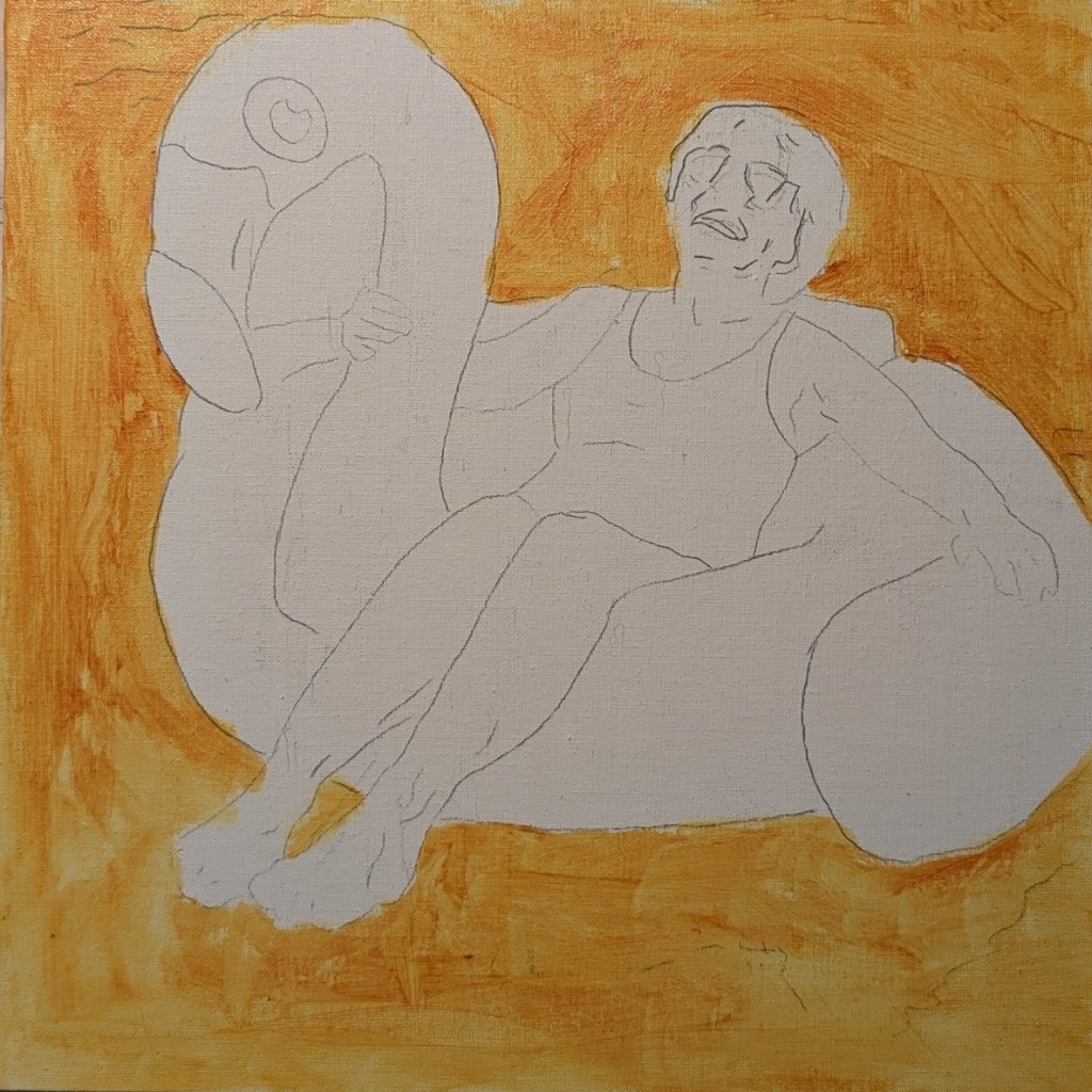
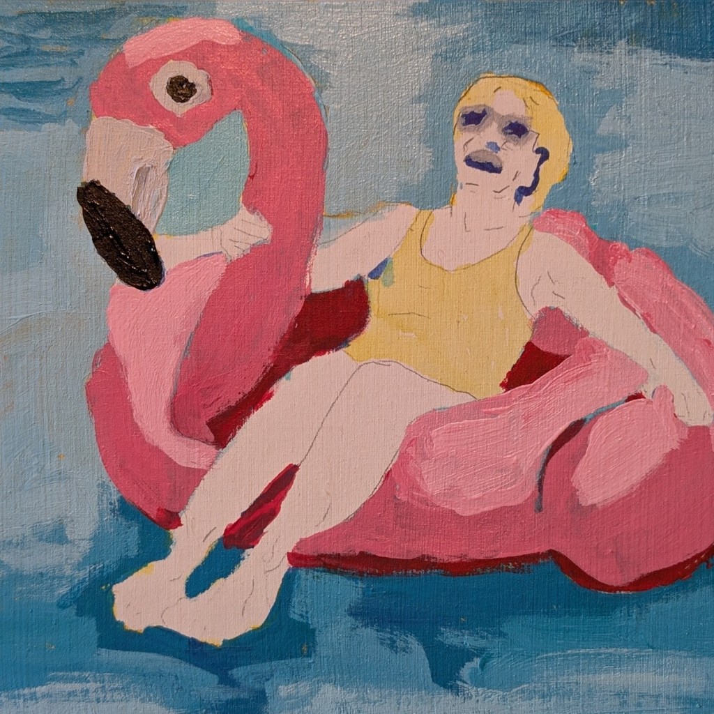
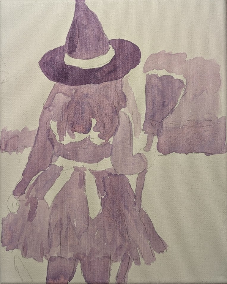
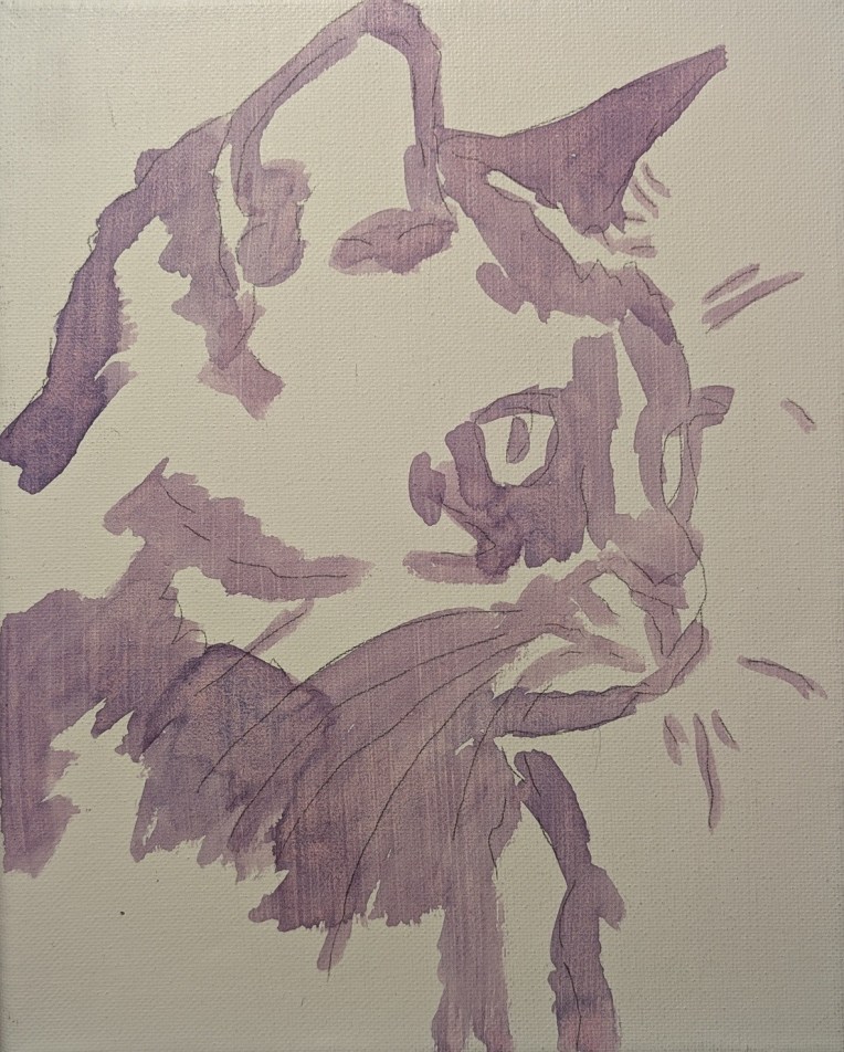
For the Labor Day holiday, I’m working on a couple of Halloween-themed paintings based off classes at Ali Kay‘s Fresh Paint. This is the initial value mapping for both paintings — I used a mix of Ultramarine Blue and Naphthol Red with a fair amount of water. And, yes, I traced the images before setting down a layer of clear gesso.
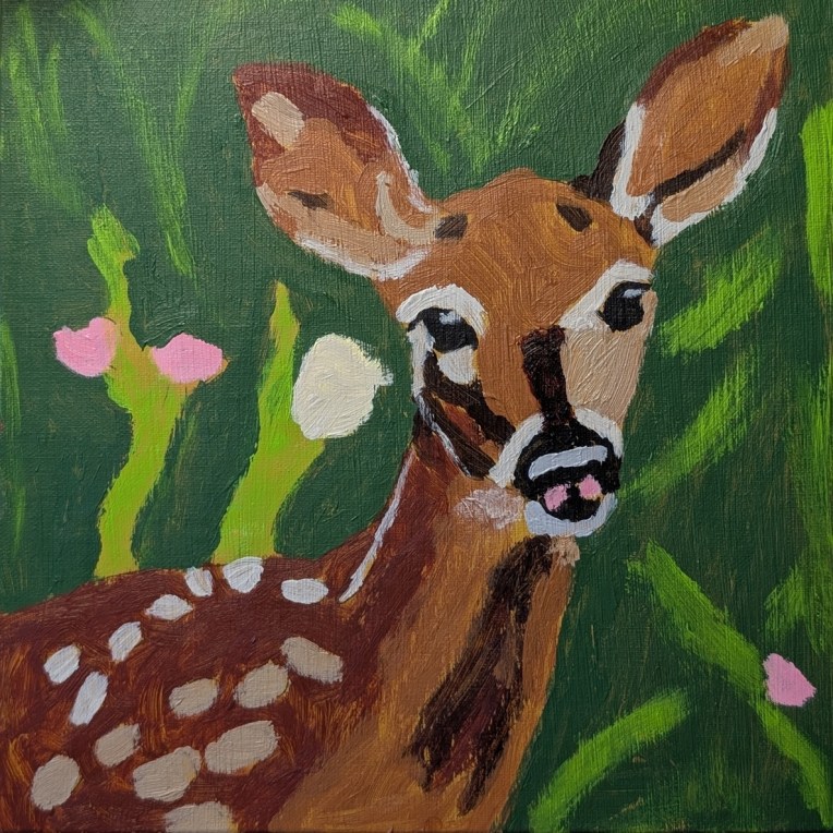
This is another Fresh Paint reference where I skipped the class and just went with the reference photo. I painted the deer on a 8×8 linen panel toned in Yellow Ochre.
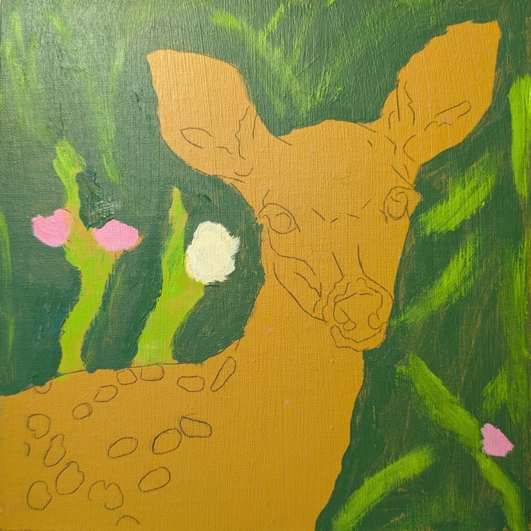
Yep, the reference for this painting is another one from Fresh Paint. Done on an 8×8 canvas panel, and I followed the reference instead of the online class and Ali Kay’s painting.
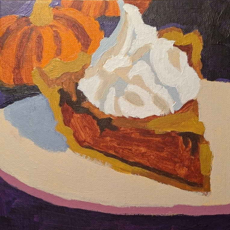
This painting was done on a 8×10 canvas, and the reference is one from an Ali Kay Fresh Paint class. I mostly followed the original photo (included in the class) rather than the revised reference or Ali Kay’s final painting.
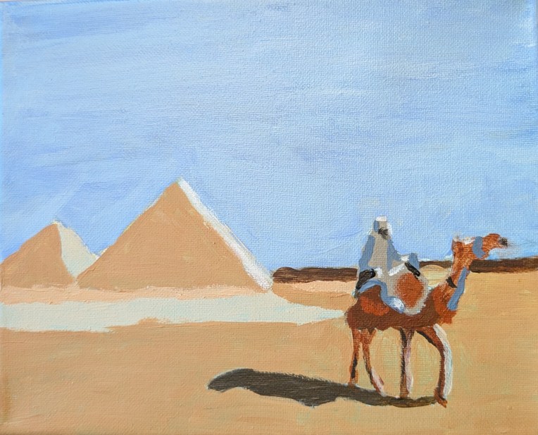
Back in March I painted two children building a snowman based off an Ali Kay Fresh Paint reference. I called it done, but the girl’s hat bothered me. So, I finally fixed it! (The new version is on the left, looking more like a hat with a poufy pom-pom.)
Note: the difference in painting shades is due to the light at the time the photos were taken.