These sketches are based on lessons in the book I bought a few weeks ago (Mark Crilley’s Ultimate Book of Drawing Hands).


These sketches are based on lessons in the book I bought a few weeks ago (Mark Crilley’s Ultimate Book of Drawing Hands).
Just practicing drawing hands…

She’s on the run… and yeah, that “she” is me — or was! Way too many years ago. This was in St. Augustine, Florida.
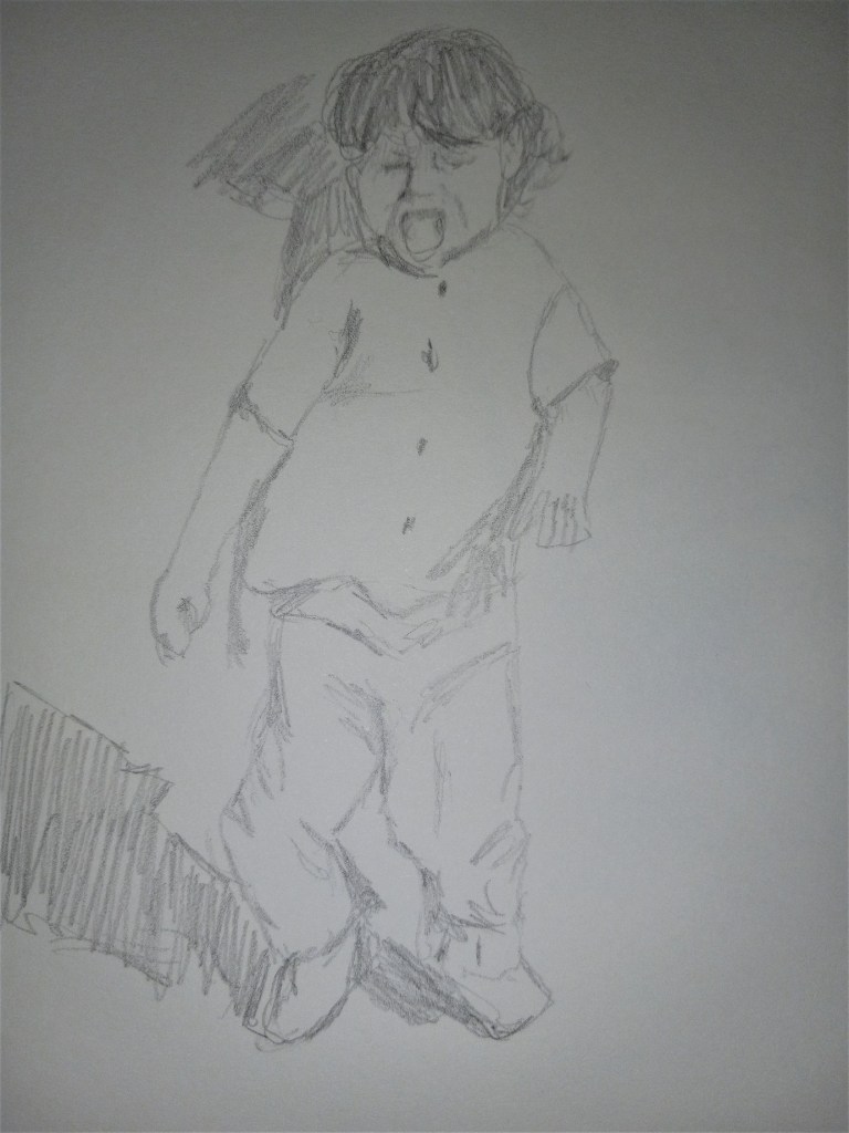
This sketch was based on a reference image provided in the ArtTutor.com class “Drawing the Human Figure & Life Drawing Techniques”.

Today I drew a poppy using willow charcoal, vine charcoal and white “charcoal”. I riffed off the Artists Network Drawing Together episode (102) but mostly just used the reference photo (after grayscaling it). For better or worse, not much following along.

This drawing was done on regular drawing paper (Blick Studio) using willow charcoal. It was based on a reference photo provided in Artists’ Network Drawing Together episode #71.
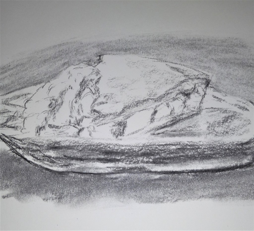
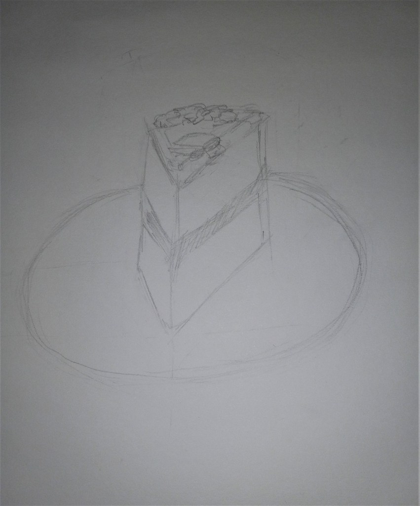
I was checking out the Artists Network “Drawing Together” site, and the 100th episode features drawing a slice of cake. This is my quick sketch attempt. I used graphite instead of charcoal.
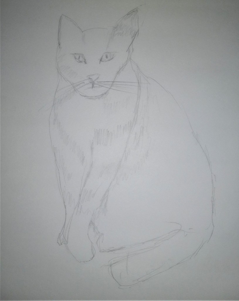
I only had 15 minutes today to do any drawing or sketching at all, so this is Simba, one of my two cats. His face is wonky; the front paw is probably the most accurate part of the sketch.
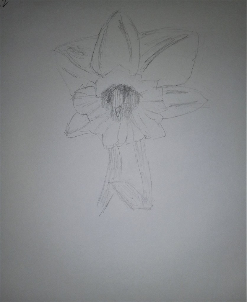
My favorite flower: this was based on a recent trip to the “Dallas Blooms” show at Dallas Arboretum.