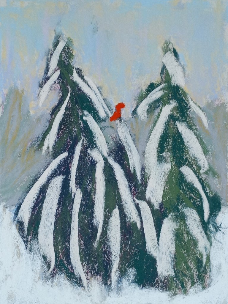
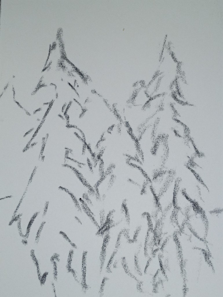
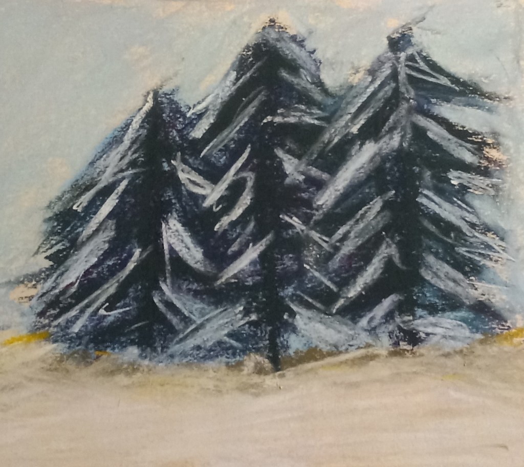
This study was inspired by an image by Yann Allegre on Unsplash. I used the same pastels as I used for my previous effort, but I added a more detailed underpainting using NuPastels, after sketching the trees with vine charcoal.
Author: cathmary1030
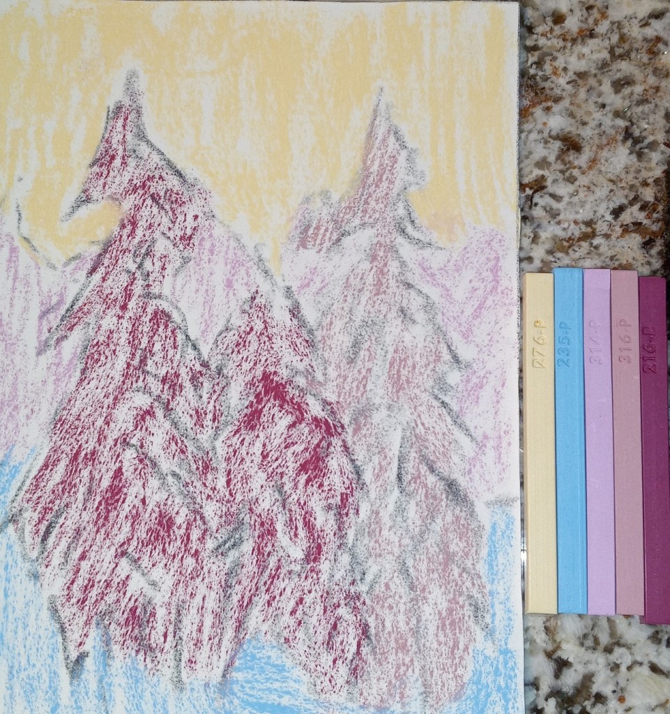
Fir Trees with snow: 1st Attempt
I used a turquoise NuPastel for the underpainting of the fir trees, and the fact that it peeks through is about the only thing satisfying about this effort. The photo doesn’t show the snow well, but I used yellows, pinks and light blues as the snow rather than straight white. The snow on the branches was actually a very pale yellow color — almost white — and a Blue Earth pastel.
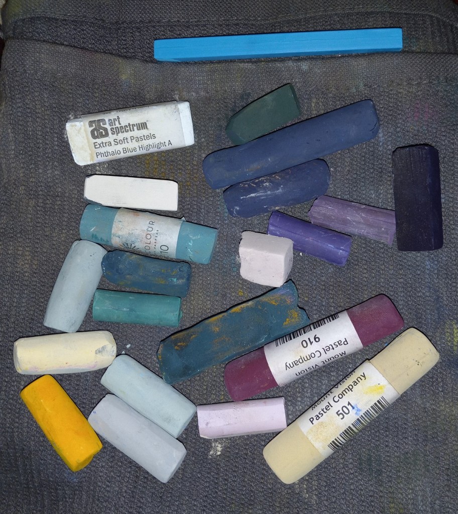
And these are the pastel sticks I used.
Value Studies — From Mitch Albala’s Landscape Painter’s Workbook
I just got The Landscape Painter’s Workbook: Essential Studies in Shape, Composition, and Color by Mitchell Albala. I really don’t know much about painting, although I’ve wanted to do it most all my life. I figured I had to learn how to draw before I painted. (Turns out, maybe, maybe not.)
In any case, the first chapter is about shape interpretation, and the first exercise is to “simplify and differentiate with limited values”. Albala has you do a painting in black and white, using 5 values (so the 3 mid-values are grays). He has you to choose a photo, and then put it in grayscale, squint and determine the no more than 5 values (to simplify). So, I used his photo example first without turning the page to see his proposed value study.
Here is my attempt, and then below it is my copy of how he did the 5 values from his photo in the book. The first thing I realized, after looking at his examples and his comments, is that i totally focus on trying to match the photo. The sky in the example photo is fairly overcast and looks like a “2” value (on a scale of 1 to 5, with 1 being the brightest), whereas the ground at the bottom of the photo looks brightest. But in reality the sky should be the lightest brightest value, so you have to adjust the proposed painting and not necessarily match the photo!
This realization also enforces another idea — there’s a reason landscape painters do paintings “en plein air”. If I were outside doing a value study (or painting) from life, it would be obvious that the sky is the lightest value and you don’t want the ground “fighting” the sky! This can be a downside of photographs.
Below that example, I used my own photo — taken in Sonoma County at a winery (I forget which one) — and my attempt at the 5 values the way I would paint it.
I used NuPastels on toned drawing paper.
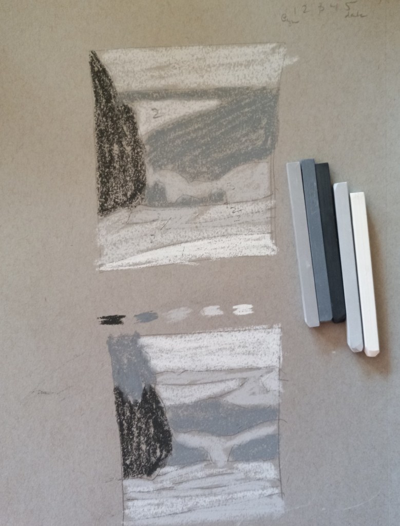
Below is my photo and my idea of a value study.


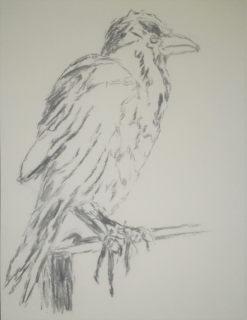
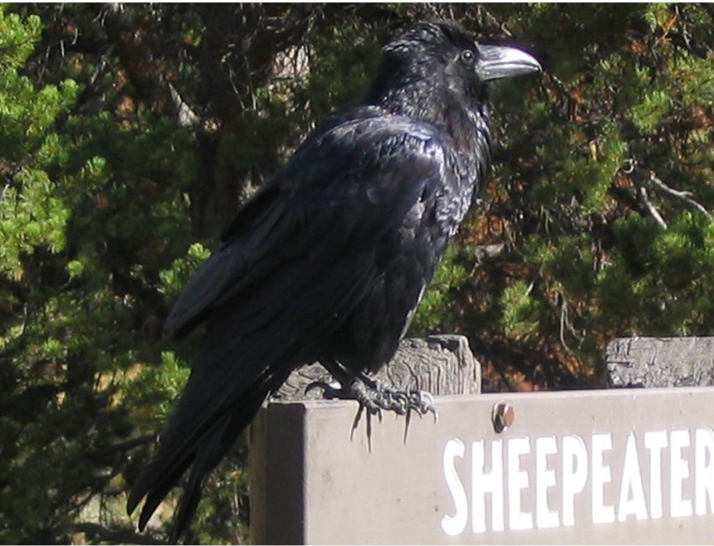
Raven: A Charcoal Sketch
I took the photo of this raven years ago when visiting Yellowstone National Park.
This is one I want to try doing in soft pastels, to show all the silvers and purplish-blues in his black feathers. Therefore, I kept this study quite sketchy.
The reference photo is below.
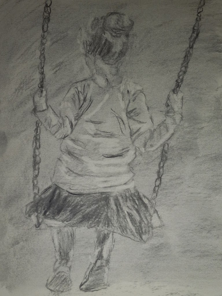
Girl on a Swing
This study, done using vine charcoal, was done on white paper toned first with charcoal powder so I could use the kneadable eraser to lift up color for highlights.
The reference image used was by Rudy and Peter Skitterians from Pixabay.
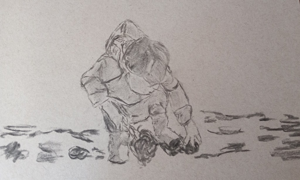
Little Boy on the Beach: Charcoal Study
The reference image for this charcoal study is by Nadine Doerlé from Pixabay.
I’ve used this same image for a work in pastel.
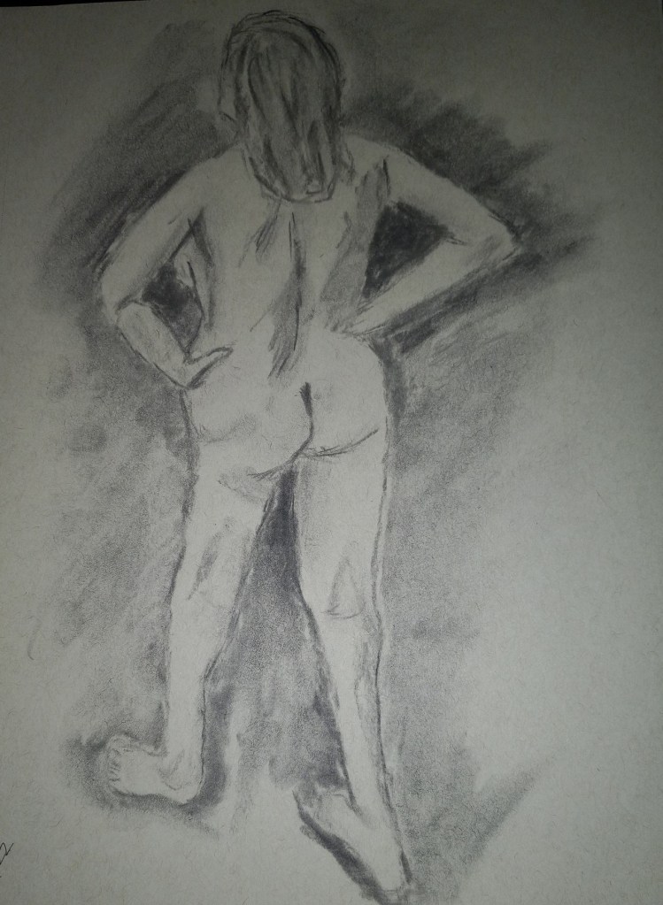
More Charcoal… I’m on a roll.
This is another piece I did, based on the ArtTutor.com class “Studies in Charcoal” by Joann Boon Thomas. Same vine charcoal, and toned paper. This reference photo was one of the instructor’s based on a life drawing she did. I need to find a life drawing class myself, although with Covid, it might be an online/Zoom version.
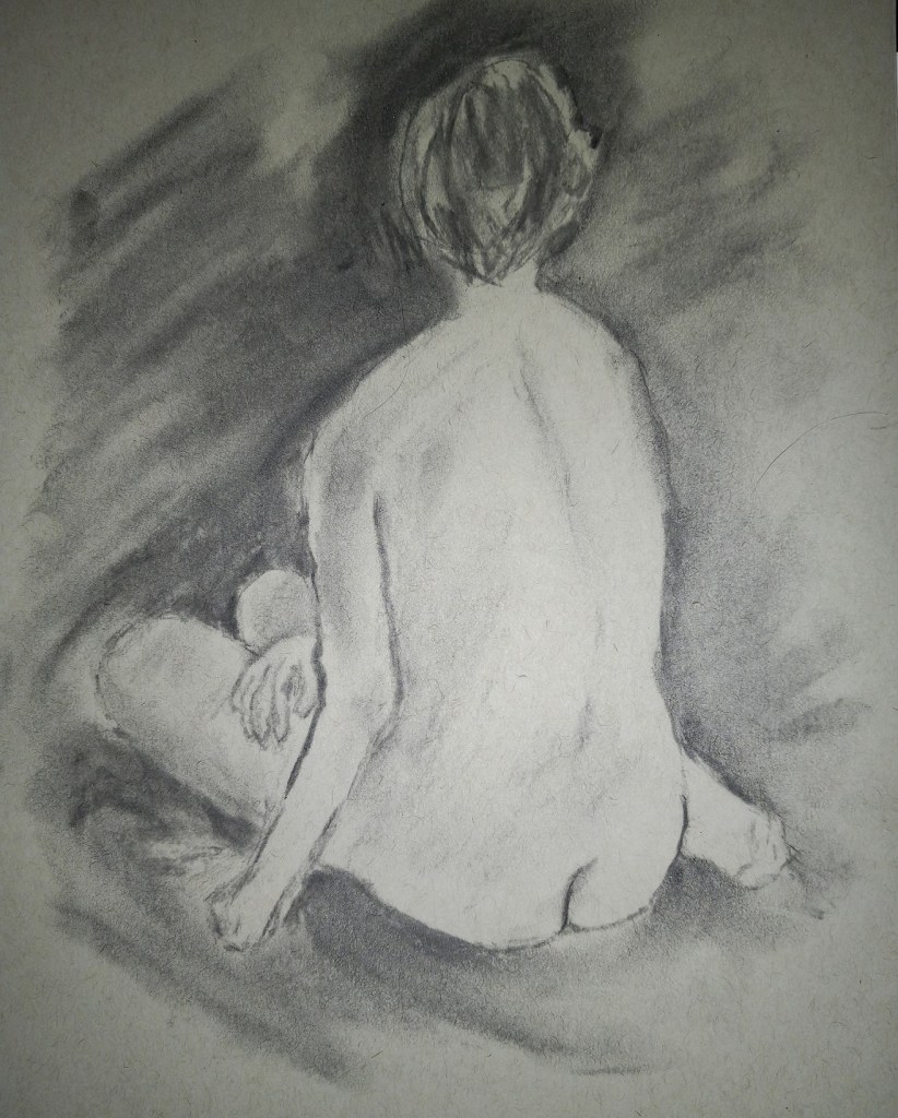
More Classwork from ArtTutor…
This piece, like the one posted yesterday, is also from the “Studies in Charcoal” by Joann Boon Thomas. Same supplies — vine charcoal and toned paper. I definitely need to practice hands and feet.
ArtTutor.com class: Studies in Charcoal
With this art tutorial website going away in March, I’ve been making an effort to use my membership, and one of the online classes I did was Joann Boon Thomas’ “Studies in Charcoal”. This drawing was done on Strathmore toned paper, using medium vine charcoal (which is extremely forgiving — i.e., easy to erase with a kneaded eraser.) The reference photo was provided in class.