I was playing with Adobe Photo Essentials today, and played with applying pointillism to photos I took of tulips and daffodils.

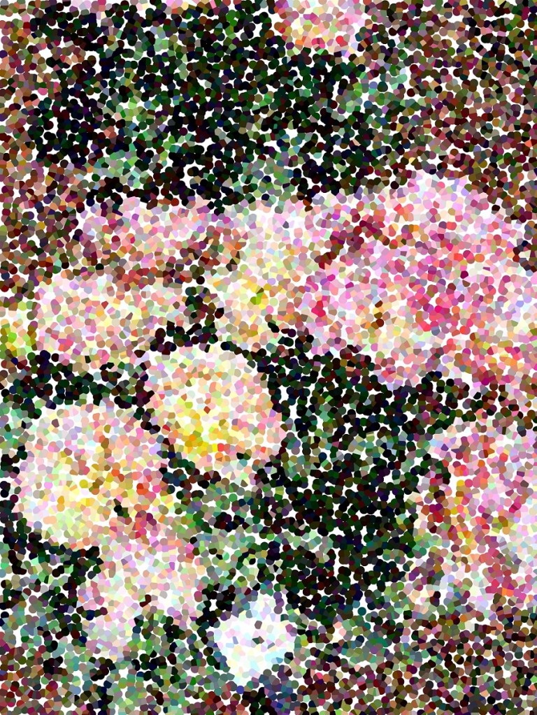

I was playing with Adobe Photo Essentials today, and played with applying pointillism to photos I took of tulips and daffodils.
This is the finished work. I used Staedtler Mars Lumograph Black pencils for the shading. The garlic cloves are out of place somewhat relative to the reference photo used in class.

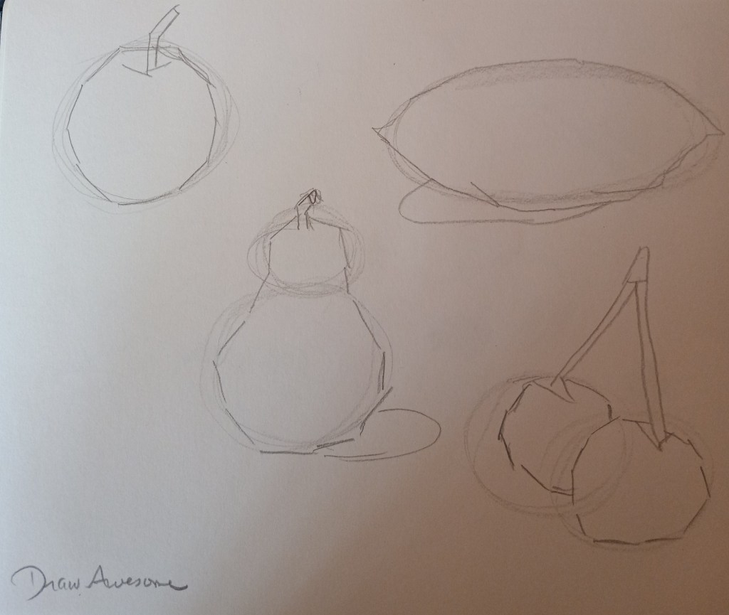
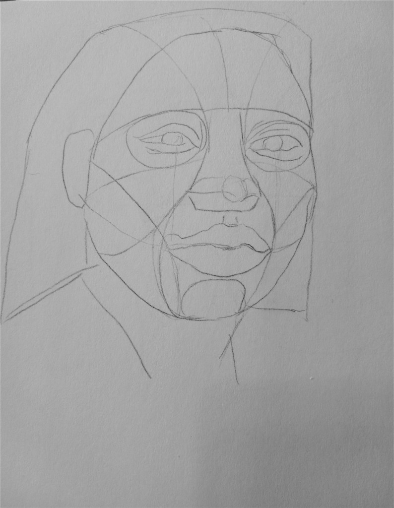
This in-progess work is from a class project, using graphite, from DrawAwesome.

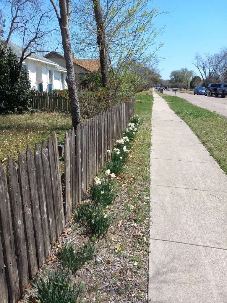
Today I’m posting Nature’s art.. Sunday was too gorgeous a day to stay inside. Lots of sun, nearly desert-dry, and quite warm (almost hot!) at 94 F (34 C). I look forward every spring to walking by this house about a mile from my own — because of the white narcissus in bloom alongside their fence.

So this is the completion.. I used charcoal pencils (2B and 6B) — over graphite and the colored pencil, so that was a fail — and willow charcoal.
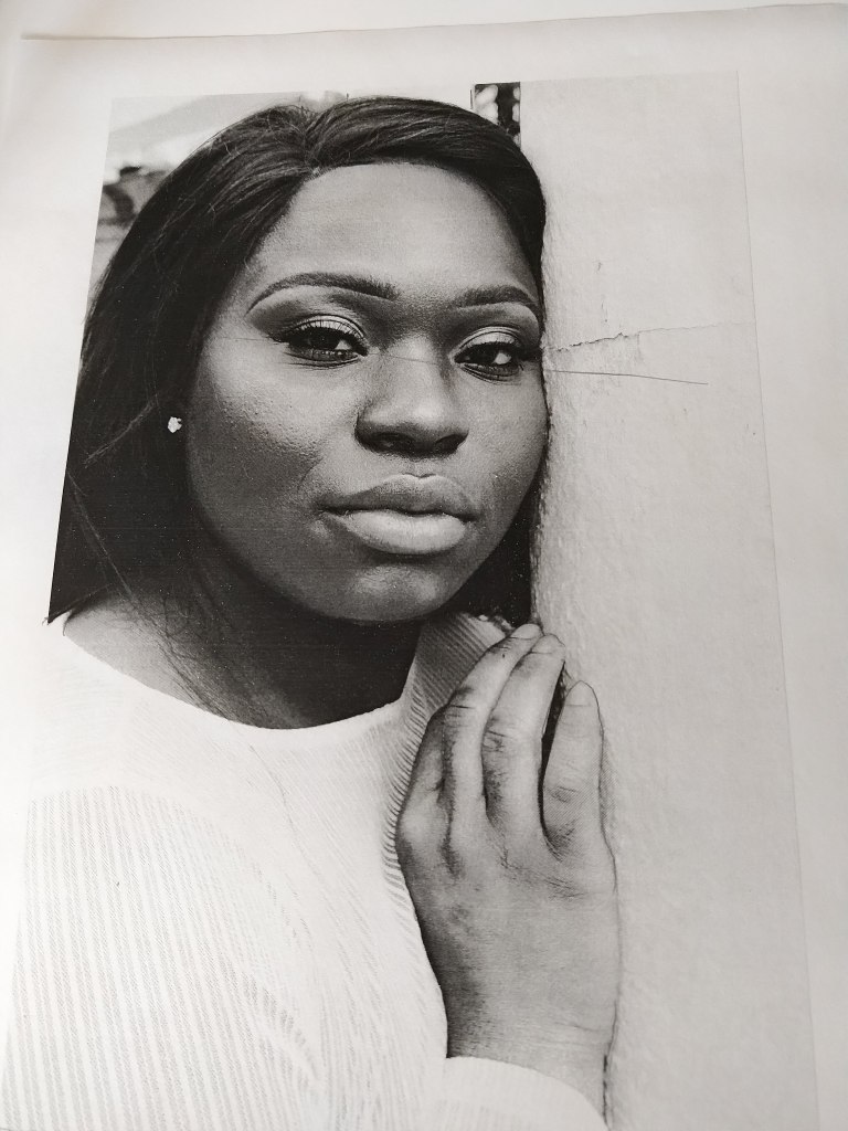
Photo by Clarke Sanders on Unsplash
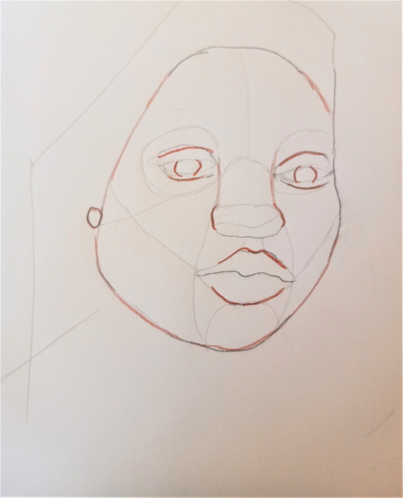
Here’s another attempt — same reference and same tracing — (Photo by Clarke Sanders on Unsplash). Much closer, except for the model’s left side.
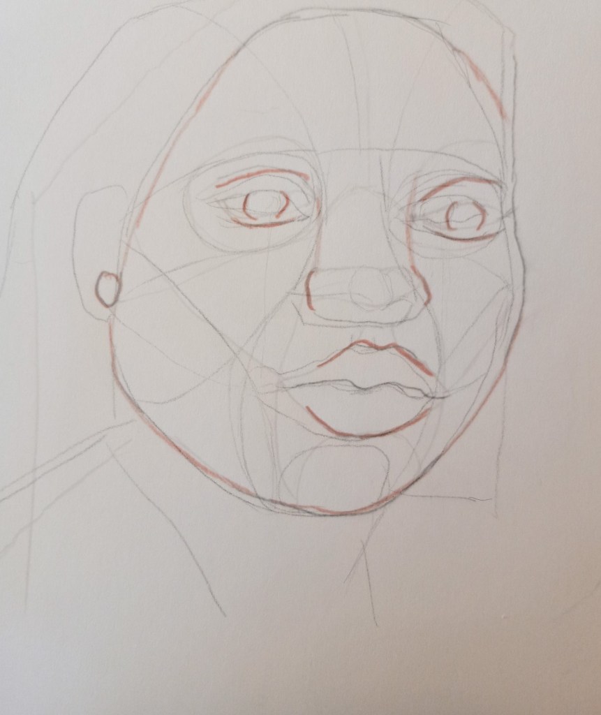
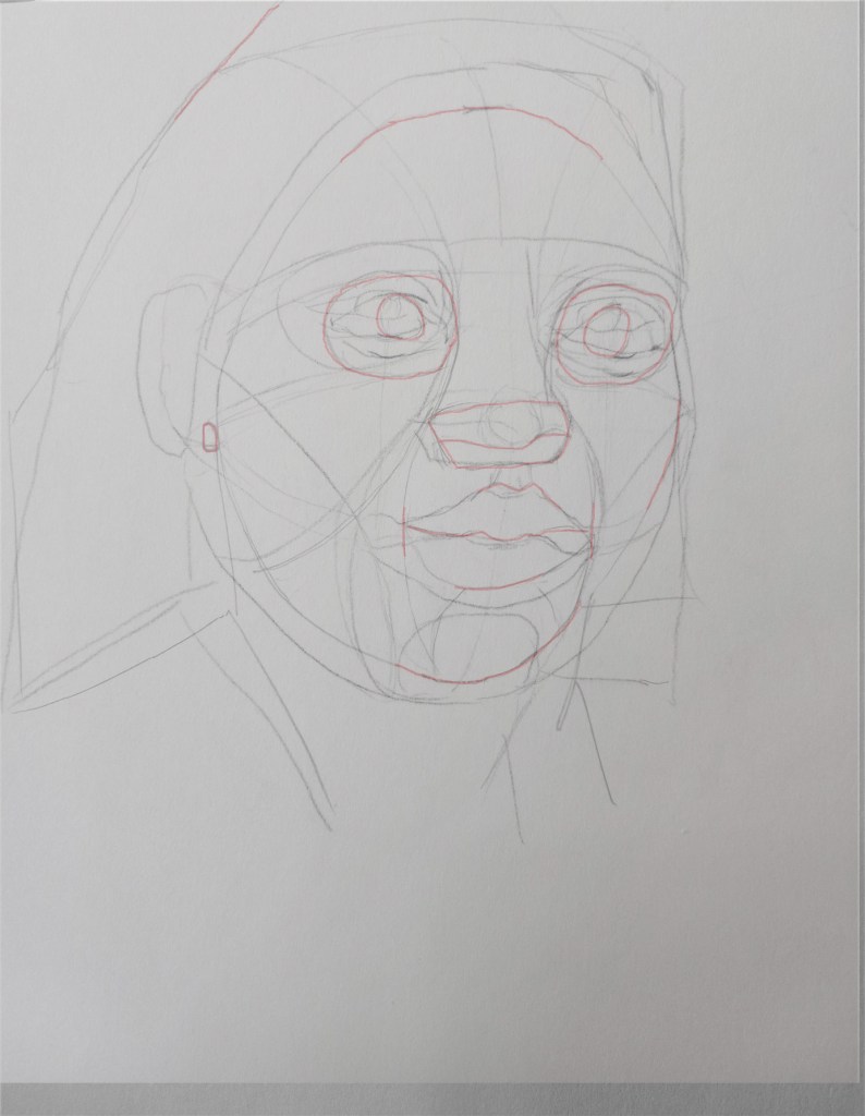
Here I was drawing free-hand against a traced copy of the reference photo (by Clarke Sanders on Unsplash). I merged the free-hand and the traced to see how far (or how close) I was to actual proportions. I added red pencil to the free-hand version so the lines would show up better in comparison.
While the face is relatively in the same proportions as the original, it’s substantially smaller all around. (Sigh.)

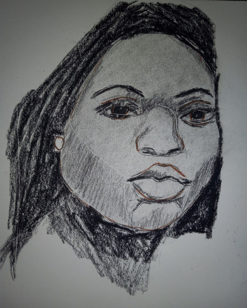
I’m following along in Nathan Fowkes’ charcoal portraits course, but using graphite and my sketchbook instead of charcoal and newsprint.
This is the initial step.

I usually hold my pencil like I would for writing. But now I’m taking (one more!) online course — called Draw Awesome — taught by the same guy who taught on ArtTutor.com (which is closing its virtual doors in another week) and practicing an overhead grip.