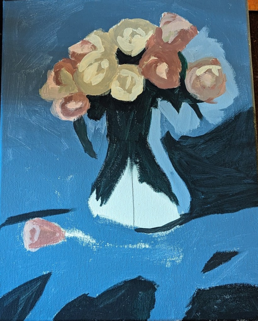
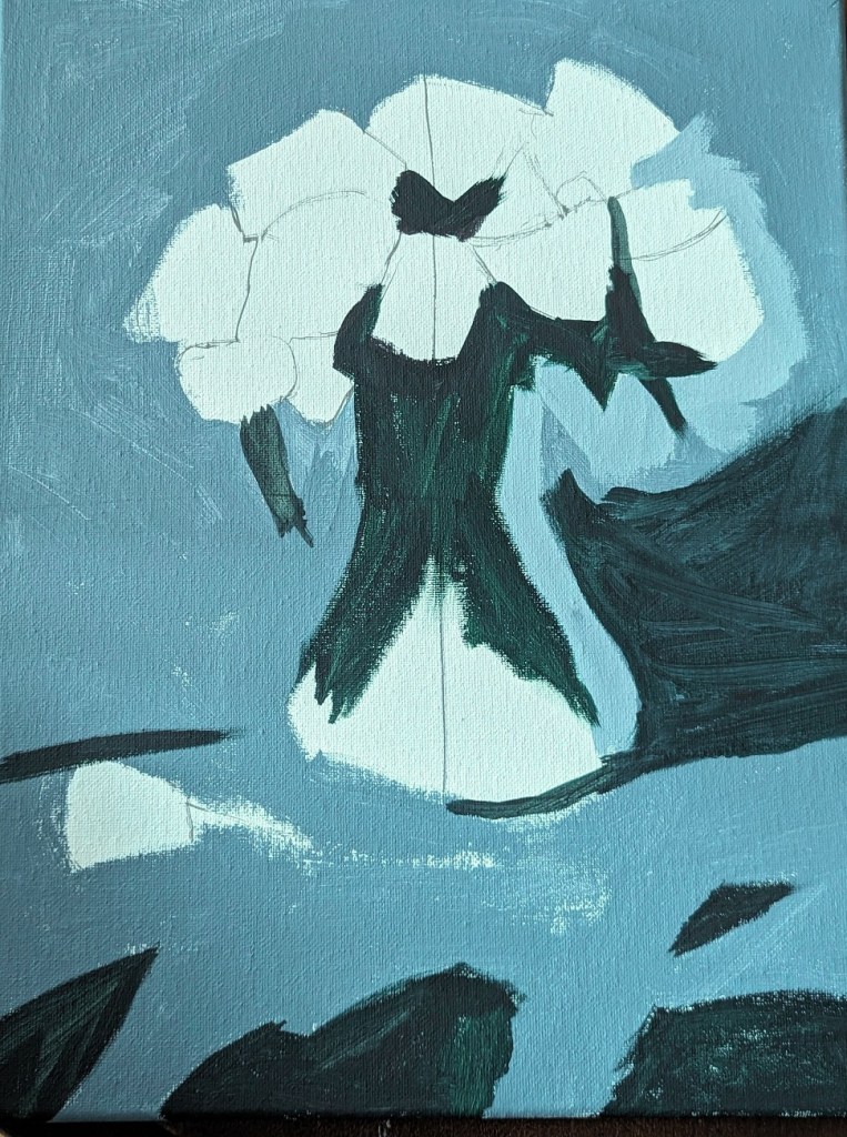
I am working on one of the still life projects in the E-book I bought at Will Kemp’s Art School online. This particular painting is focused on an analogue color scheme of red (pink) and purple.
Author: cathmary1030
Quick Study: Winter Trees in snow
I was browsing through Pixabay and Unsplash for landscape scenes of trees on a hill, and in snow. I was inspired to do this impressionistic work. For the snow, I tinted white with purple, yellow ochre, orange and pale blue. The tree trunks are painted in yellow ochre, burnt umber, orange and purple.
Image by Jason from Pixabay Image by Mali Ancor from Pixabay
Initial Final
Quick Study: A Loaf of Bread
Work-in-progress. I am trying out “drybrushing” in this quick study.
More Bright Yellow & Testing out Paint Markers
As noted yesterday, I had extra yellow paint, so I had painted an 8×8 canvas. I decided to test out some of the acrylic paint markers I just bought, as well as some of the new paint I bought (Amsterdam Expert — a brand I haven’t tried before).
The Amsterdam Expert paint in yellowish green was so thick that I wiped off much of it with a paper towel, hence the smear. I also used some of my alizarin crimson, and Liquitex soft body light blue.
The paint markers are cool; I first heard about them from the Still Life Acrylics e-book I bought from Will Kemp Art School. Kemp uses the paint marker as his drawing tool. (I’ve tried compressed charcoal and charcoal pencil for my drawing tool, and the charcoal smears into the paint.)
Quick Study: Blue Eggs in a Nest
I had some extra yellow (PY74) paint mixed with satin glazing medium, which I painted on a 6×6 canvas panel, not wanting to throw out the excess paint.
But, man, it’s bright! Ugh. Because I had recently been watching bluebirds in their nest on YouTube (they’ve since fledged), I decided to paint an impressionistic nest.
The nest and branch are painted in yellow ochre, burnt sienna, burnt umber, and dioxazine purple.
Work-in-Progress: Copying Sargent
One of the posts on the Paint Coach Patreon page is a portrait-painting tutorial using the portrait of Henry James painted by John Singer Sargent in 1913. The tutorial walks beginning painters through the process of painting the big shapes first, and gradually moving towards smaller and smaller shapes (i.e., more detail).
Chris Fornataro (aka Paint Coach) gives the highlights of that process in a recently posted video on YouTube. A copy of Sargent’s work is on the left; a screen shot from the YouTube video is on the right.
I am not yet finished with my own attempt at copying Sargent, but decided to post my work in progress.
Clementines… From Will Kemp’s Art School
Another artist I found and follow on YouTube and his personal site is Will Kemp, from the UK. He is classically trained, and began with painting in oils, later switching to acrylics because he was working in an area not properly ventilated for the paint thinners and solvents he had been using.
Will Kemp has multiple YouTube videos, online tutorials on his website, online classes for sale (and downloading) in acrylics, and I am finding his style as a useful enhancement to what I’m learning from Paint Coach.
I bought Kemp’s Still Life Acrylic Project E-Book, and am working through it. First up was a project that involved painting a group of clementines. Much of the focus is on setting up your colors by color mixing, which is something I need to learn about.
This was painted on an 8×8 canvas.

A Slice of Red and Green
This is an 8×8 painting of a watermelon slice, and the palette I used.
Lighthouse in the Harbor
This 8×8 painting is another riff off a Mark D Nelson work in his “Learn to Paint in Acrylics With 50 More Small Paintings“. I also prowled Google for images of lighthouses to get further ideas.
If I were to paint this again, I would use masking tape so that my lighthouse would have straight lines. I’m mostly satisfied with the palette used.