I am still on my doughnut painting kick. This painting, done on an 8×8 canvas panel, is based off an image by Mike Gattorna from Pixabay

I am still on my doughnut painting kick. This painting, done on an 8×8 canvas panel, is based off an image by Mike Gattorna from Pixabay
Now, this painting (on an 8×8 canvas panel) was much more fun than the peony bouquet! Again, it was from an upcoming Ali Kay Studio Fresh Paint class (later in October). In this case, I went with the original reference photo, not Ali’s painting or her modified reference image.
(Later: It turns out the original reference image can be found on Unsplash, so here’s the credit for that: Photo by Shelley Johnson on Unsplash)
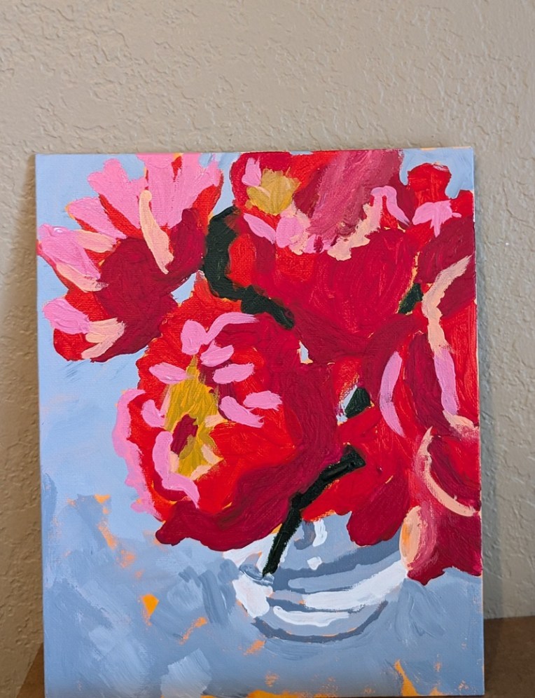
Today I finished the “Peony Bouquet” painting from Ali Kay’s Fresh Paint class (which will actually take place in October). I used her modified reference photo, as well as her own painting (the orange underpainting, the blue-gray background, etc.) as my jumping-off point.
What looks black in the photo is actually dark green. The reds are a mixture of Quinacridone Magenta (PR 122), Pyrrole Red (PR 254) and Quinacridone Rose (PV 19).
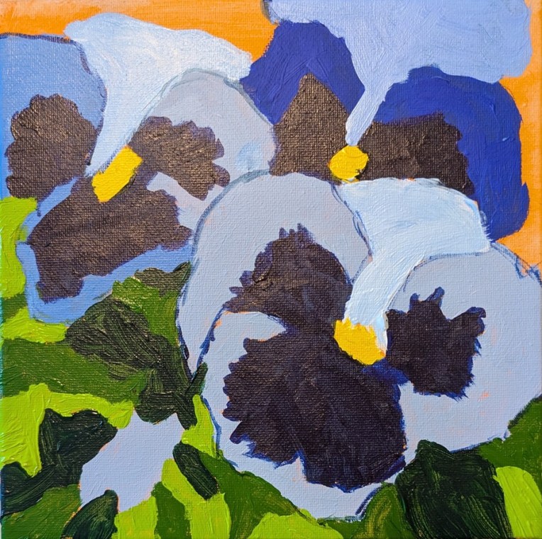
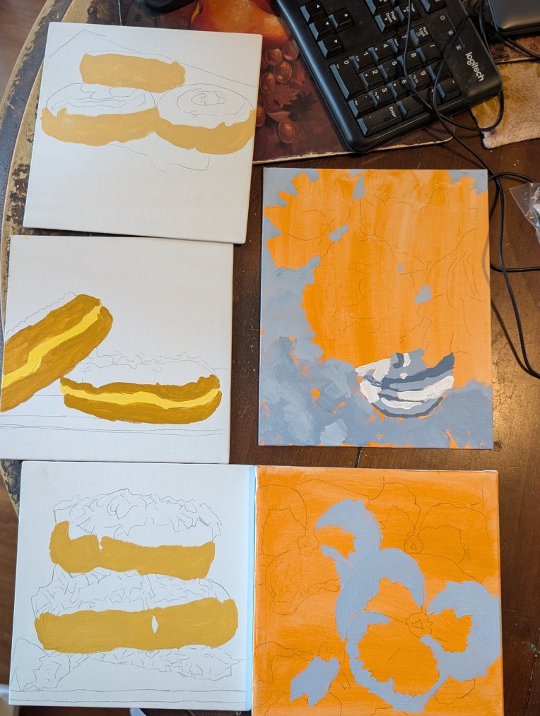
I’m working on 5 different paintings at once.. two from Ali Kay’s Fresh Paint classes (pansies and a bouquet of peonies). Her classes don’t actually start until October so I’m doing my own version. The other three paintings are part of my donuts series and the reference images are from Unsplash.
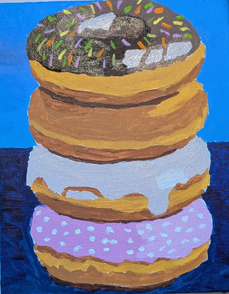
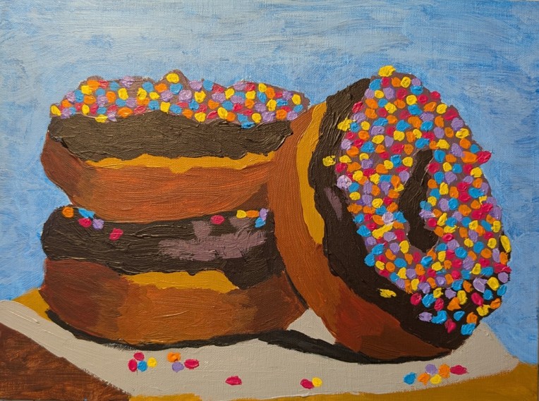
These doughnuts were painted on a 9×12 linen panel, based on a photo by Pushpak Dsilva on Unsplash. I changed the background from black to Cerulean Blue. What appealed to me about the reference image was the bright sprinkles, only I went overboard. Why not?
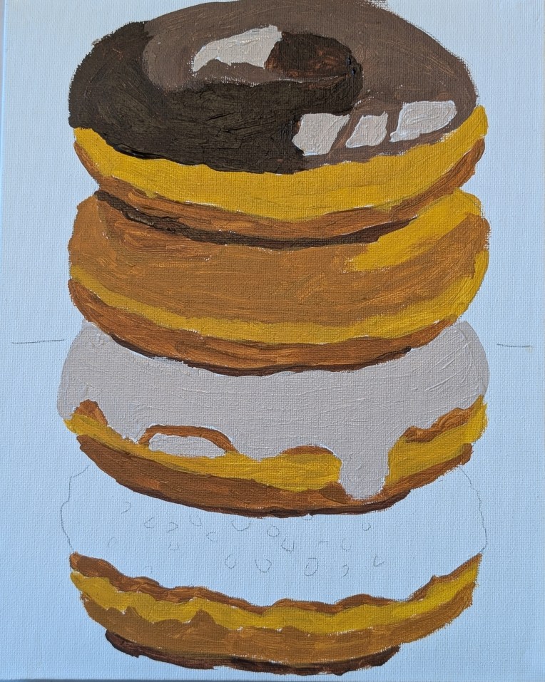
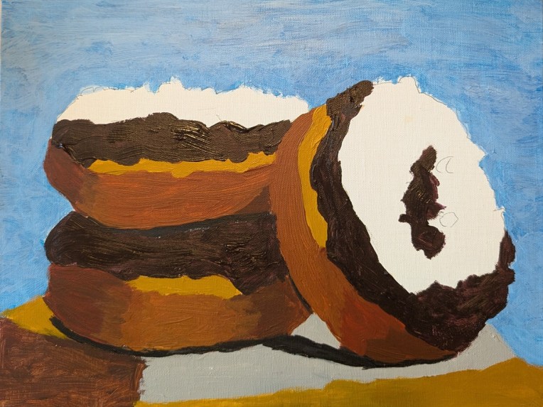
This is a work-in-progress painting on an 9×12 linen panel based on a photo by Pushpak Dsilva on Unsplash.
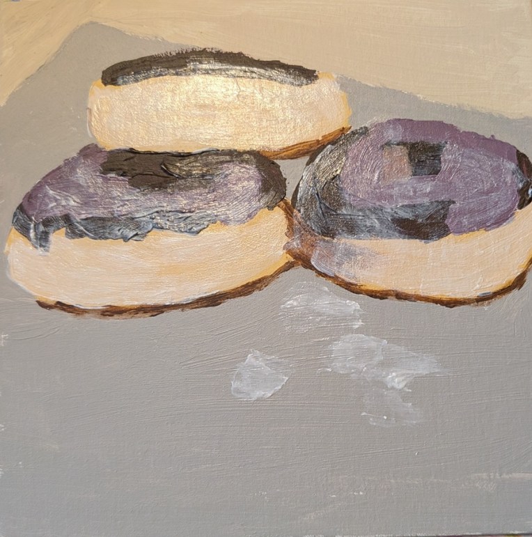
I struggled with this painting, and am going to show some of the struggle. It is based off a photo by Glen Carrie on Unsplash. My final painting is way down at the bottom of this post. I ended up essentially just using the shapes of the 3 doughnuts, and went off on my own, adding frosting to the top doughnut and ignoring the crumble topping of the bottom doughnut.
My first attempt in a side-by-side with the reference photo. This was just a fail — although I DID try the gloss medium mixed in with the yellow ochre paint on top. (Turns out you can’t mix it FAST; it will create air bubbles which then minimize the shine.)
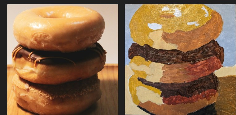
The second attempt is below and I used Yellow Ochre mixed with white, and Raw Sienna (by Golden) mixed with white for the more shaded parts. Ultimately, completely unexciting, but at least the transparency (see above) was gone due to a second layer of paint. Last night, I watched a YouTube video by Marla Baggetta called How to Paint Donuts in Acrylic (I took her online acrylic painting course a few years ago, plus some of her pastel classes). Anyway, for the chocolate frosting, she mixed a touch of Dioxazine Purple with Burnt Umber so I tried that for this version of the painting. (In HER reference photo, the purple cast of the chocolate is easily seen, but I like the deeper dark the mix brings.)
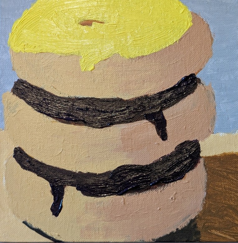
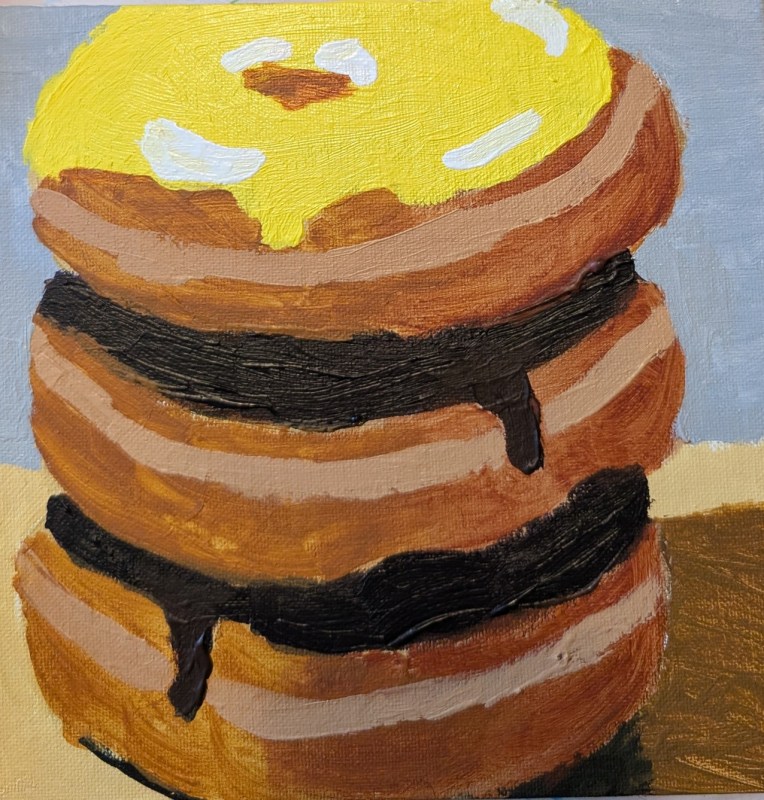
Finally, here is the painting I am calling done. I painted over the above painting, using Raw Sienna and Burnt Sienna without any white. I added another coat of yellow “frosting”, and added a middle seam to the doughnuts, touched up the chocolate frosting, and then the highlights.
Here, I was experimenting with making my white paint (aka the frosting) glossy. It definitely painted on as very shiny, but now that it’s dry, much — but not all — of the shine is gone. It looks like I will need to continue to experiment with the ratio of glazing medium to paint. Or, I may need try some of the other mediums I have like matte medium.
(UPDATE: I just learned that the likely best candidate for making my paint look glossy is the gloss medium — NOT the glazing medium. I’ll have to purchase some and test it out.)
This doughnut was painted on an 8×8 canvas panel, and the image is by Ali4364 from Pixabay.
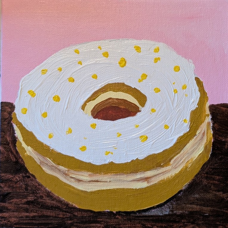
I got this reference from a January 2026 Open Studio Hours Session for Fresh Paint VIP members. I didn’t attend the session, and went my own way with the colors. This was painted on an 8×10 canvas panel.
I painted glazing medium on top of the dark paint after it was dry — turns out that’s a mistake. (Hence the weird blur on the finished painting on the left.] It’s better to mix in the glazing medium with the paint so that it ends up shiny and glossy like frosting. Live and learn! I may redo when I have more time.