Yes, this IS a type of sunflower! Since it’s different, I decided to paint it on a 5×7 gessoboard.
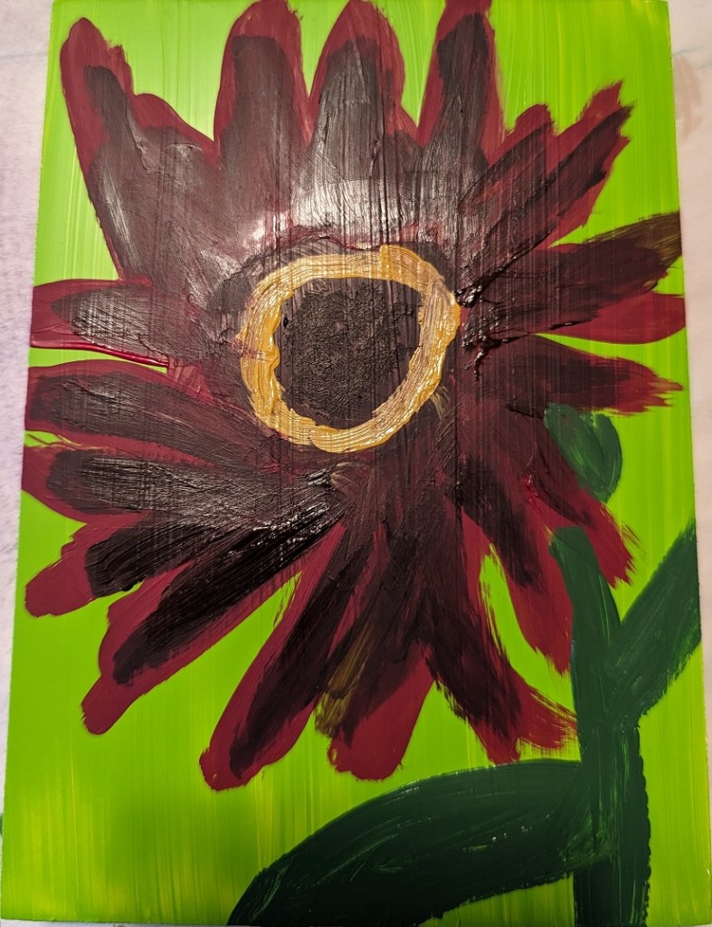

Yes, this IS a type of sunflower! Since it’s different, I decided to paint it on a 5×7 gessoboard.
This painting was done by “winging it” — meaning, no specific reference photo. I wanted to try building out my sunflower with a base of green petals. Below is the result. I’ve layered the petals with Liquitex cadmium-free lemon, and cadmium-free yellow medium, as well as yellow ochre and dioxazine purple.
I did this on a piece of 6×8 300-lb. watercolor paper.

I’ve been unsatisfied with my sunflower painting so the other day I googled “how to paint sunflowers in acrylics”. The search results were a bounty of different YouTube videos. Well, naturally, some sunflower paintings appealed to me more than others so I watched about half a dozen.
What I found was, naturally, everyone has their own way of painting sunflowers. Some start with the background, some start with the dark center of the flower. However, the colors they chose for painting the flower were largely in sync across the board — and with my own paintings: yellow, yellow ochre, burnt sienna, burnt umber, etc. etc.
One process I decided to try, though, was to do more layering of the petals, and start with a round of yellow ochre first, applying the brighter yellow afterwards. This painting on an 8×8 canvas was just from my imagination, and the mix of all the sunflower pictures I’ve been looking at lately.
I wasn’t particularly satisfied with my pink and white roses in the vase a few posts back so I tried winging this one (on 6×8 watercolor paper). I like the colors, but this is a pretty abstract “symbolic” rose.

I’m still fired up about sunflowers, and trying to improve. This work was based off the image by Nadine Doerlé from Pixabay.
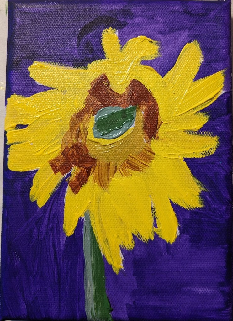
I did the background is dioxazine purple, a complementary of the yellow. (I think I’m better at drawing out the sunflower than painting it!)
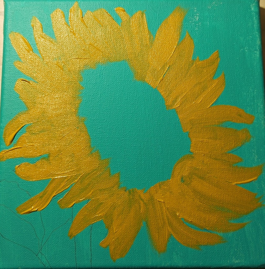
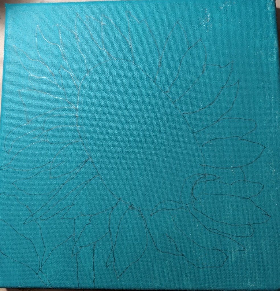
Step 1 – draw out the flower; Step 2 – paint the background

Then I painted the flower petals and the center.
And, last steps.

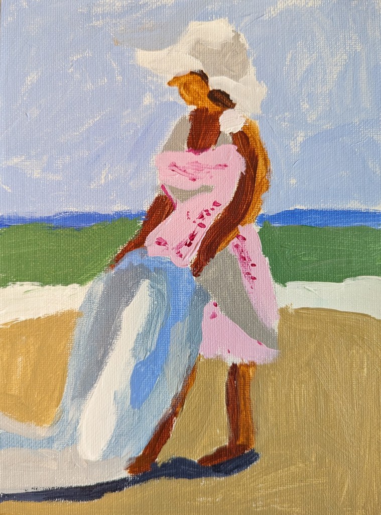
I’m taking an online class (more precisely, watching streaming demos online) by Peggi Kroll-Roberts who is particularly known for her beach photos of human figures. The class is about value structures to show the form of the human figure: the lights and darks.
Effectively, this is a notan. You start with 2 values and then move to 2 darks, 1 light or 2 lights, 1 dark. And then you move to color.
My next step here would be to paint in black and white, then to move to 3 values, and finally to color — using colors mapped to the values.
In fact, Laurel Hart, in her 2007 book Putting People in your Paintings (on p. 23) even suggests you even go ahead and paint over your penciled-in shadows if you prefer. You can erase the pencil later.

I recently purchased the June 2019 of Leisure Painter which had an article by Steve Strode about the basics of acrylics. He suggests you model good painters, and gives an example in the magazine of his painting based off of Peggi Kroll-Roberts‘ style.
This is the first figure I’ve ever painted, and my goal was 1) just to do one, and 2) was trying to focus on using minimal brush strokes — just to boldly attempt it, in other words.

I updated the flowers because I felt like they were too washed out. Still need to update the cloth the vase is sitting on — LATER.
The revised painting is on the left; the former version is on the right.


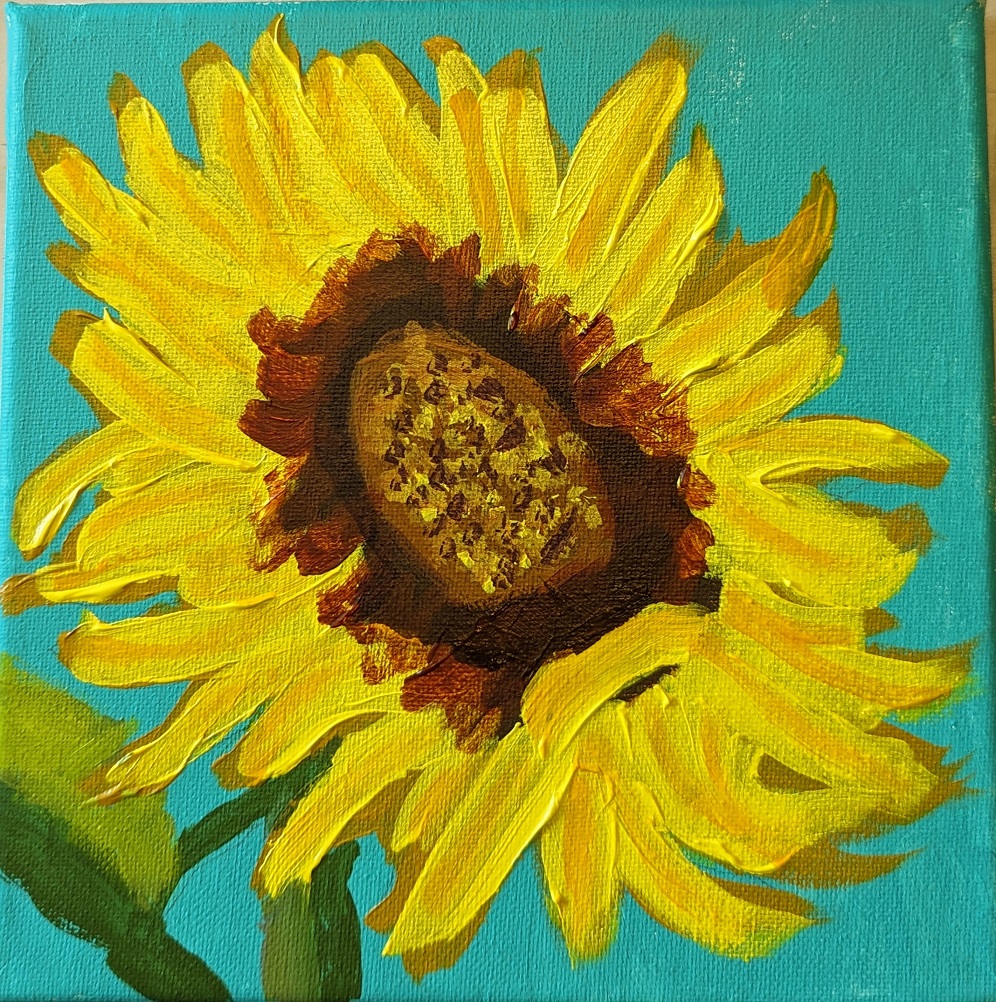
This 6×8 painting of a sunflower is based off the image used for Episode 29 of Artists Network Drawing Together series. What I did differently from the others I’ve painted was that for the shadowed part of the leaves, I mixed my yellow with a touch of Dioxazine Purple to desaturate it (rather than using Yellow Ochre). Ditto for the center of the flower; there’s a lot of the purple mixed in with yellow (although I also used Burnt Sienna and Burnt Umber).
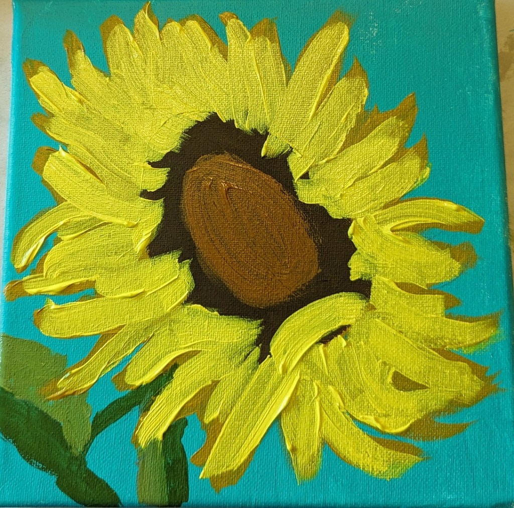
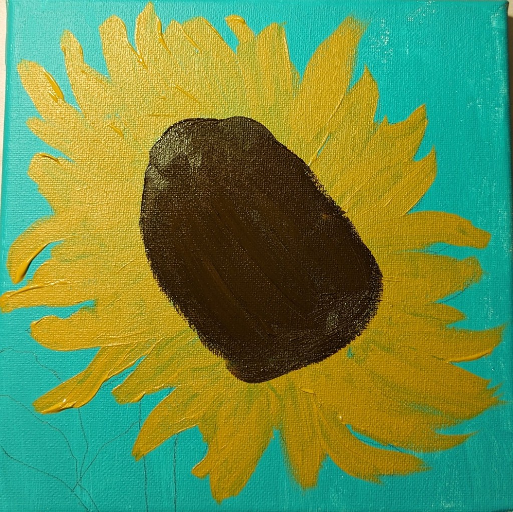
Here’s the work-in-progress.

And here’s the finished piece.

