I updated the flowers because I felt like they were too washed out. Still need to update the cloth the vase is sitting on — LATER.
The revised painting is on the left; the former version is on the right.

I updated the flowers because I felt like they were too washed out. Still need to update the cloth the vase is sitting on — LATER.
The revised painting is on the left; the former version is on the right.


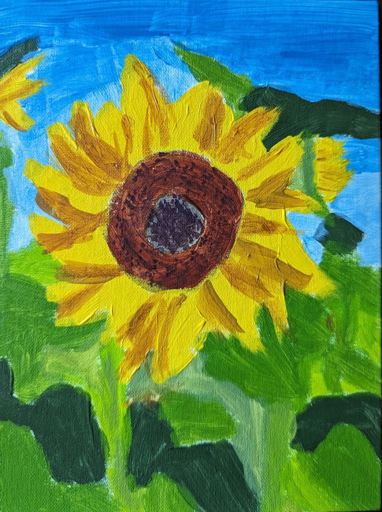
This 6×8 painting of a sunflower is based off the image used for Episode 29 of Artists Network Drawing Together series. What I did differently from the others I’ve painted was that for the shadowed part of the leaves, I mixed my yellow with a touch of Dioxazine Purple to desaturate it (rather than using Yellow Ochre). Ditto for the center of the flower; there’s a lot of the purple mixed in with yellow (although I also used Burnt Sienna and Burnt Umber).
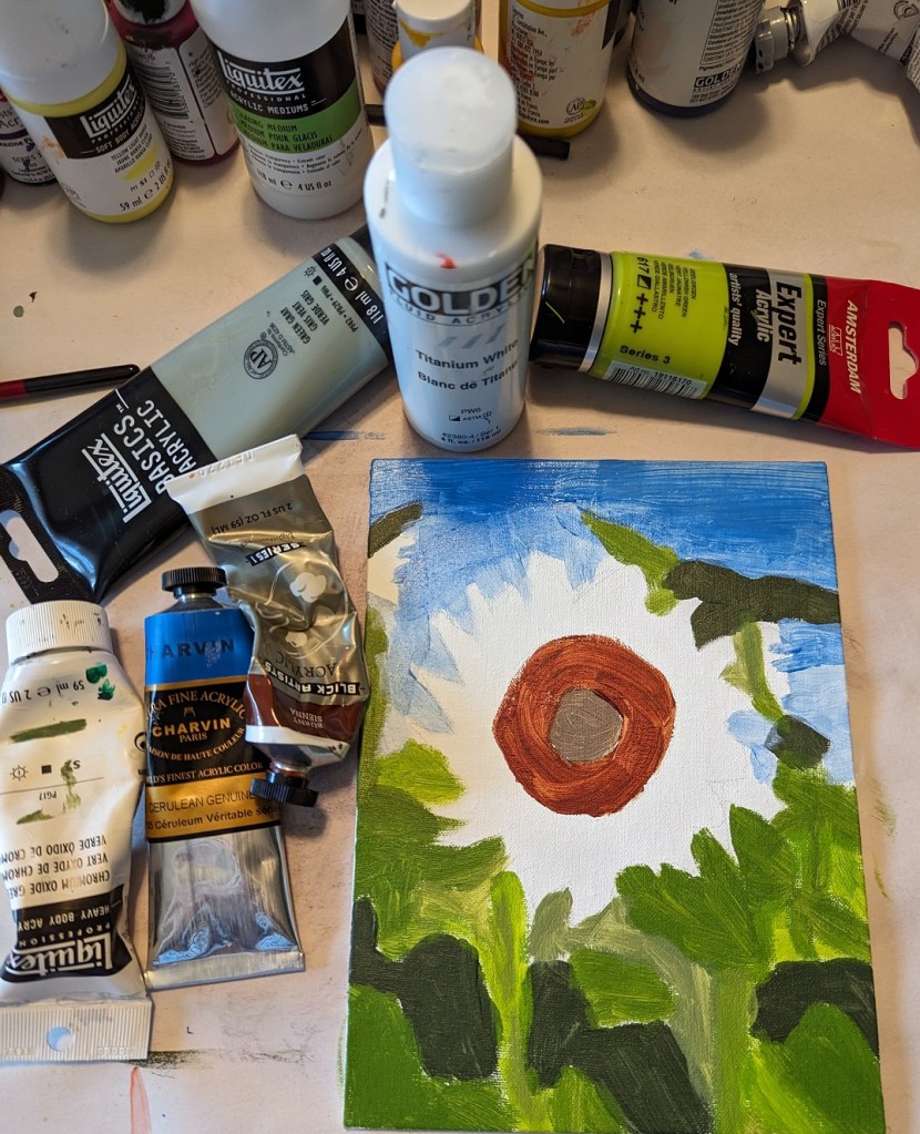
Here’s the work-in-progress.

And here’s the finished piece.


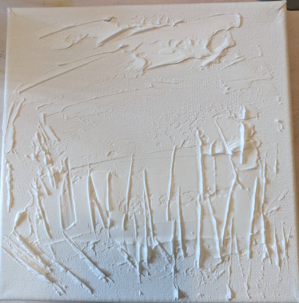
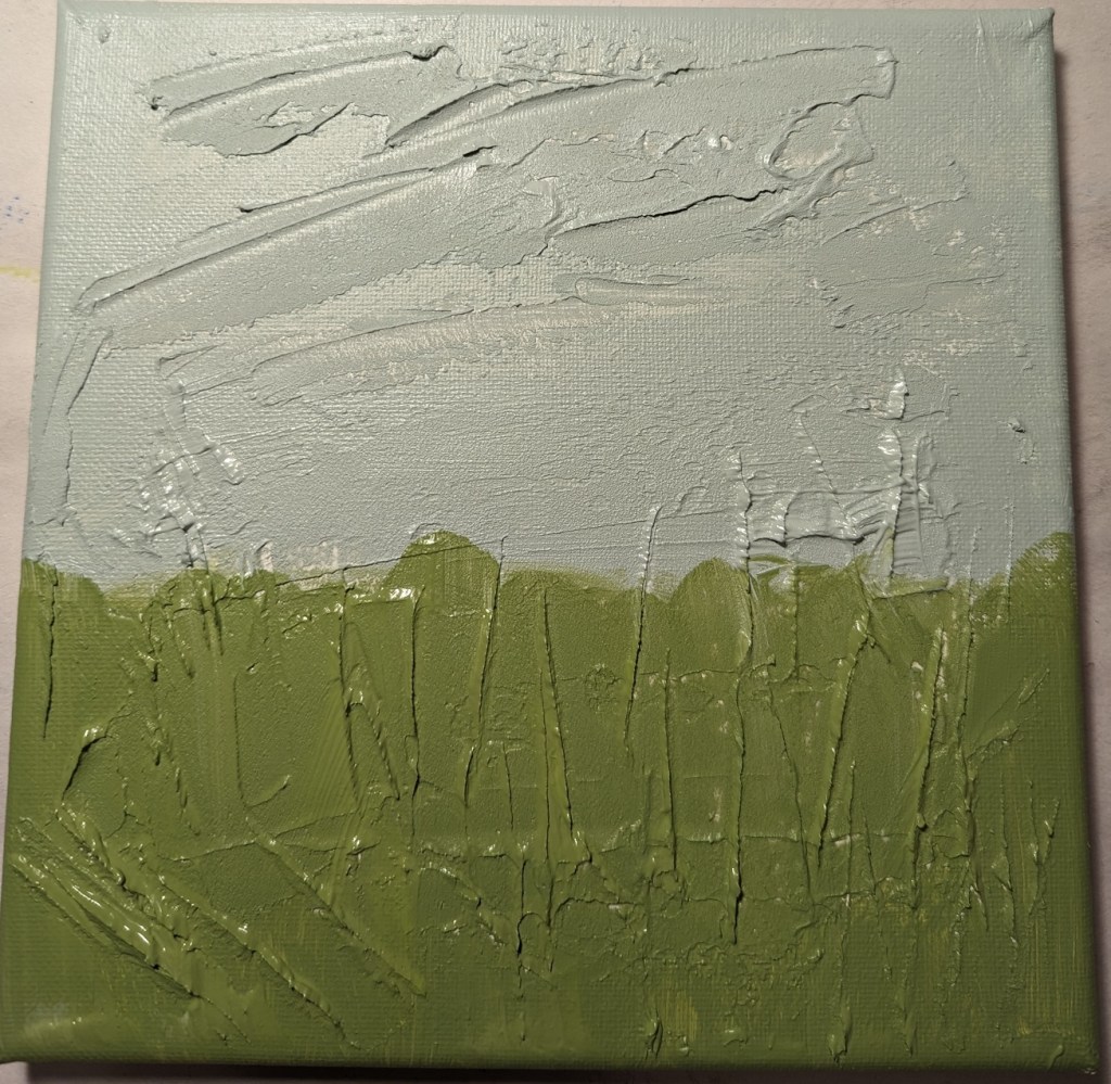
This painting was based off an image by RÜŞTÜ BOZKUŞ from Pixabay, and an article I found on the UK site Painters Online. I used an 8×8 canvas for this work, and took photos of each step I took.
Step One was to apply the modeling paste. The horizontal “goop” was to signify clouds; the vertical lines was to signify weeds and plant stalks.
After applying the modeling paste and letting it thoroughly dry, I went in my own direction rather than following the Painters Online demo.
I used a gray green mixed with a yellow green for the grasses, and a gray blue for the sky area.
Green is reportedly not a good color to use alone when doing landscapes and meadows. So, my next step was to apply a transparent orange glaze (using Liquitex Gloss Glazing Medium over the green paint, and let that dry thoroughly.
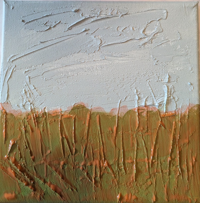
After the glaze dried, I added a darker value in the center bottom (to match with the reference photo) as well as adding a glaze of Cadmium Red Medium Hue for the clouds.

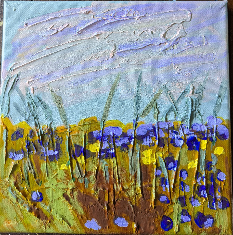
Next I painted the flowers, using Dioxazine Purple with some Titanium White, some yellow flowers, and highlighted the stems with Gray Green, yellow, and Burnt Sienna. I retouched the grassy area with some green. Then I added some of the Dioxazine Purple mixture to the clouds in the sky, and called it a day.
(The photo here doesn’t fully reflect the periwinkle/purple color of the flowers; they look too blue.)
This charcoal pencil sketch is based on an image by sarahbernier3140 from Pixabay, which I intend to paint at some point soon.

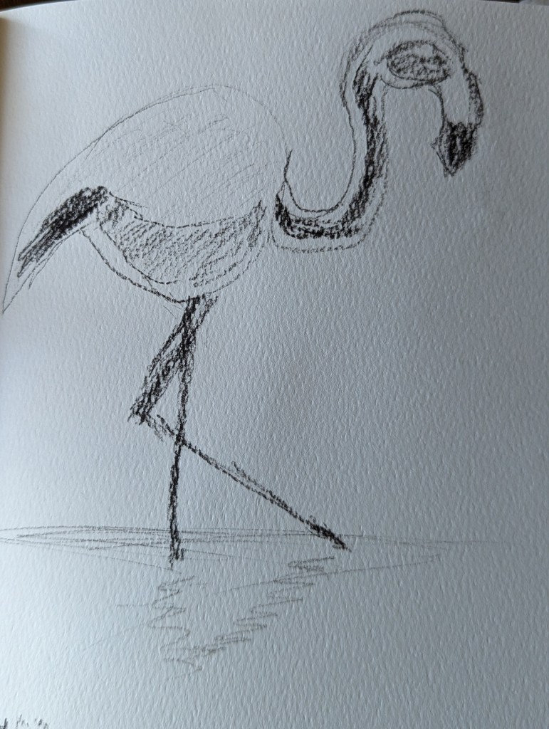
I did this charcoal pencil sketch of a flamingo in my Arteza sketchbook. My intention is to paint it at some point.
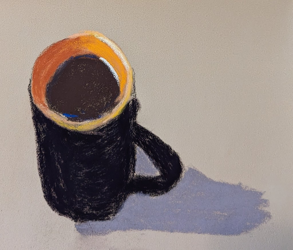
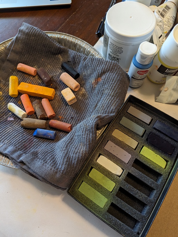
These pastel paintings were done based off an image by นิธิ วีระสันติ from Pixabay.
I used the same pastel palette for both (mostly) — Blick, Richeson, and Terry Ludwig sticks.
The paper on the left is Art Spectrum Colourfix, and the paper on the right — which I found easier to work with — is Clairefontaine Pastelmat.

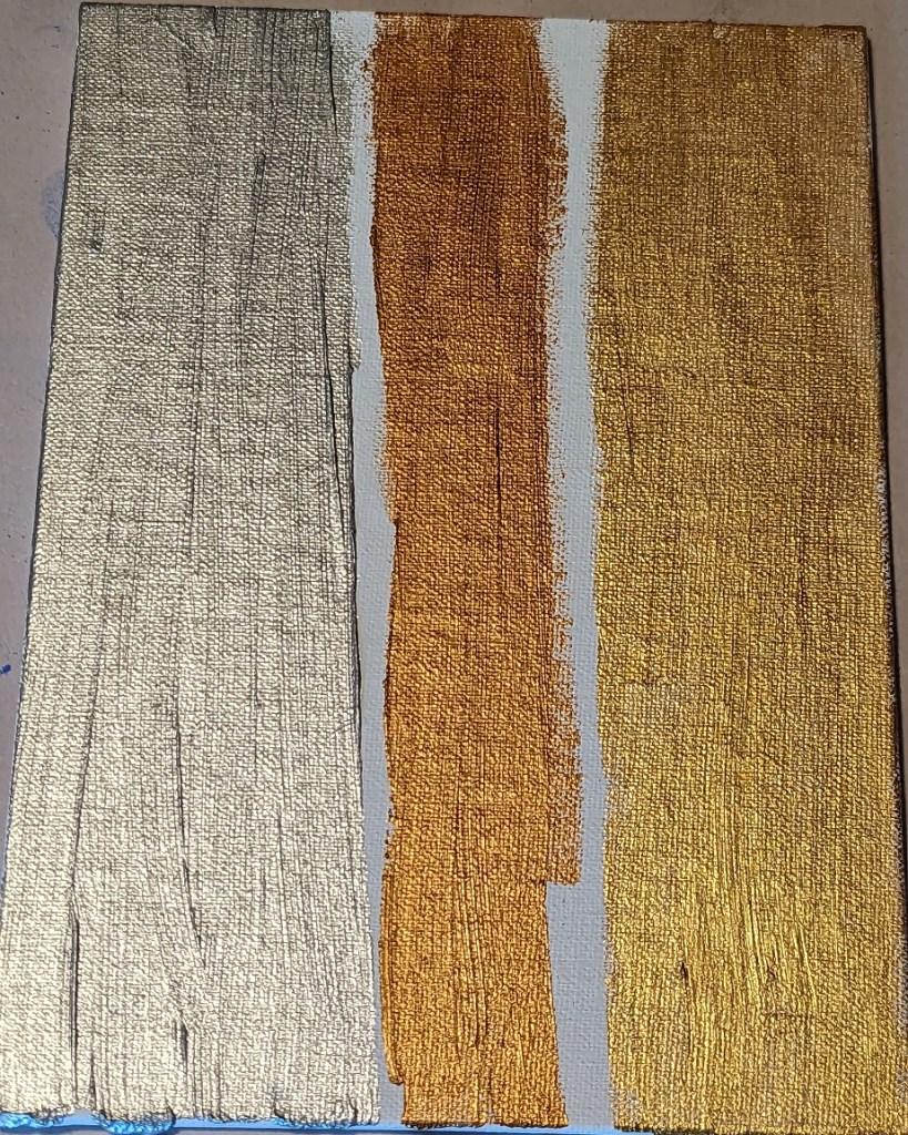
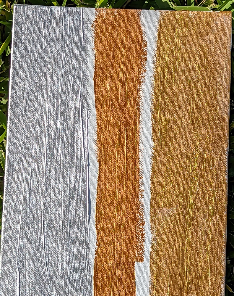
I got some Lascaux Metallic paints, and haven’t used them yet. (When DO you use metallic paint in an acrylic painting?) I painted samples, and photographed them indoors under an overhead light [left], outdoors in a shaded area [right], and outdoors in the sun [bottom].
Don’t they look cool?

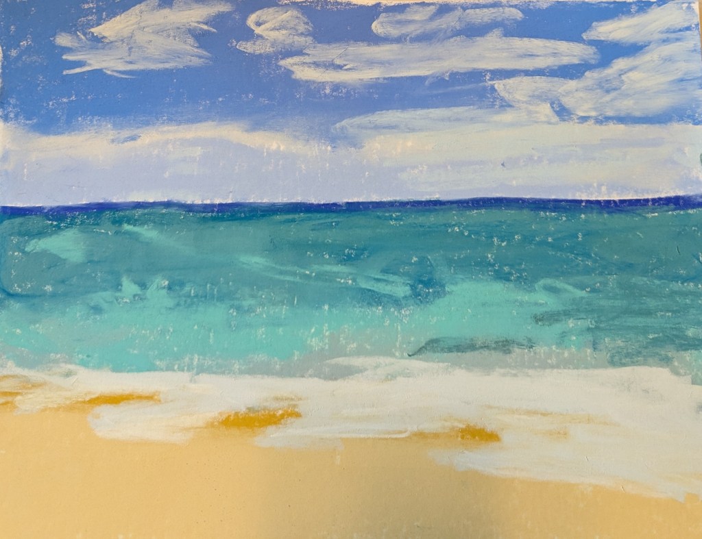
This pastel work, done on an approx. 12×10 scrap of white Pastelmat, was based in part off an image by Somchai Sumnow from Pixabay, but also off of some of my own reference photos of Hawaiian beaches.
Mostly I was interested in the different shades of blue and also how different brands of pastel lay down on the paper. There are some weird diagonal lines, probably creases from the original 19×25 size of the Pastelmat sheet,
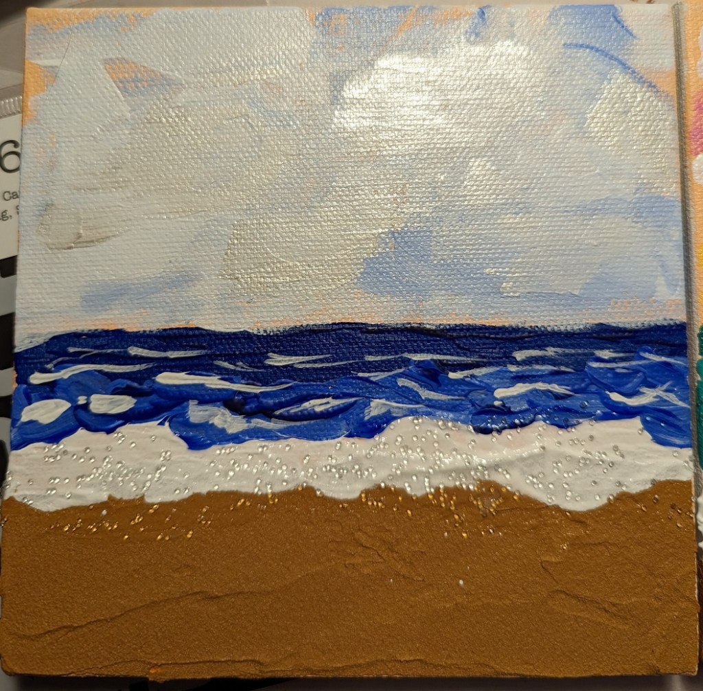
And, just for fun, comparing the above pastel piece with another beach piece I did 3 or 4 months ago with acrylics, sand texture, glass beads, and iridescent paint.