
Sometimes doing the NuPastel thing doesn’t make sense to me. I noticed on one of my follow-along courses that the suggested paper to use was dark blue Pastelmat, and the suggested underpainting was to be done in Blue Spruce NuPastel. But the instructions in the form of a PDF clearly showed a taupe-colored paper, because Blue Spruce doesn’t really show up on a dark blue paper!
In any case, I tested the NuPastel by using a light touch on two different papers: the dark blue Pastelmat (where it went on “like butter”) and gives more coverage, even without rubbing it in, and the twilight Canson Touch, where it was hard and scratchy, and seemingly added no value at all!
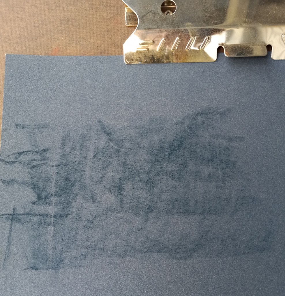
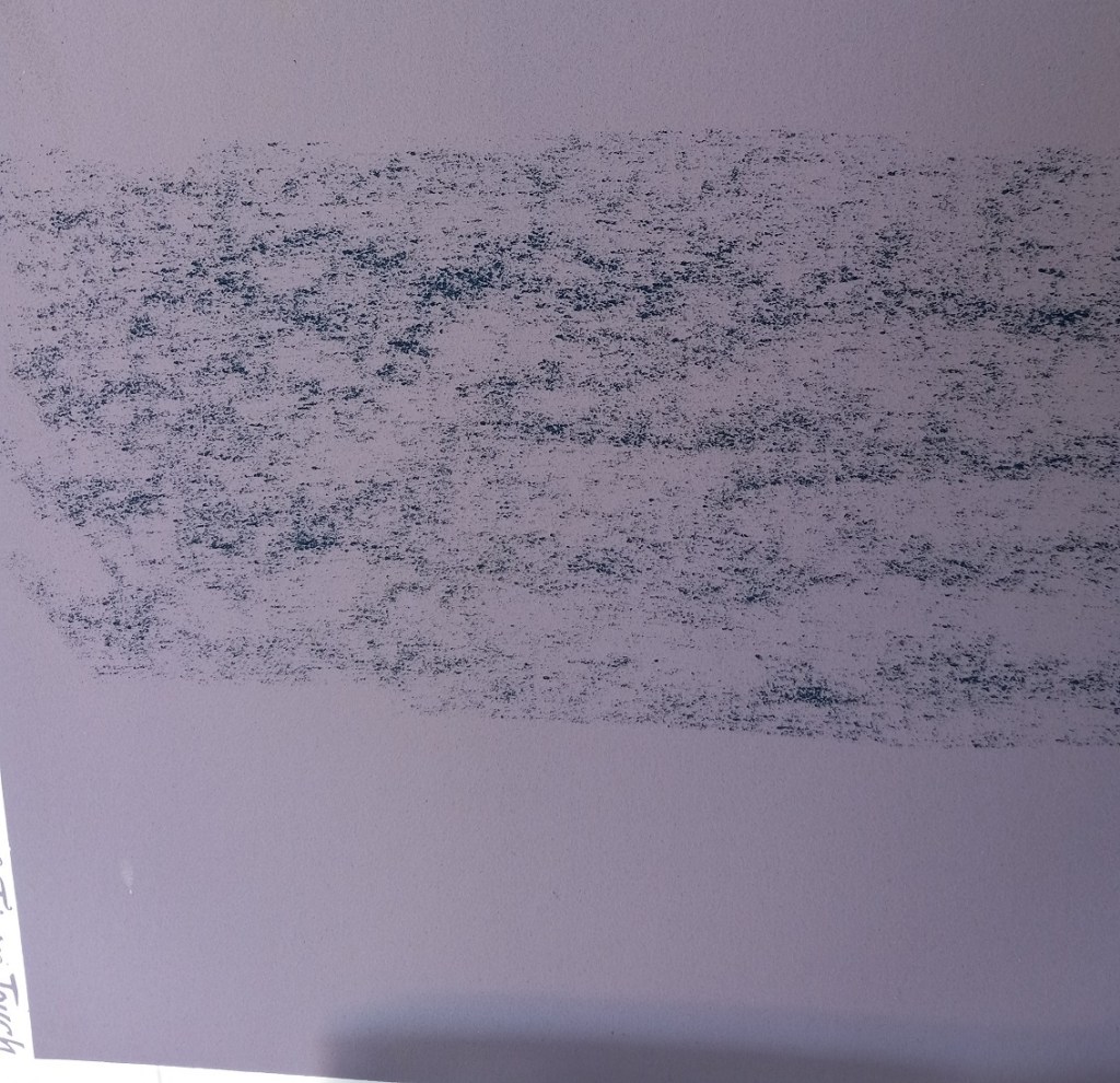
I later attempted to brush it out of both papers, and failed. All it did was smear and grind in. Ugh!
