The reference image for this charcoal study is by Nadine Doerlé from Pixabay.
I’ve used this same image for a work in pastel.

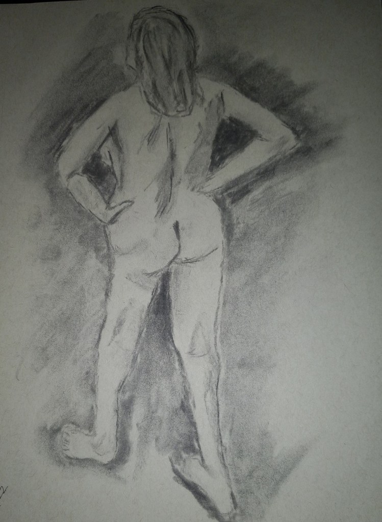
The reference image for this charcoal study is by Nadine Doerlé from Pixabay.
I’ve used this same image for a work in pastel.
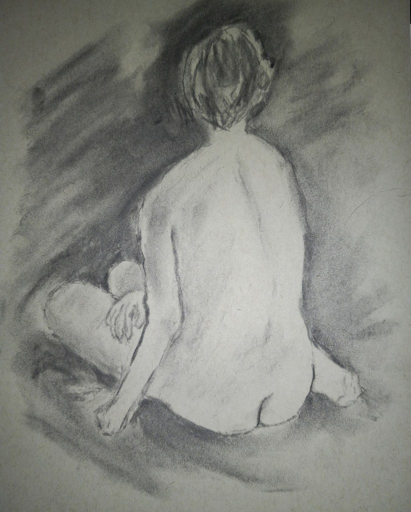
This is another piece I did, based on the ArtTutor.com class “Studies in Charcoal” by Joann Boon Thomas. Same vine charcoal, and toned paper. This reference photo was one of the instructor’s based on a life drawing she did. I need to find a life drawing class myself, although with Covid, it might be an online/Zoom version.
This piece, like the one posted yesterday, is also from the “Studies in Charcoal” by Joann Boon Thomas. Same supplies — vine charcoal and toned paper. I definitely need to practice hands and feet.
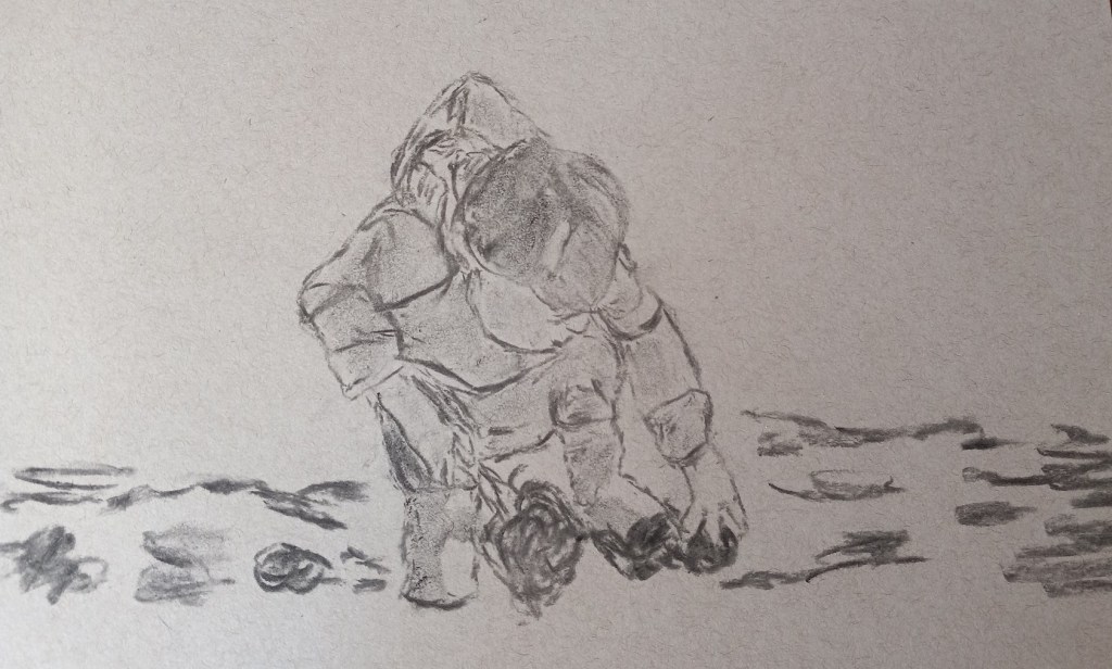
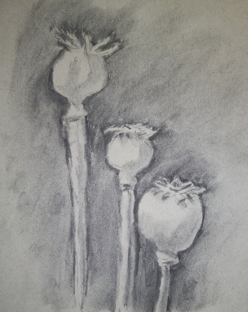
With this art tutorial website going away in March, I’ve been making an effort to use my membership, and one of the online classes I did was Joann Boon Thomas’ “Studies in Charcoal”. This drawing was done on Strathmore toned paper, using medium vine charcoal (which is extremely forgiving — i.e., easy to erase with a kneaded eraser.) The reference photo was provided in class.
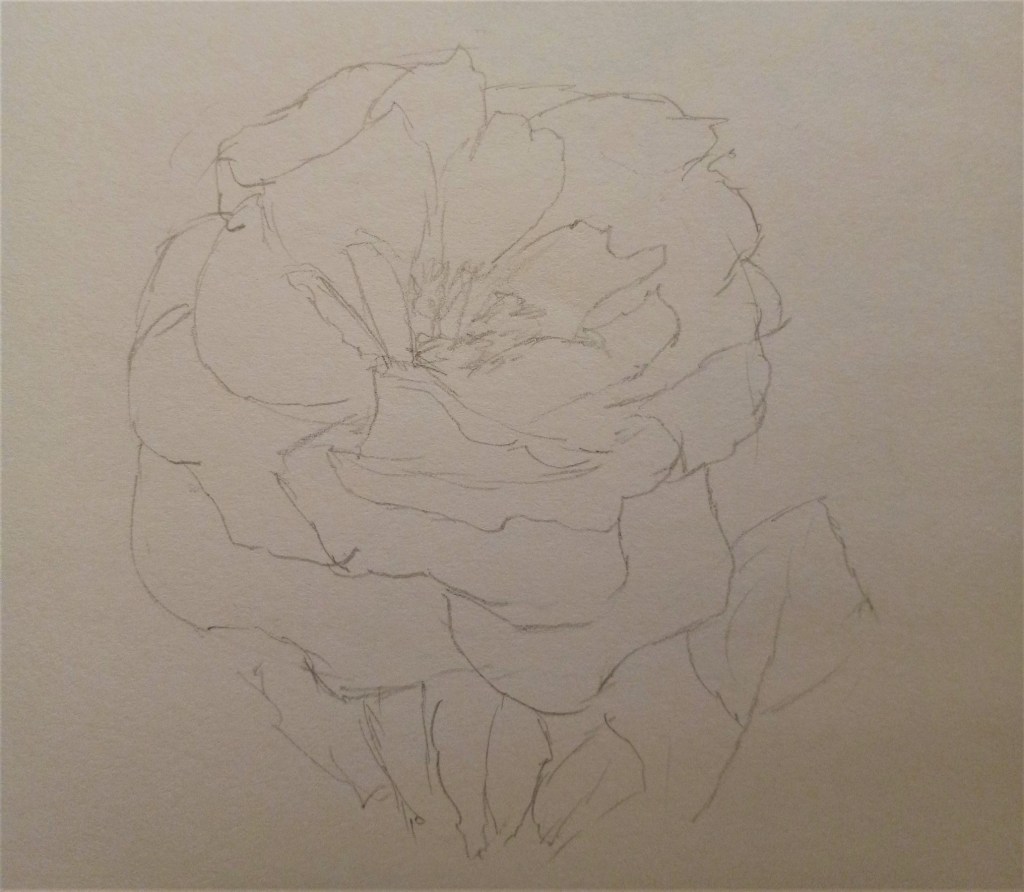
I had so much fun drawing this rose from life (“en plein air”) that I ended up drawing it a second time, in willow charcoal, and then using my NuPastels. This is the original drawing, done in graphite (2B) on ordinary drawing paper. (Pencil marks are terrible to view on the website).
Sometimes I get dissatisfied with the pastel landscapes I’m doing. There’s not a lot of drawing involved, and these fat sticks are irritating. I’m more and more inclined to draw and perhaps “color in” (as needed) with, say, watercolor.
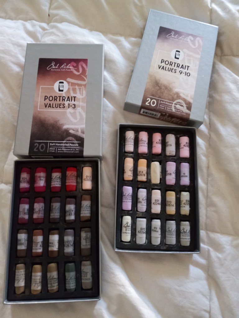
I got the darkest values, and the lightest values. The darker ones have a lot of good browns, while the lighter ones can be used for sand and snow — if I stay with doing landscapes.
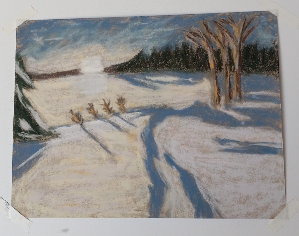
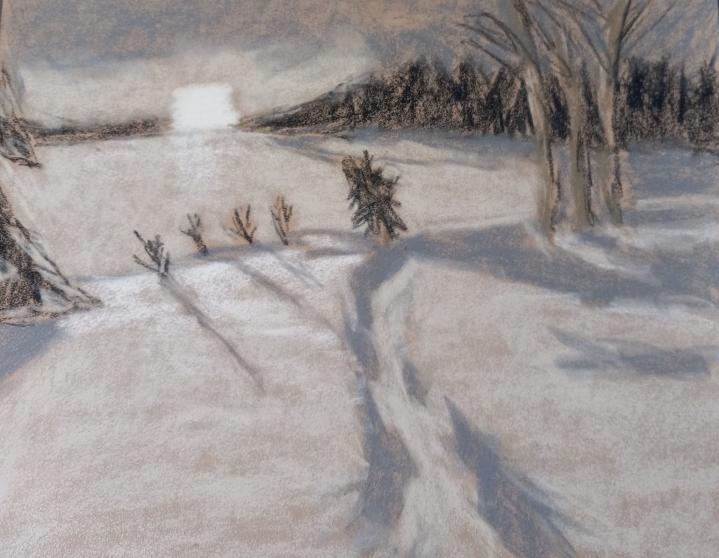
Here is my snowscape done in color. The snow is partly pink, blue and yellow, and very nearly white where the small bushes are. I removed the little pine tree at the suggestion of a member of Karen Margulis’ Patreon group for pastel classes. Most of the pastels used were Richeson hand-rolled, which is fast becoming my favorite brand.
(I have the comparison between the value study and the color version below. The original image was by Alain Audet from Pixabay.)
This is how the two versions compare:
ArtTutor.com, the website based in Liverpool, England, where I got most of my drawing training in Phil Davies’ Drawing Essentials course, is shutting down as of the end of March 2022. This is largely due to the pandemic lockdowns, etc.
Many of the courses offered are currently being made available for purchase at a discount to monthly members like myself and at a smaller discount (for a short period of time) to a la carte users of the site.
If you previously bought a course from that site, or if you think you might want to, you have until the end of March to download that course. Downloading can only be done to a laptop or desktop computer, not a mobile phone or a tablet.
I was playing with my new watercolor travel kit and made two color wheels — one Warm, one Cool. The Warm wheel was mixed from French Ultramarine, Cadmium Yellow and Cadmium Red (all Winsor-Newton). I love the orange, but the “purple” and “green” are unappealing. (This was done on 300 lb. paper.)
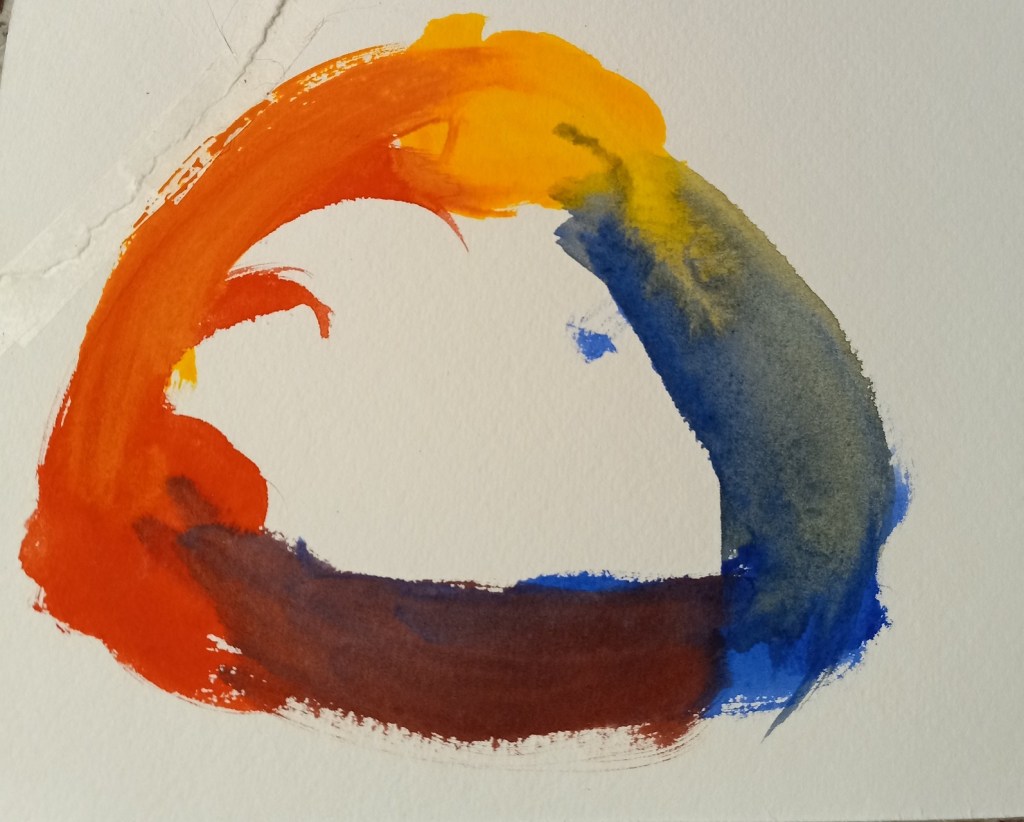
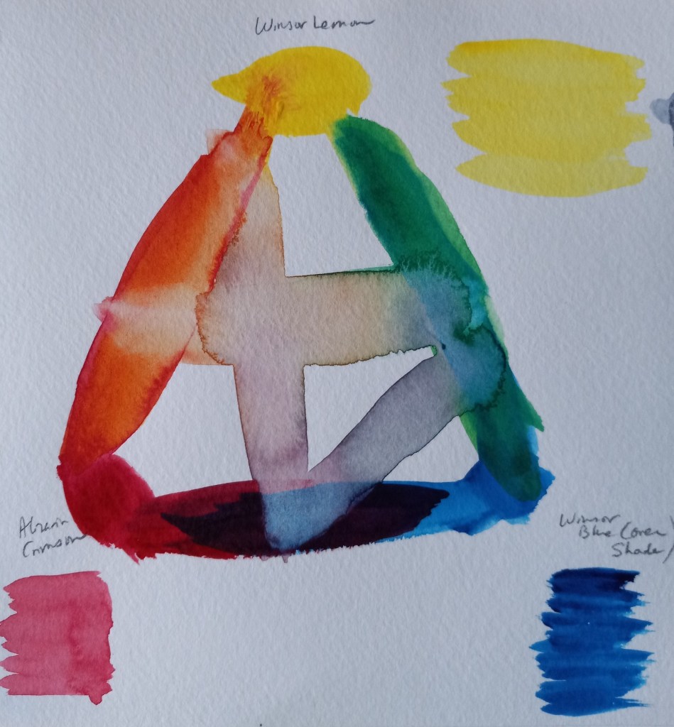
The Cool color wheel was made up of Winsor (Phthalo) Blue (Green Shade), Winsor Lemon and Alizarin Crimson. The “orange” is unappealing to me, but l love the vivid green. The purple is not too bad.