This landscape was done on Pastelmat (Sand color), using soft pastels from Blue Earth, Sennelier, and Dick Blick’s Artist’s Soft Pastels. The original image was by Larisa Koshkina from Pixabay
Month: December 2021
Little Girl With Daisies
This drawing — done in graphite, compressed charcoal, and white Conte crayon — was based on a photograph from Pixabay, which I cropped and changed to grayscale.
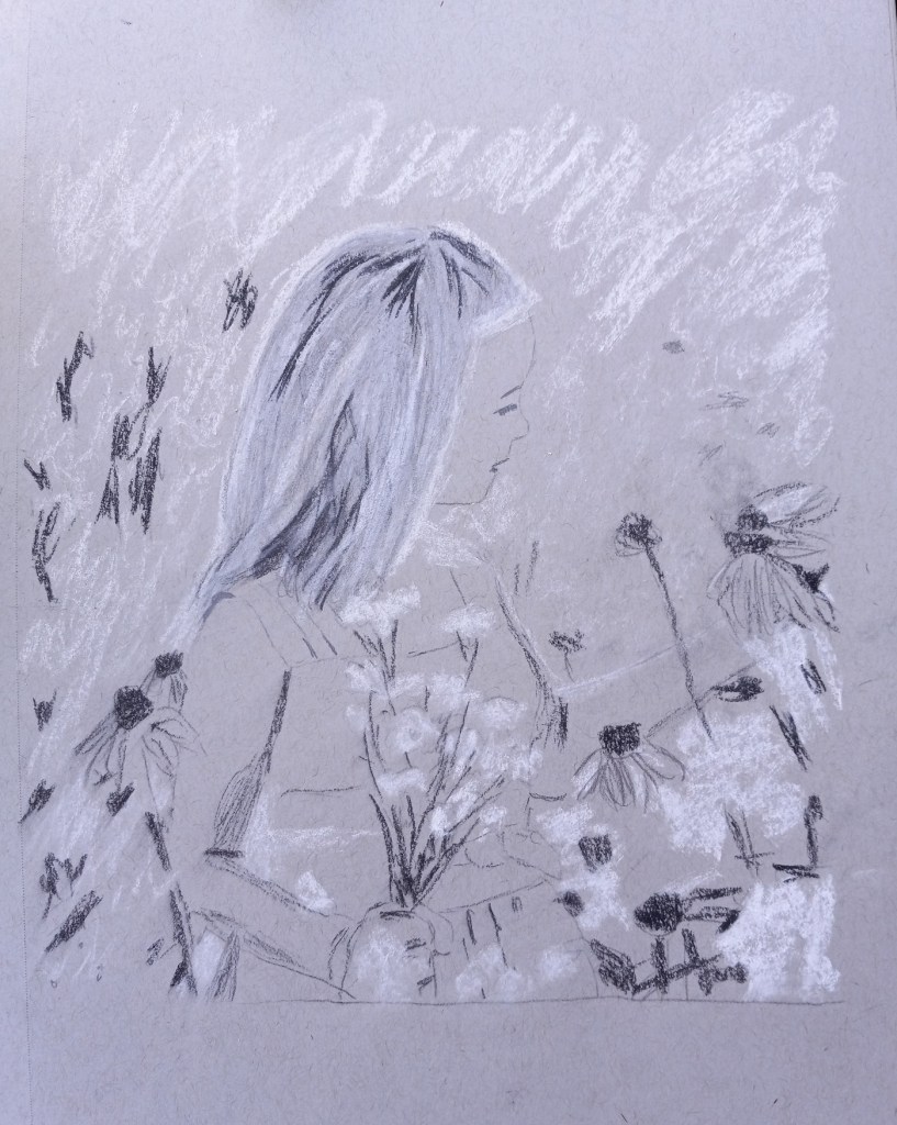

Original image by Jill Wellington from Pixabay
Daily Drawing… Again
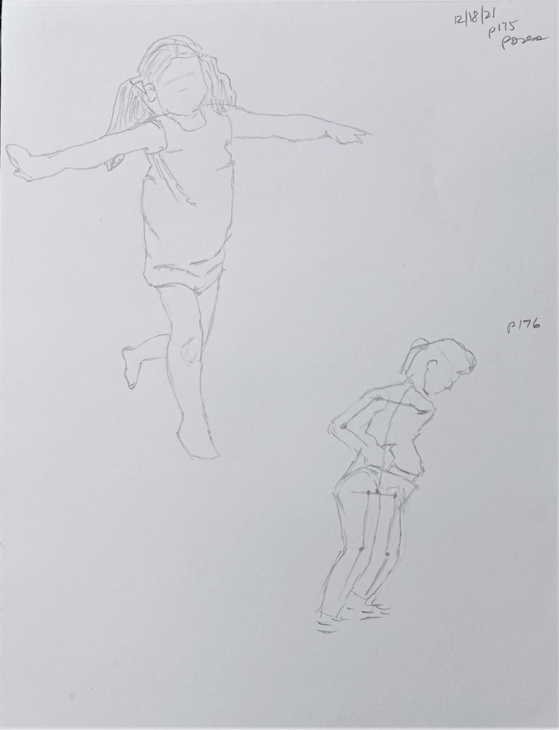
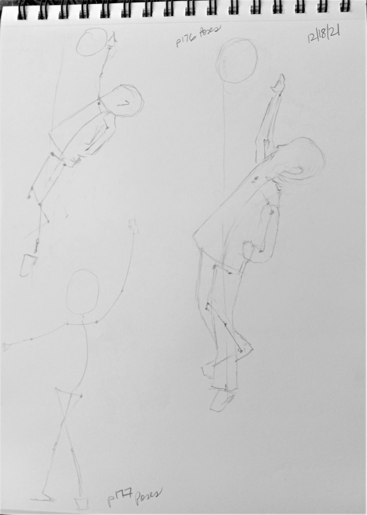
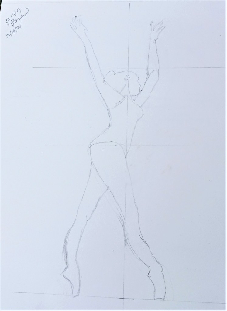
These sketches and figures are based off poses found in The Complete Book of Poses for Artists: A comprehensive photographic and illustrated reference book for learning to draw more than 500 poses, by Ken & Stephanie Goldman (Walter Foster Publishing, 2017).
I left the center-of-balance line in the sketch of the boy with the basketball; in the first sketch he is way off kilter in an unnatural pose.

More Daily Drawing
Still focused on regular daily drawing since it is the foundation for so much.
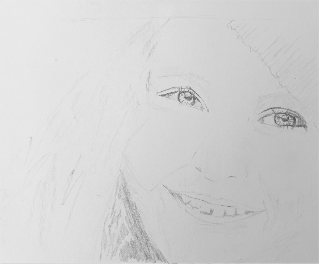
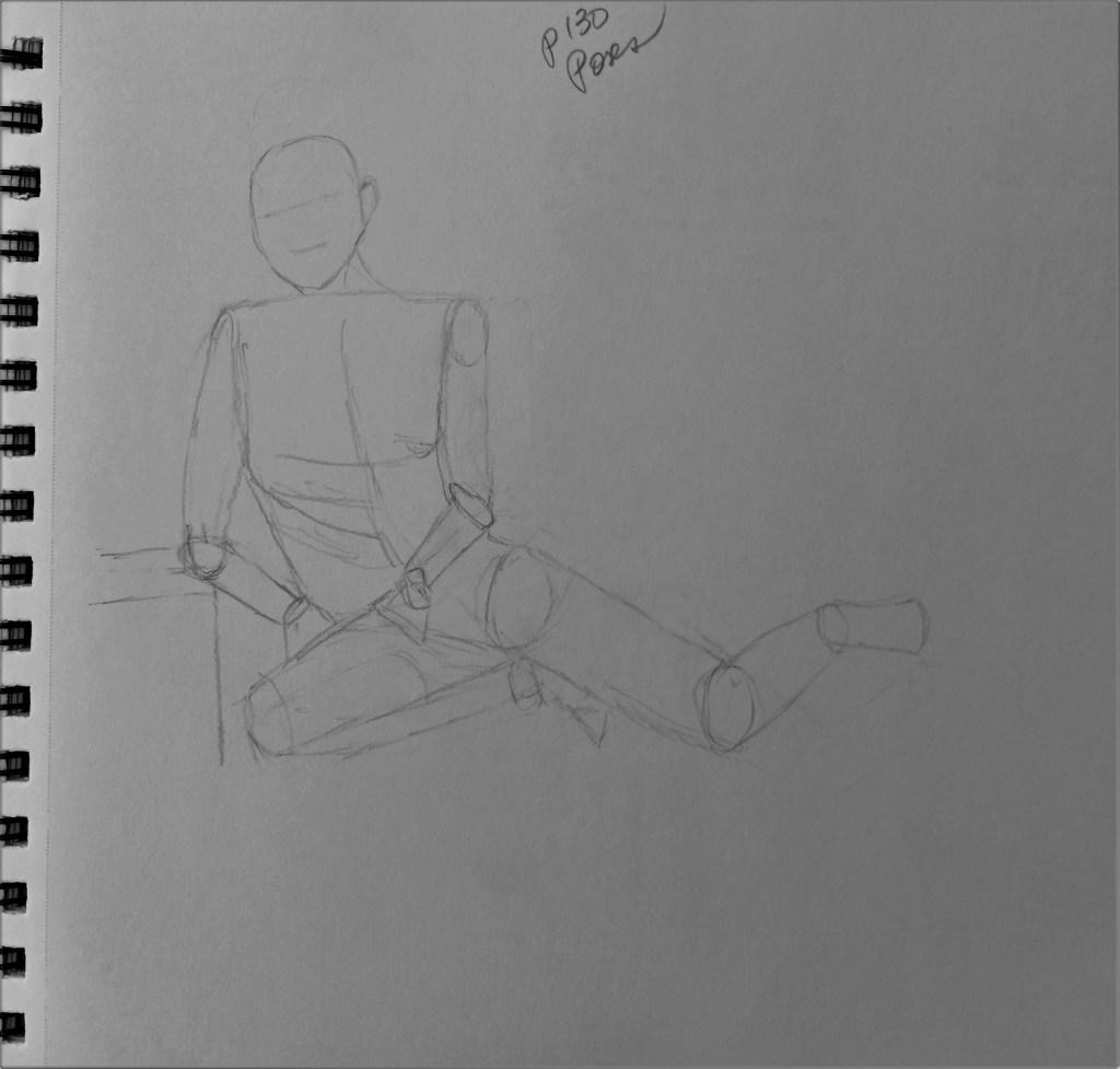
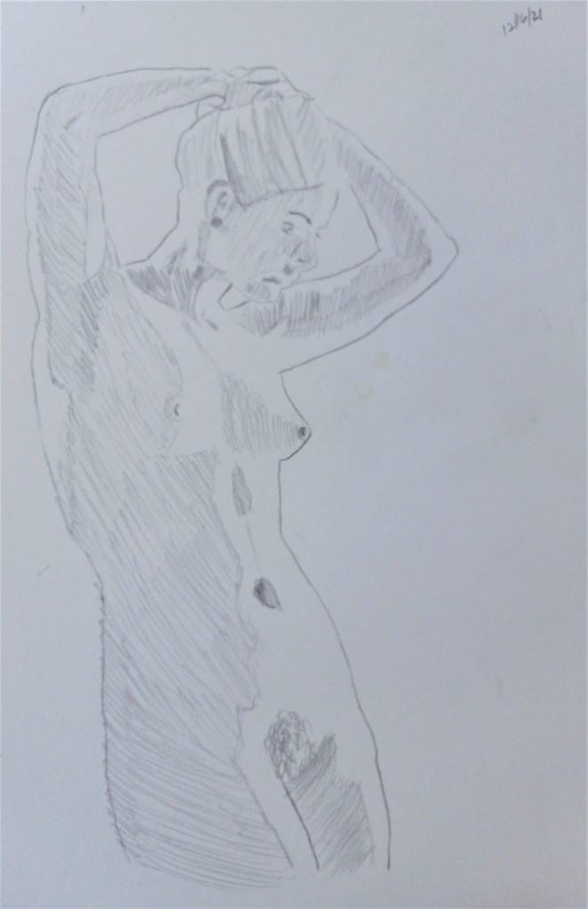
Figure Drawing
I was reading Mary Whyte’s book Painting Portraits and Figures in Watercolor (pub. 2011 by Watson-Guptill) and in it she talks about how imperative it is to watercolor painting to have good drawing skills, particularly if you are painting portraits or human figures. I suppose the same is true for other media, like pastel or oils. So, to that end, I did some drawing today.

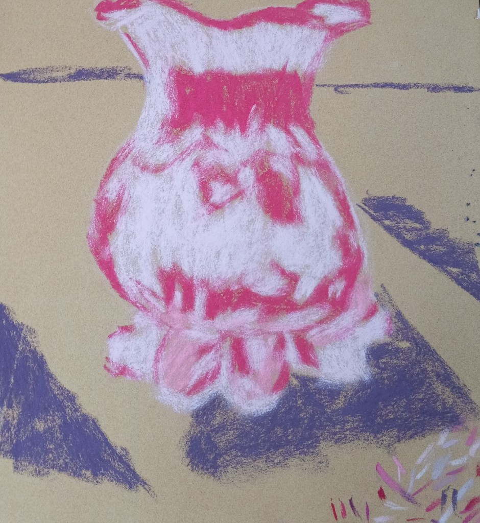
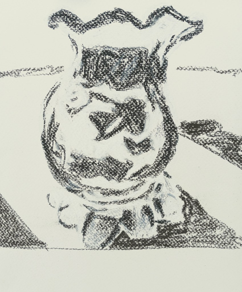
Glass Vase in Color
Finally got around to trying out some colors for my cranberry glass. I LOVED the paper — Sennelier Soft Pastel Card 360gsm — from my sampler set of sanded papers. I used Dick Blick Artist’s Soft pastels in 3 different rose colors, and they went down smooth as butter!
Comparing the two versions, I see i missed a few shadow spots. Oh well!
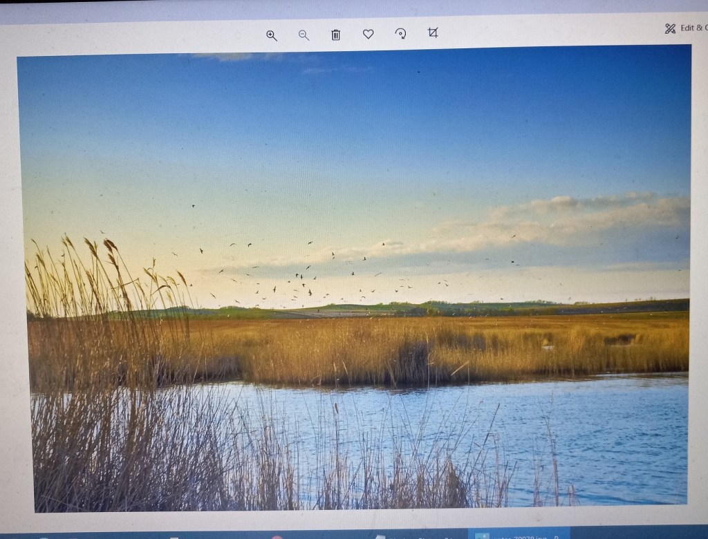
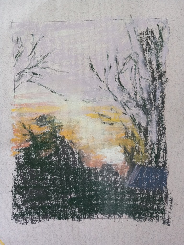
My First Landscape
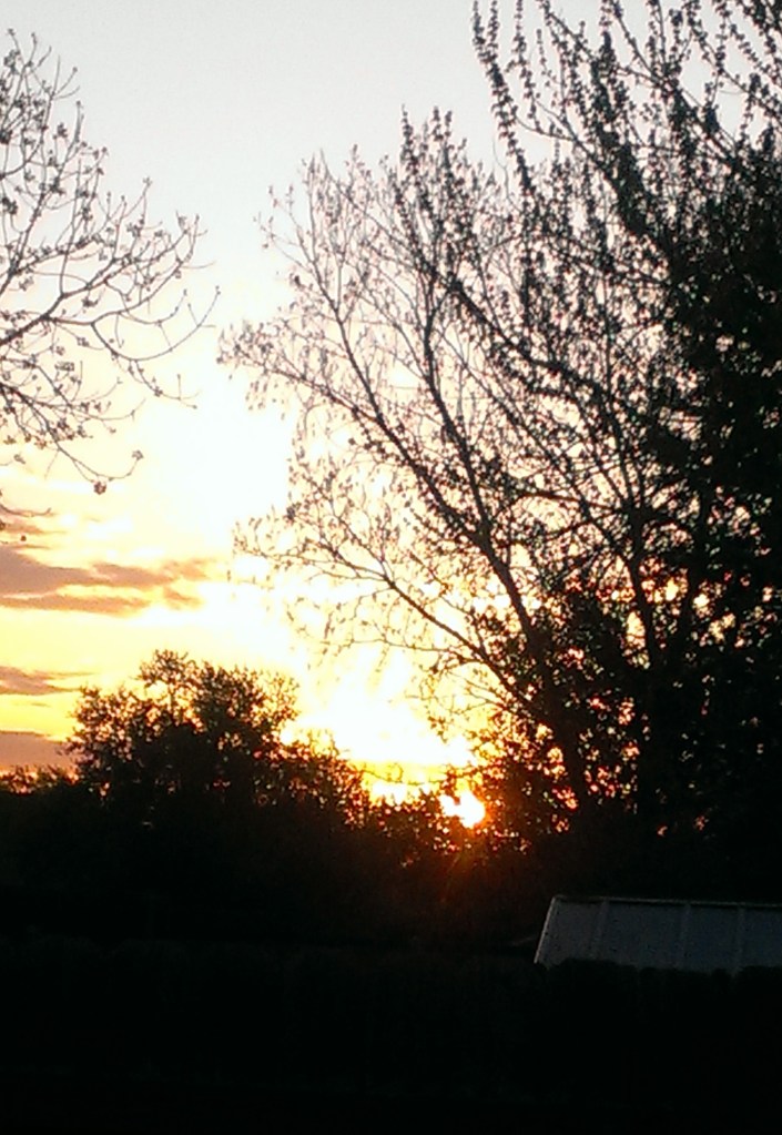
Today I did my own landscape painting based on a photo of a sunrise I took several years ago in our backyard.
I used Clairefontaine Ingres paper, which is unsanded, and not too bad. It was a pale tan color (and part of my unsanded paper sample I purchased from Jackson’s Art a year ago.) The initial drawing was done in vine charcoal. And I kept the size to 8×6.
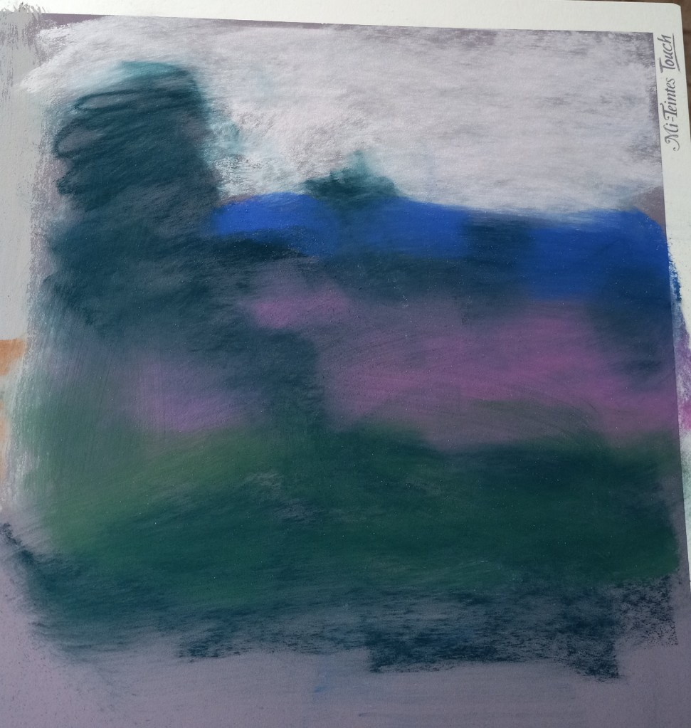
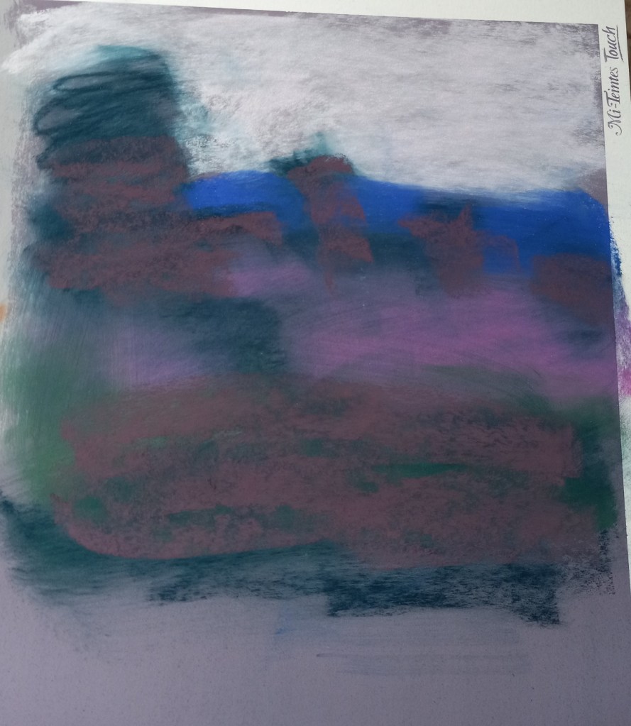
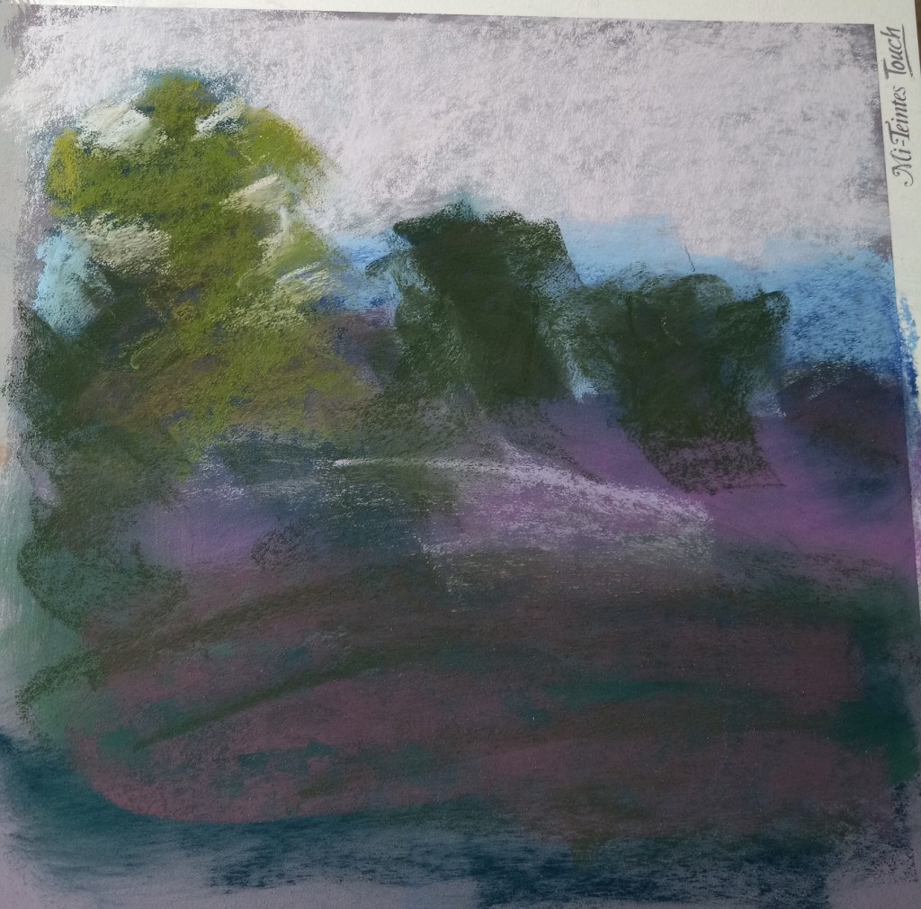
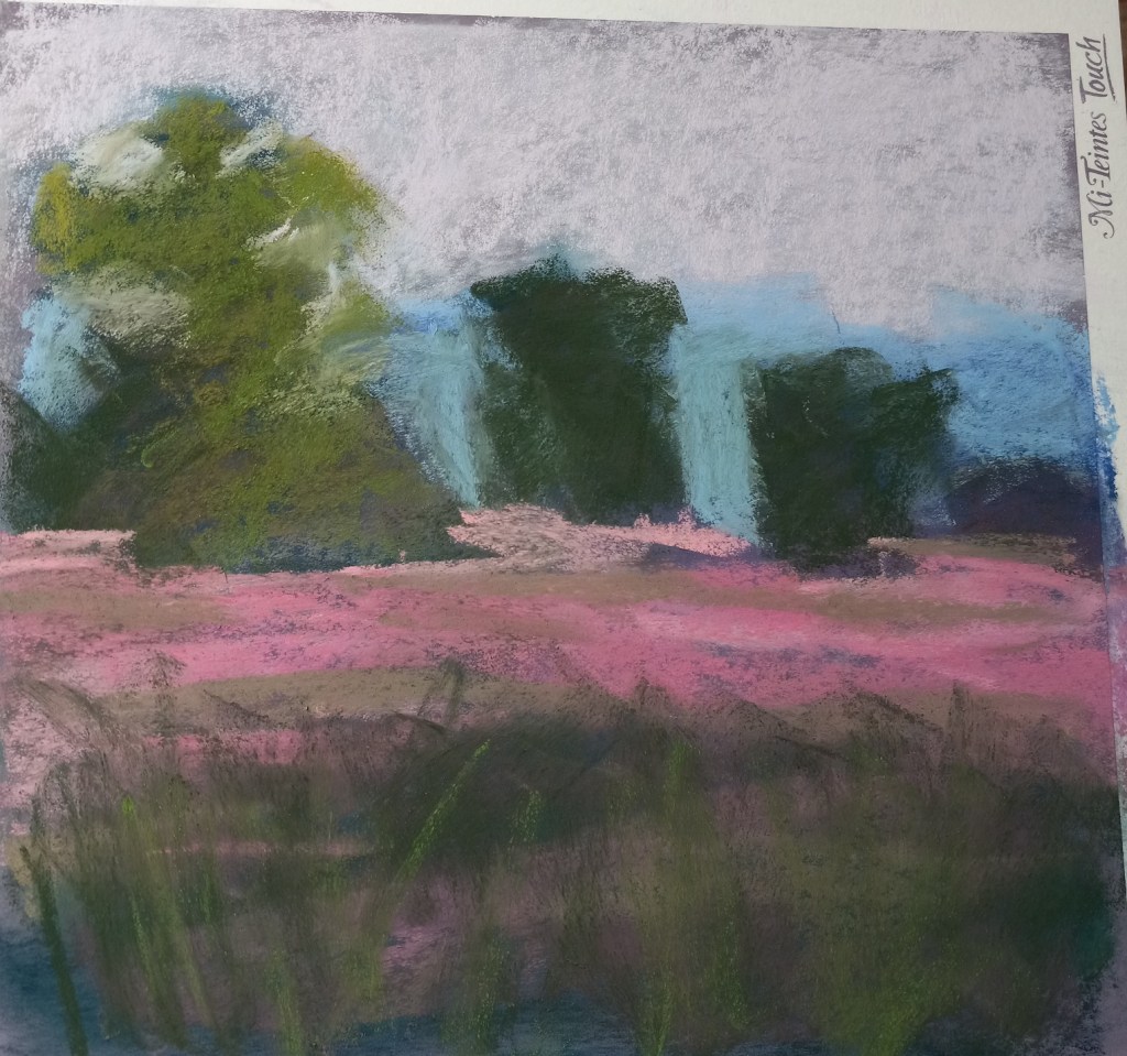
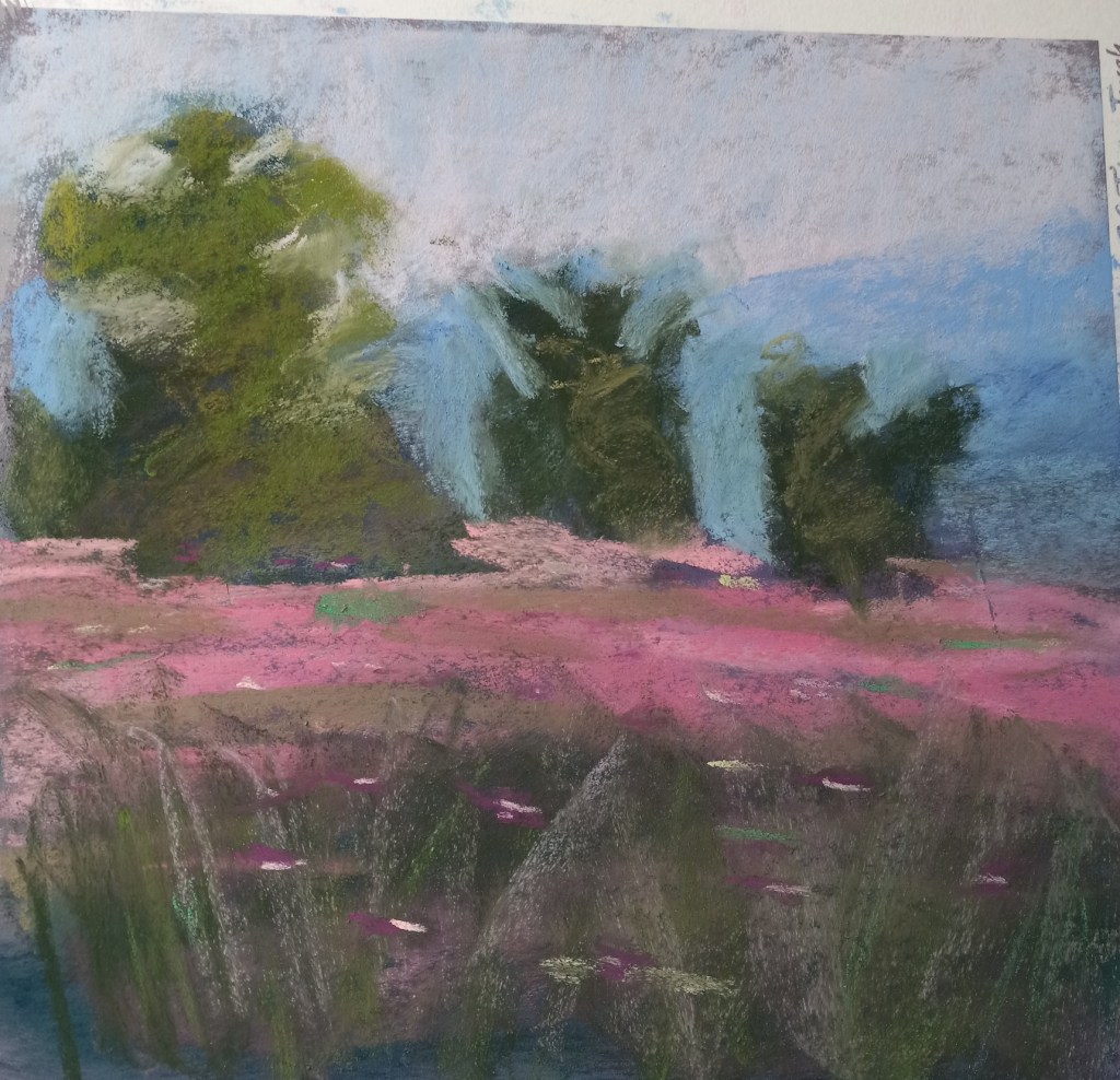
Follow-Along: Karen Margulis Landscape
Today I watched a YouTube video (click here) by Karen Margulis about successful strategies for a daily painting habit. She demonstrated painting a landscape in pastel in 20 minutes and after I watched it once I decided to follow-along and try my hand at her style.
Below are step-by-step pictures of my attempt. I used a portion of my Canson Touch board in Twilight color. Karen’s painting is much superior to mine, but this was actually fun! It really did take 20 minutes. AND I feel ready to give a shot to doing a painting using one of my own photos.
The big tree really only looks like a tree from a distance, so I included a distant shot. I don’t yet have the skill Margulis has so I would want to draw out my trees a bit more. I can’t quite make the connection from abstract value shape to something I view as a tree after painting.

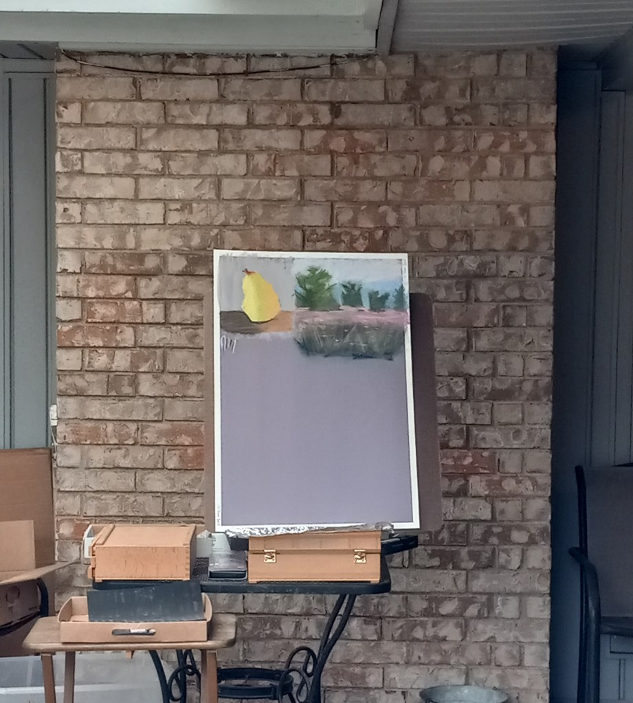
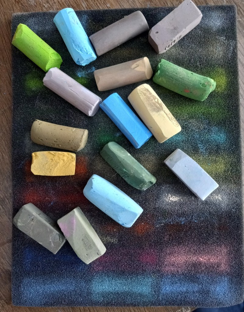
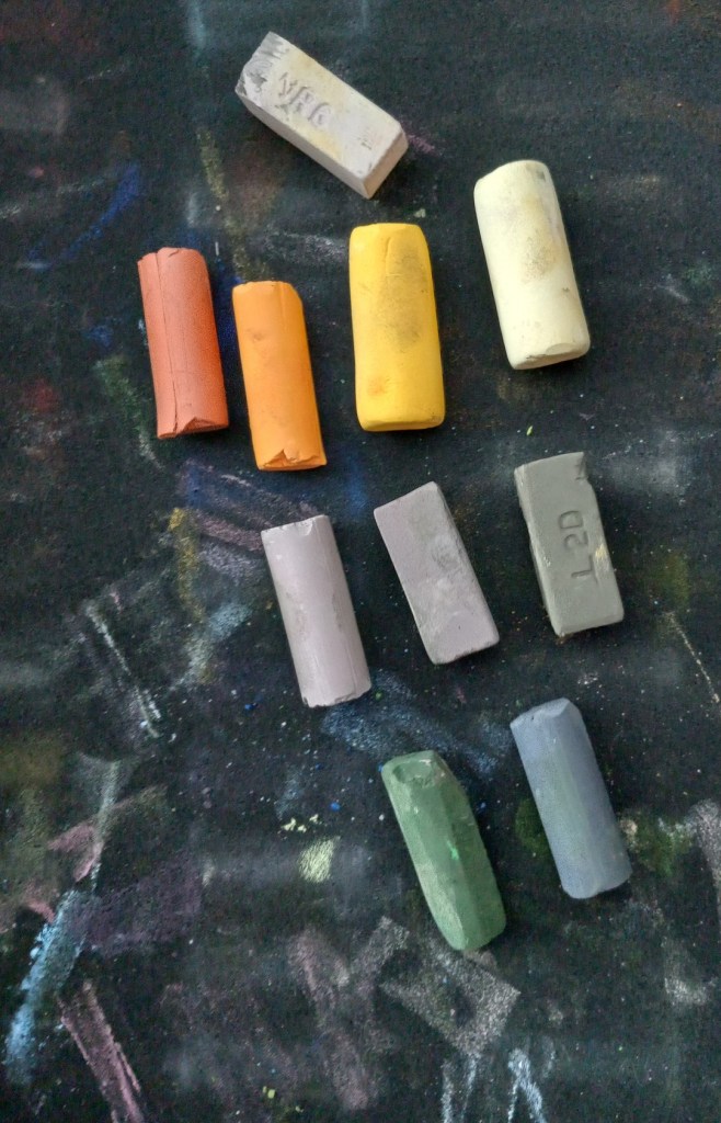
“Confident Color” Arrived today!
A week or so ago I was reading a posts about color palettes on Karen Margulis’ blog. She referred to 2 books on color by Nita Leland: Confident Color and Exploring Color Workshop (30th anniversary edition). I have Leland’s Creative Collage Techniques book so I was familiar with her name. So I decided to buy Confident Color used from a seller on Amazon because I could view more pages from it than the color workshop book.
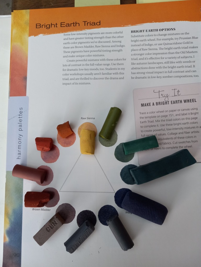
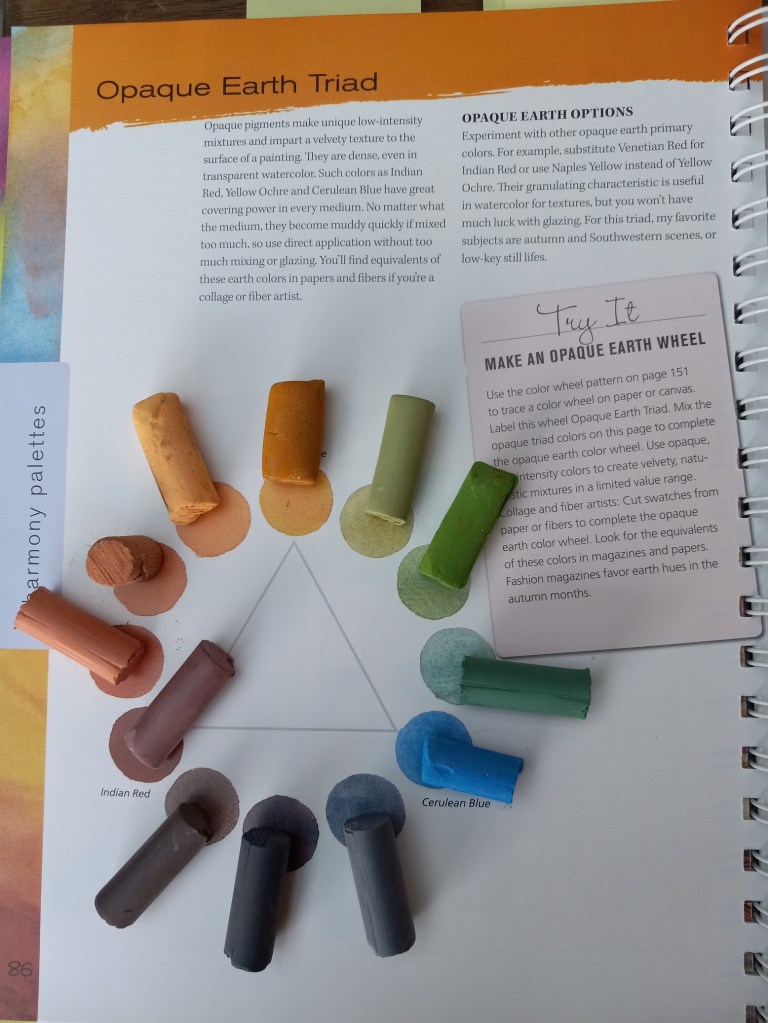
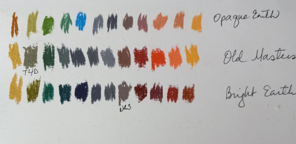
My tastes, in general, run to what Leland calls “Bright Earth” and “Opaque Earth”, both more muted palettes than bright bold ones. (I also like those, but they can be so bright and so bold it’s like a punch in the face.)
In any case, it was fun to try matching pastels I already have to the references in the book, as seen in the photos below.