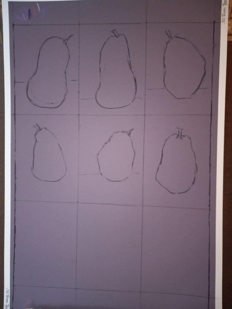
I spent some time today prepping for the first of two 9 pear studies (from Marla Baggetta’s “Making Your Mark” online workshop).
I’m using Canson Mi-Teintes Touch board in the Twilight color, and each pear study will be 8″ x 6″. I’m drawing the outlines in vine charcoal, and may make further adjustments as some of these pears look more like butternut squashes.

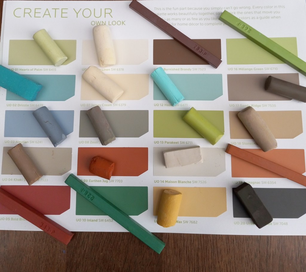
I also chose my palette, based on the “Urban Organic” palette from Sherwin-Williams HGTV back in 2012 (also the palette for the rooms in my house). It looked great as far as matching pastels — although I have nothing particularly close to the green blues — but when I put the pastels in their case, I realized there are too many that are too similar.
So I made adjustments, swapping out some of the creams and browns for magenta and purple. Looking forward to getting started tomorrow!


