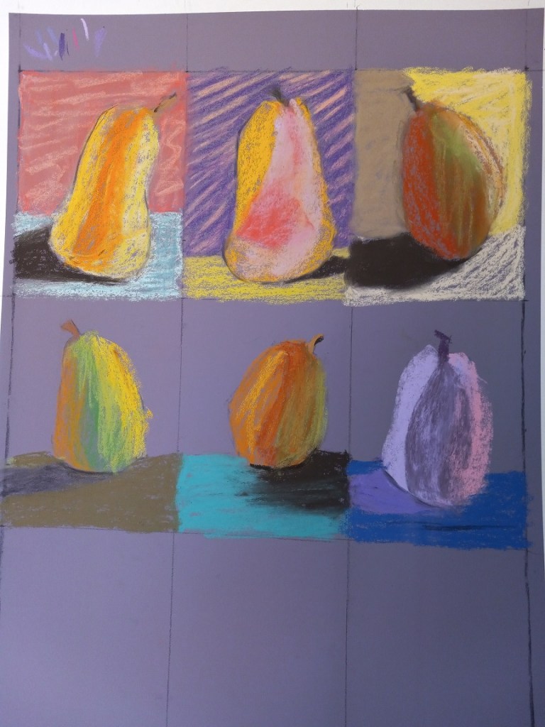
Ugh. This did not turn out as I had wanted. Instead of learning how to make different marks with pastel sticks, I learned about which pastels work on which paper.
This paper was Canson Mi-Teintes Touch in Twilight. Sadly, I have 4 more boards of this stuff — and 5 boards (same size) in Indigo color. I regret buying the stuff and will never buy it again!
The pastels that don’t lay down color well on this paper are NuPastels, the Dick Blick Soft Artist’s sticks, Rembrandts, and Sennelier (at least from the 30 Landscape half-stick collection).
On the other hand, Richeson Hand-Rolled was not too bad! Neither was Blue Earth. The best of all, though, was Great American. (They’re having supply chain issues at the moment, sadly; else I’d buy some more sticks right now!) Willow charcoal is also great — perhaps I’ll do some charcoal work so as not to waste this paper.
Of course, the wildcard in all this is my beginner skill level. Could a pro lay down color better than I? It’s certainly possible. As it was, I was grinding the pastels into the “paper” and losing massive pigment in the process!
For pear #1, (top left) I stupidly did some blending with my finger of the background. Now it looks worse than before, plus the dust just rolled off. Fortunately, I’m working outside in the patio and have a jerry-rigged dust catcher at the bottom of the easel.
I’ve given up on doing 9 pears on this purple toned paper. What I plan to do for the last three pears is to wash the paper with fluid acrylic in yellow ochre — at least that’s somewhat of a pear color. I’ll let that dry, and try putting pastel on top of that to see what happens.